Hire the Top 3% of Freelance E-commerce Website Designers
Toptal is an elite marketplace for E-Commerce website designers and Shopify experts. Each Toptal E-Commerce website freelancer is thoroughly vetted and trusted by top companies for their most critical design projects.
Erin has over 10 years of experience in product design and agile product management, leading various responsive web and native app projects for eCommerce, B2C, and B2B organizations. She works with US and global organizations ranging from startups to large Fortune 500 companies to create inspired and innovative products. She also enjoys helping build new, agile product teams and is well-versed in Agile, Scrum, and Kanban.
With almost two decades of product design experience working with clients from within media, telecom, and online retail, Bill has designed a wide range of product types, such as eCommerce sites and streaming media apps for mobile and connected devices. He's led his teams' UI/UX efforts, taking his products from conception to production. Bill has also worked extensively with remote product teams using both Waterfall and Agile methodologies.
Sérgio is a UI/UX designer with over 15 years of experience crafting intuitive interfaces across diverse industries, including AI, enterprise, finance, education, eCommerce, and automotive. His background in graphic design, front-end development, and team leadership ensures a comprehensive approach to user-centered solutions. As a tech enthusiast and digital nomad with experience in 50+ countries, Sérgio brings a unique global perspective to his design approach.
Lauri is an accomplished senior UX/UI designer with an impressive decade-long track record. His passion is crafting remarkable digital experiences, digital products, and high-converting eCommerce websites. He won the European Design Awards (Silver), three German Design Awards, and several others. He's worked on design projects from 25+ countries and has been hired by Google seven times to train thousands at the Grow with Google series. Lauri is a collaborative team member and a positive thinker.
Light is an experienced product designer, UI/UX, and branding expert with over six years of proven end-to-end experience in banking, fintech, eCommerce, travel, edtech, and social networks. She prides herself in delivering detailed and highly creative digital products from initial concept to completion. Light focuses on creating human-centered experiences, which increase brand loyalty, sales and profit margins, customer retention, and knowledge of products and services.
Arthur, a senior product designer, boasts over eight years of crafting captivating designs for numerous domains—from eCommerce to SaaS platforms. His architectural acumen bolsters problem-solving skills, delivering user-centric designs for luxury giants like Mercedes-Benz, Babbel with 10+ million users, and Fortune 500 logistic leader C.H. Robinson. Rooted in empathy, Arthur strives to decipher user needs, funnel them into intuitive designs, and seamlessly collaborate with development teams.
Akis is a seasoned lead product designer and UX designer with 24 years of experience, specializing in fintech, AI/ML, healthtech, dashboard design, SaaS, and eCommerce. With an extensive background in creating design systems for enterprises based on the Atomic Design methodology, his clients include companies such as the Harvard Kennedy School, Sony Pictures, WeWork, Pfizer, Cigna, and Unilever. He is a Certified AI Consultant (CAIC) from the US Artificial Intelligence Institute.
Tatiana has 17+ years of design experience, including UX/UI design of digital products for the luxury travel sector, healthcare, B2C eCommerce, and airline industries. Past clients include Samsung, SLH, Six Senses, iconic London hotels, and private member clubs. For the past two years, Tatiana has consulted and created MVPs for digital startups. She has a master's degree in UX design and uses a structured, user-centered approach to design and problem solving.
Dobs is an entrepreneur and lead UI/UX designer specializing in iOS apps and responsive web products with expertise in the eCommerce, luxury and lifestyle, hospitality, social networks, and travel industries. He has helped multi-million dollar clients increase reach, engagement, and profits. Dobs has in-depth knowledge of product lifecycles—from research, concept, and planning through design and validation to live releases and team collaboration.
With a decade of experience designing for small and big companies and a background in project management, Nina is the type of designer who likes to work with the whole team. Nina excels at making unique, simple designs that are pleasing to the eye yet functional, and her work ranges from brand development to UX design. Nina has been a digital product manager and product owner for B2B at On AG, as a UI/UX designer, and as an interim product manager in the eCommerce team at Laerdal Medical.
Lauren worked on creating interaction guidelines for Samsung Electronics and the transparent, flexible display UX through the Korea Institute of Science and Technology for 8+ years. She's provided eCommerce solutions for fast-growing startups and augmented reality UX solutions for a top-ranked, global construction technology company. Lauren specializes in the digital transformation of work, specific-domain matters, and the translation of business requirements to new UXs and clear USPs.
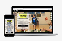
Several factors determine the overall success of an eCommerce website; for example, product quality, shipping costs, trustworthiness, and customer service. However, great user experience design is also key to providing customers with a satisfying experience. It will not only convert potential clicks into actual eCommerce transactions but also cause customers to come back time and again.
... allows corporations to quickly assemble teams that have the right skills for specific projects.
Despite accelerating demand for coders, Toptal prides itself on almost Ivy League-level vetting.
Our clients
Creating an app for the game
Leading a digital transformation
Building a cross-platform app to be used worldwide
Drilling into real-time data creates an industry game changer
Testimonials
Michael is an incredible designer, and has been a great fit for our project. He just gets it in a way that can’t be taught. My goal was to pay Toptal to find me a high quality designer for my project, and that is exactly what happened. It was easy. Being able to see the portfolio work on Toptal’s platform is what gave me the infomation I needed to choose Michael. I have nothing but good things to say about Toptal and am looking forward to using Toptal for other projects in the future.
Edward Daniel
Co-Founder
I've worked very closely with Martina for over a year and have to say she is one of the best people I have ever worked with. Instead of simply following instructions blindly, she thinks through the task at hand, becoming a thought partner to help with whatever the project may be. Besides being super talented at design, she possesses specific qualities that make her exceptional to work with given the fast paced nature of being a startup. I would definitely recommend her to anyone looking for a talented, professional designer who doesn't need much direction to hit the ground running.
Sahil Khanna
Sr. Manager, Marketing
Darko did a great job figuring out the user architecture for our concept, which led him to produce terrific wireframes. His knowledge of usability and design was a perfect match for the outside voice we needed to help jumpstart our project. We would certainly recommend him and work with him again in the future.
Rich Danker
Founder
Carlos has the unique talent of blending both quantitative and qualitative research to keenly identify UX challenges and opportunities. He thinks methodically, emphatically, and holistically to produce data-driven strategies and well-executed designs. Over the past 8 years of working with fully or partially distributed teams, Carlos manages working remotely far better than anyone I've encountered because of his strong communication and presentation skills. He is the first on my list the next time I need a UX designer.
Michelle Krogmeier
Project Manager
Rafael is an amazing designer. His aesthetic sense is spot on, and he seems to be able to anticipate our needs before we even know what they are. He's taken the time to understand both our company and our clientele, and his solutions are consistently in-line with our values, interests, and our customers' needs. He delivers on time (if not earlier), works quickly, is well organized, and very effective. He's a pleasure to work with, and we're very happy to have found him through Toptal.
Ethan Brooks
CTO
How to Hire E-commerce Website Designers Through Toptal
1
Talk to One of Our Industry Experts
A Toptal director of design will work with you to understand your goals, technical needs, and team dynamics.
2
Work With Hand-Selected Talent
Within days, we'll introduce you to the right E-commerce website designer for your project. Average time to match is under 24 hours.
3
The Right Fit, Guaranteed
Work with your new E-commerce website designer for a trial period (pay only if satisfied), ensuring they're the right fit before starting the engagement.
Find Experts With Related Skills
Access a vast pool of skilled designers in our talent network and hire the top 3% within just 48 hours.
Typically, you can hire an E-commerce website designer with Toptal in about 48 hours. For larger teams of talent or Managed Delivery, timelines may vary. Our talent matchers are highly skilled in the same fields they’re matching in—they’re not recruiters or HR reps. They’ll work with you to understand your goals, technical needs, and team dynamics, and match you with ideal candidates from our vetted global talent network.
Once you select your E-commerce website designer, you’ll have a no-risk trial period to ensure they’re the perfect fit. Our matching process has a 98% trial-to-hire rate, so you can rest assured that you’re getting the best fit every time.
How do I hire an E-commerce website designer?
To hire the right E-commerce website designer, it’s important to evaluate a candidate’s experience, technical skills, and communication skills. You’ll also want to consider the fit with your particular industry, company, and project. Toptal’s rigorous screening process ensures that every member of our network has excellent experience and skills, and our team will match you with the perfect E-commerce website designers for your project.
How are Toptal E-commerce website designers different?
At Toptal, we thoroughly screen our E-commerce website designers to ensure we only match you with the highest caliber of talent. Of the more than 200,000 people who apply to join the Toptal network each year, fewer than 3% make the cut.
In addition to screening for industry-leading expertise, we also assess candidates’ language and interpersonal skills to ensure that you have a smooth working relationship.
When you hire an E-commerce website designer with Toptal, you’ll always work with world-class, custom-matched E-commerce website designers ready to help you achieve your goals.
Can you hire E-commerce website designers on an hourly basis or for project-based tasks?
You can hire an E-commerce website designer on an hourly, part-time, or full-time basis. Toptal can also manage the entire project from end-to-end with our Managed Delivery offering. Whether you hire an expert for a full- or part-time position, you’ll have the control and flexibility to scale your team up or down as your needs evolve. Our E-commerce website designers can fully integrate into your existing team for a seamless working experience.
What is the no-risk trial period for Toptal E-commerce website designers?
We make sure that each engagement between you and your E-commerce website designer begins with a trial period of up to two weeks. This means that you have time to confirm the engagement will be successful. If you’re completely satisfied with the results, we’ll bill you for the time and continue the engagement for as long as you’d like. If you’re not completely satisfied, you won’t be billed. From there, we can either part ways, or we can provide you with another expert who may be a better fit and with whom we will begin a second, no-risk trial.
Share
The Ultimate Guide to Designing eCommerce Websites
In 2017, eCommerce sales in the US alone are estimated to reach around $434 billion.
Several factors determine the overall success of an eCommerce website; for example, product quality, shipping costs, trustworthiness, and customer service. However, great user experience design is also key to providing customers with a satisfying experience. It will not only convert potential clicks into actual eCommerce transactions but also cause customers to come back time and again.
Here is a comprehensive guide to designing great eCommerce websites, complete with examples.
Trustworthiness
First and foremost, it is important to design a website that shoppers feel they can trust. Most shoppers are concerned about privacy and whether the site will protect their personal data by providing a secure transaction. If the website does not feel trustworthy, they will simply choose to shop elsewhere.
ASOS shares pertinent information about the business and secure payment solutions in the footer.
Here are some methods that will communicate trustworthiness:
Include an overview of the business:
General information
Photographs of people behind the business
Contact information
Links to social media
A FAQ page
Publish store policies and make sure they are not too difficult to find:
Shipping and return policies
Outline of the return process and what products can be returned
An easy-to-access privacy policy that covers shoppers’ personal and financial information (this is crucial)
Write in plain language and avoid legal or internal policy jargon.
Share product reviews: Provide product reviews to help shoppers understand more about the product; this will help alleviate any concerns they may have. Take it a step further by offering product reviews along with additional information about the reviewers, or by summarizing the reviews. This step can help make it easier for shoppers to get the full benefit of others’ opinions.
Use a secure server: Shoppers expect that their personal information will stay secure while they purchase online. SSL (Secure Sockets Layer) certificates authenticate the identity of a website and encrypt information that needs to remain safe. It is an essential sign that indicates checkouts are secure. Assure shoppers that their data is protected by implementing SSL and displaying SSL certificate badges.
Some examples of trust seals
Add recognized trust seals: A trust seal verifies the legitimacy and security of a website. Some trust companies even add an extra layer of protection by offering some insurance if the transaction turns out to be fraudulent. Using recognized trust seals convinces potential shoppers of a secure transaction process, which leads to increased sales.
Show attention to detail: Make the website look legitimate and professional by avoiding typos, missing images, broken links, 404 errors, and other mistakes.
Design Considerations
The look and feel of a website is the main driver of first impressions. Research concludes that people will determine whether they like a website or not in just 50 milliseconds.
Here are some essential user interface design tips:
Follow the brand identity: The branding should be apparent throughout the website. Choose colors that reflect the brand, and set the style in order to make clear what type of products are sold. Ensure that brand experience is consistent across all channels, whether online, in-store, or on a mobile device. This will help build a strong brand-customer relationship.
Adopt visual hierarchy: The most critical content should be displayed above the fold. In some cases, using less whitespace to bring items closer together is better than pushing critical content below the fold.
Do not over-design: Limit font formats such as font face, sizes, and colors. When the texts looks too much like graphics, it will be mistaken for an ad. Use high-contrast text and background colors to make the content as clear as possible.
Stick to known symbols: Use icons or symbols that are easy to identify. Unfamiliar icons will only confuse the shoppers. A good way to avoid any possible confusion is to provide labels for icons.
Avoid popup windows: Popup windows are a distraction. Even if they contain valuable information, shoppers are more than likely to dismiss them immediately—once gone, even if they want to, it’s hard for shoppers to find the information again.
Navigation is about how easy it is for people to move around the website and finally take action. The eCommerce shopping experience should be seamless so shoppers do not drop off halfway through the process. Some key aspects of eCommerce website design for easy navigation include:
Categories
The top level of navigation should show the set of categories that the site offers. Group products into categories and subcategories that make sense. Category labels work best as single words that describe the range of products so that shoppers can scan through them and instantly understand what they represent.
Search
If the shoppers cannot find the product, they cannot buy the product—build a search function that helps them easily find what they are looking for:
Make it omnipresent: Put the search box on every page and in familiar locations. The box should be visible, quickly recognizable, and easy to use. Standard positions to implement the search box are the top right or top center of the pages, or on the main menu.
Support all kinds of queries: Searches need to support all types of queries such as product names, categories, and product attributes as well as customer service related information. It’s a good idea to include a sample search query in the input field to suggest to shoppers the use of the various functions.
Have auto-complete functionality: Auto-complete functionality makes it easier for shoppers to find what they are looking for and increases sales potential by suggesting things within the area they are already searching.
Sportsgirl allows sorting and filtering of search results.
Allow sorting and filtering of results: Let shoppers sort search results based on various criteria (best sellers, highest or lowest price, product rating, newest item, etc.) as well as eliminate items that do not fit within a certain category.
Filters
The more choice given, the harder it is to choose. Help shoppers find the right products by implementing filters. It will help them narrow their choices and jump to their desired product range directly.
Quick View
A “quick view” reduces the time it takes for shoppers to find the right product by eliminating unnecessary page loads. Typically, the product details are displayed in a modal window over the viewed page. Do not try to show all the product details; instead, include a link to the full product page to view complete details. Also, be sure to include a prominently positioned “Add to Cart” button as well as a “save to wishlist” functionality.
Shoppers always look for special offers, discounts, or best deals. Make exclusive offers visible so shoppers know about them. Even if the price differences aren’t that great, the psychological sense of saving some money creates an illusion of having an upper hand.
Product Page Design
When shoppers successfully find the product they want, let them find out about the product. Design a product page that creates an experience that is as similar to an in-person shopping experience as much possible, by including lots of images, detailed descriptions, and any other useful and related information about the product. Let’s take an in-depth look at what this means.
Product Images
MR PORTER's product images include a zoom feature and even a video.
With eCommerce, shoppers cannot touch, feel, or try out the product. Instead, everything depends exclusively on what they see online. This is why providing product images that clearly exhibit all aspects of the product is critical. Here is a checklist for perfect product images:
Use a white background: The background for product images should not distract or conflict with the product itself. A white background works best because it allows the product to stand out and works with almost any style or color scheme.
Use high-quality, large images: Good images sell the product. High-quality images catch shoppers’ interest and show them exactly what they are buying. Having large images lets shoppers zoom up and examine a product in fine detail.
Use various images: Display the product from a number of different angles and include closeups in order to provide a more complete sense of the product. A 360-degree view, where they can move the product around, is a good way to provide an experience close to physically going into the store and engaging with it. VR eCommerce is the next wave of this experience.
Use a video: Videos have the ability to deliver a lot of information in a short amount of time. Use a video to show the product in use, and to provide as much functional information as possible.
Be consistent: Use images that are consistent across multiple pages and are also in line with the look and feel of the rest of the website. This will keep everything looking clean and uncluttered. The main product image should be the same across all areas of the site, such as product highlights or in the featured items section.
Product Information
Give shoppers detailed information about the product so they can make an informed purchase decision. Show availability, options for different sizes or colors, dimensions, a size chart, materials used, total cost, warranties, and more. The fewer remaining questions they have about a product, the more likely they are to make a purchase.
According to the scarcity principle, humans place a higher value on an object that is scarce and a lower value on those that are abundant. Create a sense of urgency in the sales process by showing scarcity—display how many products are left, grey out sizes that are out of stock, or show sale deadlines. Scarcity will motivate potential buyers to take action.
Increasingly, companies are using advanced psychological research, and in order to drive more engagement and purchases, have turned what used to be an art into a science. Persuasive design in eCommerce is a very effective way to garner more purchases.
Display similar products that shoppers might also like that work well with the current product or products that others purchased. This can be displayed on a product detail page or in the shopping cart and will help guide shoppers to the products that meet their needs and potentially encourage them to continue shopping—a great way to cross-sell related products.
The shopping cart is essential, as it is where shoppers review their selected products, make the final decision, and proceed to checkout. The primary goal of the shopping cart is to lead shoppers to checkout. Below are tips on designing a shopping cart that is user-friendly and which will encourage shoppers to purchase further.
Clear call to action (CTA): The primary call to action on the shopping cart page should be the checkout button. Use bright colors, plenty of clickable areas, and simple language to make the checkout button visible, straightforward, and easy to use.
Provide adequate feedback: Make sure when a product is added to the shopping cart that it is immediately and clearly confirmed. Shoppers get confused by inadequate feedback, such as showing inconspicuous confirmation text. A good idea is to use animations, as movement attracts the human eye.
Use a mini cart widget: Allow shoppers to add products to their cart without leaving the page they are on by using a mini cart. It also allows them to navigate, discover, and add more products. Mini cart widgets should always link to the full-page shopping cart.
Display product details: Displaying details like product names, images, sizes, colours, and prices in the shopping cart helps the shoppers remember each product as well as compare products. Link products in the cart back to their full product pages so that shoppers can review more details when necessary.
Make the cart easily editable: The ability to remove, save for later, or change details like size, color, or quantity should be easy to access.
Avoid the surprise of unexpected shipping costs and taxes: Unexpected shipping costs are one of the leading reasons shoppers abandon their shopping carts. Place shipping options and taxes with precise calculation of the costs and an expected delivery date up front.
Checkout Design
A stylish and trendy design does not determine a successful eCommerce website. The success is simply measured by the number of completed purchases. Here are a few ways to build a well-designed checkout page, which will contribute to a successful conversion:
Offer various payment options: Different shoppers have different preferences when it comes to making payments. Cater to as many payment options as possible (contingent on the target audience) to expand the customer base and to make it easy for shoppers to complete their order.
Keep it simple: Minimize the number of fields and steps to complete the purchase. Using shipping address as billing address by default is a good way to minimize the number of fields—ideally, design a single-page checkout where shoppers can view their cart and enter delivery and payment information.
Crumpler has a single-page checkout with an option to shop as guest.
Make registration optional: Forcing shoppers to create an account prior to their first purchase will drive the shoppers away. Give them an option to register after the purchase is complete and highlight the benefits of registration when asking them to register. Benefits include faster checkout thanks to personal information like saved shipping address or payment information as well as access to exclusive offers that are only available to registered members.
Use clear error indications: There is nothing more frustrating than not being able to make a purchase and having to guess at why. Instead of showing the errors after a form is submitted, make error notifications that come up in real time. Place clear and concise error messages directly above or next to the item that requires correction, so shoppers will notice them immediately.
Lululemon shows that a three-step process is all it takes to complete a purchase.
Keep them on track: When using a multi-page checkout, include a progress bar that shows how many more steps are left to complete the purchase. This will eliminate any ambiguity and assure shoppers they are on the right track. When the purchase is complete, display an order confirmation and order status with shipment tracking.
Offer support: Include a live chat or contact number throughout the checkout process, so when shoppers have questions, they can quickly get answers rather than having to leave the site and go elsewhere.
Summary
When designing an eCommerce site, it is not just about building a website but also creating an online shopping experience that will convert passive shoppers into paying customers. Use this guide to make essential design decisions in order to build a website that is professional, attractive, user-friendly, and makes shoppers come back for more time and again.