-
Notifications
You must be signed in to change notification settings - Fork 4k
New issue
Have a question about this project? Sign up for a free GitHub account to open an issue and contact its maintainers and the community.
By clicking “Sign up for GitHub”, you agree to our terms of service and privacy statement. We’ll occasionally send you account related emails.
Already on GitHub? Sign in to your account
Persist design tool selection to improve UX #41376
Comments
|
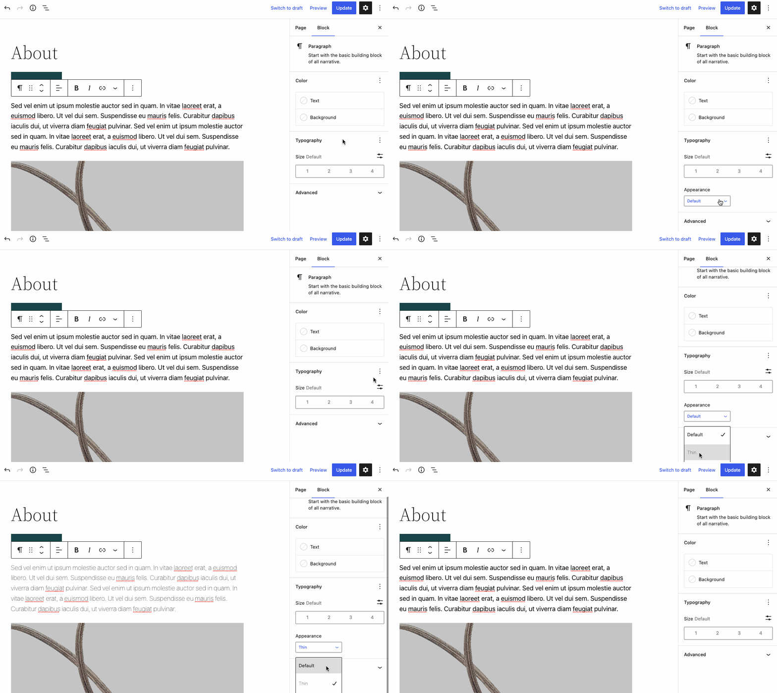
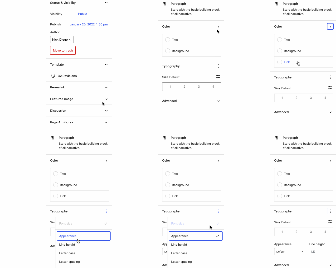
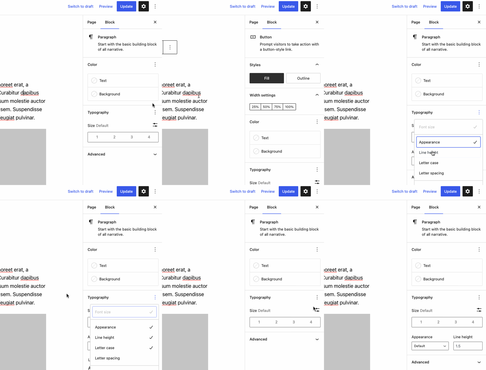
Nick and I did some more investigation. WP 6.0 and GB 13.3.0 have different behavior. GB has the reported behavior. WP 6.0 dismisses the popover menu immediately when an option is clicked. This makes it possible to edit the setting immediately, but requires me to go back in to the menu to enable other related settings. Example: Typography has two hidden options by default. |
|
To follow up on this, after some testing there are some interesting UX issues that could be improved in future releases and warrant discussion. Enabling a setting is not "remembered" unless the setting is setUsing the example of the Typography panel, if I add "Appearance" to a Paragraph block, and then click off of the block, the "Appearance" setting is no longer applied when I select the block again. The reason is that no value has been set for "Appearance", so the setting is hidden. However, it's a bit disorienting. I added the setting to the block, I feel it would make more sense if it did not disappear unless it was explicitly disabled. Current setup using 6.0 and Gutenberg 13.3 Block settings popover menu is tricky to useWe currently have two different behaviors, one in 6.0 and another in Gutenberg. In 6.0, when you enable a setting in the popover menu, the menu immediately closes and the setting is appended to the corresponding settings panel. This is fine but gets a bit annoying when you want to enable/disable/reset many settings at once as it requires you to keep opening the menu for each setting. Current setup using 6.0 In Gutenberg, the menu remains open after a setting is enabled/disabled/reset. While this solves the issue in 6.0, it introduces another. In order to close the menu, the user has to click on the menu icon or click anywhere outside of the popover. The issue, as Brandon mentioned, is that if you click anywhere other than the settings sidebar, the current block loses focus. You have to then click back into the block to access the settings. If you had been adding settings, you run into the issue noted above. Current setup using 6.0 and Gutenberg 13.3 I think improving this UI would be a great goal for future versions of Gutenberg and 6.1. There are a lot of nuances here, and I am not sure what ultimately would be the best solution. |
|
cc @aaronrobertshaw @apeatling in terms of the above feedback! Updated the title to better match the feature being discussed as well for discoverability. |
Making this happen would be pretty huge. It is also consistent with general user feedback I've heard. As someone who spent over the last two years writing daily in the editor, the settings dropdown was one of my favorite features because it meant some settings that I rarely used were tucked away neatly. However, it also meant that settings I often used became a bit of an annoyance to access. It was a bit of a double-edged sword. For almost every post I've written since this was introduced, I've had to go through a two-step process to access one or two settings (click to enable + customize setting). It was one of those inconveniences that I just learned to live with. |
|
👍 Thanks for raising this issue @bdurette it's definitely a problem that needs some attention. Also, I appreciate the effort to think of possible remedies, the more ideas the better as I fear improving the UX here is trickier than anticipated. It might be easiest if I start by noting a few thoughts on the possible solutions proposed so far and provide a little extra history and context. Proposed Solutions
There has already been an exploration into remembering controls that have been toggled on for display per block type (#39561). That approach was decided against as it undermined some of the ongoing design goals for the sidebar (see Joen's comment on this). Essentially, doing this per block type meant excessive controls within the sidebar and it's a problem that is growing along with our design tooling. It should also be noted that this decision occurred before the change was made in #40716 to keep the panel menu open which absolutely makes the problem raised in this issue worse.
At first glance the simplicity of this option is appealing however I'm not 100% sold on the idea. I think this might just create a different annoyance. To me, having to click twice to select something else would also be unexpected, particularly given the non modal-like appearance for the menu.
If the menu popover was to be positioned above the ellipsis button this could be done though some may find it odd positioning. On different viewports etc that menu popover positioning might be automatically updated to ensure the menu stays within the viewport so that could also limit what we can achieve with this approach.
One of the design goals the I do like the simplification of the UX here if we can find something that would work for resets without reintroducing reset buttons for lots of controls. If we kept a menu for the reset functionality only then we still effectively have the same issue unless it can be closed on reset selection. Perhaps that would be ok if we can restore the focus to the field that was cleared? A dedicated reset menu, with a more obvious icon, might improve its discoverability as well. Other Thoughts
I believe the difference is due to #40716 only landing in Gutenberg 13.2 while WP 6.0 encapsulates up to Gutenberg 13.0.
The reasoning here was that the goal of the ToolsPanel was to reduce the proliferation of controls in the sidebar. To maximise the sidebar real estate and simplify the UI. Joen refers to this when asking to hold off on attempting to store ToolsPanel state for each block type. An alternate use case is that a user is exploring the controls and doesn't really want the displayed control to be "remembered". It's also possible that the user is only modifying that value for that specific block and it shouldn't be shown for all blocks of that type.
I agree that the UX certainly needs improving. Finding options that don't create different issues or undermine other design goals for the sidebar has been tricky. My personal preference was for the original behaviour where the menu closed immediately upon selection. My reasoning for this is that the idea was for each block to have its most needed controls displayed by default, only in exceptional cases is the user needing to toggle on display of a non-default control. If we curate the default controls well, the occurrence of needing to toggle on multiple controls should be rare. The change in #40716 to keep the menu open was to solve an issue with change of focus. Perhaps we can address that in a different manner?
While the larger issues are being addressed, the lowest hanging fruit might be to adjust which controls are displayed by default. We can tailor the default controls per block type as well based on their requirements. @justintadlock Is there a consistent pattern to which controls you regularly needed to toggle on display of? Where to from here?
Obviously, I'm open to any other ideas or solutions people might have up their sleeves. |
|
Thanks for the detailed response @aaronrobertshaw! As your response makes clear, design is a series of tradeoffs. Not being a designer myself, I do look to prior art for inspiration and in one case my idea was inspired by observing what my natural behavior was. My suggestion (2) was specifically based on what my natural subconscious behavior expected to happen. In fact, that's what was so natural that I went through it multiple times, before realizing that it wasn't going to work. Because that was my natural expectation, surely there must be other applications that have engrained this behavior in me. I went looking for prior art. Here are some examples I found:
I honestly think this behavior is so common and so natural that the annoyance that you anticipate is non-existent. Worth doing some testing with users, I would think. I think that trying to find the default controls that work best is a worthy goal, but I suspect different users will use different controls (See also: the joke about MS Word being bloatware because nobody uses more than 20% of the features, but everyone uses a different 20%) and it will be context dependent. Theme designers will need a different control set than end users, for example. I don't think I understand the objection to the option (4) regarding the reset buttons. My thinking is that each section have its own mode. You could leave the reset buttons inside the "full" menu, so they would only be displayed if the user chose to leave the extended menu open. An alternative formulation that may make this idea clearer is to put the controls for the hidden options directly into the popup. If we're committed to the idea that the defaults should be the only ones shown by default (i.e., the user shouldn't be able to control/pin what controls are shown), then every time the user opens that menu, their intent is to change some setting. Having to first enable the control so I can then change it is a lot of extra work. I have to visually scan and find the setting I want twice. |
|
I appreciate the clarification and additional thoughts @bdurette 👍
I did have a look around within the editor and I couldn't find another instance where a simple popover menu needed a click to dismiss first. I do acknowledge that some menus in some applications function as you describe. Making this one menu function differently sounds like with some creative thinking we can keep that consistent with our other editor menus despite its requirements and use case differing a bit. There's nothing stopping us putting a PR together to explore this option.
Agreed. I'd reiterate that the curation of the default controls wouldn't always be a perfect fit for everyone. It's to get them to meet the majority of the use cases for the majority of users to make the need to use the menu at all infrequent. It has come up in discussions that a future iteration of ToolsPanel would allow for users to configure their preferred default controls per block type within Global Styles. There's a way to go before we can get to that however.
I'm sorry I'm not following, which "full" menu? Option 4 begins with "Ditch the popover menu altogether".
I don't believe this, as described, will end in a great result when we consider large numbers of secondary color controls, more complex controls such as the
I agree it's not ideal though I'm not sure I'd call it a lot of extra work. Reducing the number of clicks required to perform any task here and reducing friction is worthwhile though, so I'm not trying to block us from improving the situation. It's important however to try and keep a balanced view of the trade-offs to help us all decide on a path forward. |
Removing the panel menuIn the spirit of exploring ideas, I've experimented a little with completely removing the The UI is only a very rough approximation of a design but I think it illustrates well enough that such an approach still has a lot of its own problems and is a bit clunky. Hopefully, it might spur some new ideas or help us decide on a direction. Screen.Recording.2022-06-02.at.5.23.56.pm.mp4Moving menu popover off the sidebar a.k.a. Option 3There could be something here, relocating the menu off the sidebar and repositioning the button. It will require further tweaks and thought but could be the start of something to alleviate the main issue while the overall UX is continued to be looked at. Screen.Recording.2022-06-03.at.12.46.41.pm.mp4An experimental PR for the above relocation of the menu can be found in #41523. |
|
Thanks for all the comments and discussion so far. I've had a good look at this issue and experimented with the menus across Gutenberg. I've also looked at what happens in other tools like Gmail and Figma for reference. For clarity it seems three problems need to be addressed:
I think each of these are related but different problems that could addressed separately in order to iterate the ToolsPanel UX to something better. I've opened issues for each of the three of them, and I'll follow up and post thoughts on each. We should continue to discuss solutions for each one there. I'm going to close this one out so we can focus the conversation around each different issue. I've referenced this issue in each of them. |


What problem does this address?
I'm frustrated when I use the three-dot menu to add settings options to the block settings sidebar, but that's not a persistent preference. This is made worse by the popup menu occluding the options that I want to set. To make the menu go away, I'm used to clicking away from the menu itself, but unless I click on the sidebar or exactly on the element that I'm modifying, the sidebar changes to the element that I clicked on and the menu reverts back to default behavior when I get back to the element I'm trying to modify.
The first time this happened, I went around this loop 4 times before I figured out what click targets were acceptable to not have it lose my preference change.
A quick screen video, in case this isn't clear:
BlockSettings.mov
What is your proposed solution?
Some options:
The text was updated successfully, but these errors were encountered: