Skip to content
New issue

Have a question about this project? Sign up for a free GitHub account to open an issue and contact its maintainers and the community.

By clicking “Sign up for GitHub”, you agree to our terms of service and privacy statement. We’ll occasionally send you account related emails.

Already on GitHub? Sign in to your account

ToolsPanel: The ToolsPanel menu gets in the way of seeing what selected options look like #41545

Open
apeatling opened this issue Jun 3, 2022 · 5 comments
Assignees
Labels
[Feature] Design Tools Tools that impact the appearance of blocks both to expand the number of tools and improve the experi Needs Design Feedback Needs general design feedback. [Type] Enhancement A suggestion for improvement.
Comments

@apeatling
Copy link
Contributor

apeatling commented Jun 3, 2022

Prior: #41376

Description

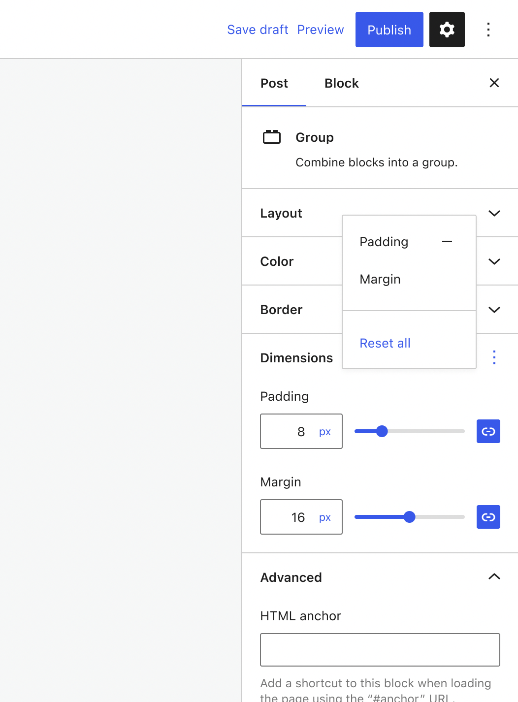
When using the ToolsPanel to select different design tool options, the ToolsPanel menu obscures the content behind. This means you can't select a design tool and get an idea of what it actually does without closing the menu first.

2022-06-03 10 12 17

@apeatling apeatling added [Type] Enhancement A suggestion for improvement. [Feature] Design Tools Tools that impact the appearance of blocks both to expand the number of tools and improve the experi labels Jun 3, 2022
@apeatling
Copy link
Contributor Author

apeatling commented Jun 3, 2022

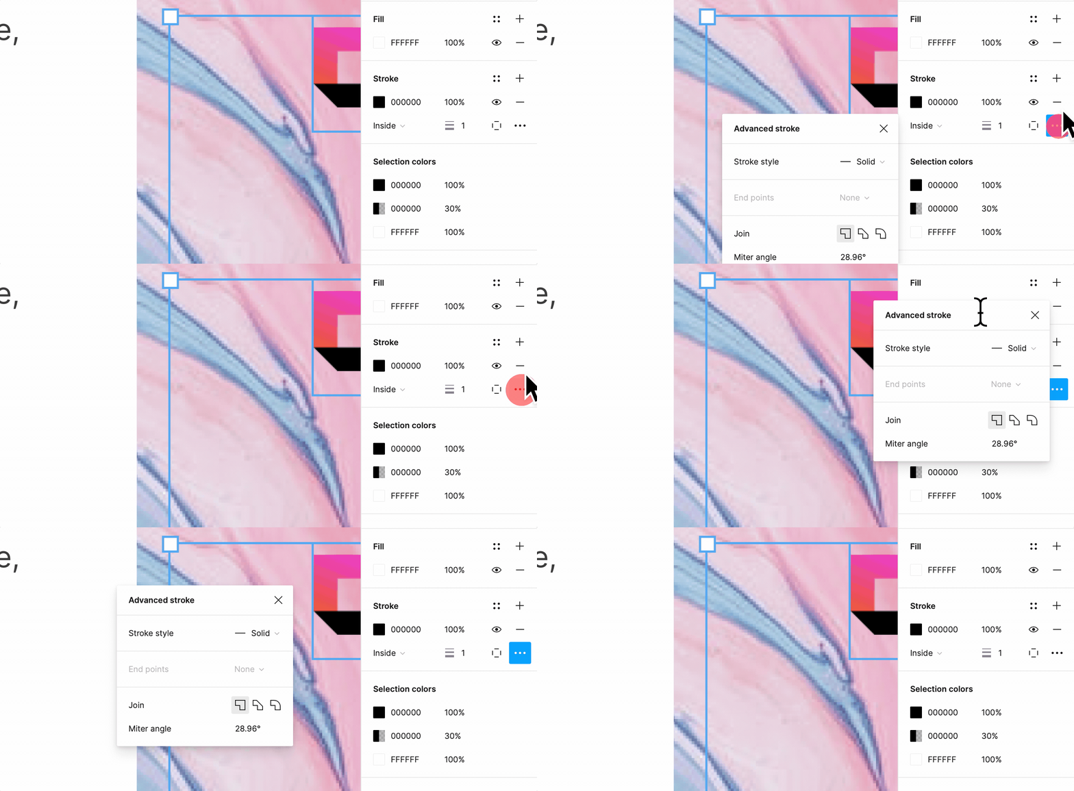
Using Figma as a reference, their equivalent menus are position initially to the side. We already have prior art there in the form of the color selection controls.

Figma also allows you to drag around the menu and position it wherever you'd like. I think this is interesting, but an obvious first iteration would be to move it to the side.

My one concern there is the disconnect from the button you've clicked. It feels less like a menu, perhaps the reason Figma treats it more like a draggable popup box with a close button. We should discuss if this is an issue for Gutenberg.

2022-06-03 10 30 55

@apeatling apeatling added the Needs Design Feedback Needs general design feedback. label Jun 3, 2022
@fotisps
Copy link

fotisps commented Jun 6, 2022

In our case, most of the fix menus are on the sidebar so using figma as a paradigm, I think it's not the best solution. I would just add a close text and icon as a button in order to close the window, in case the user needs to see all the options that are available after making his/her choice.

@jameskoster
Copy link
Contributor

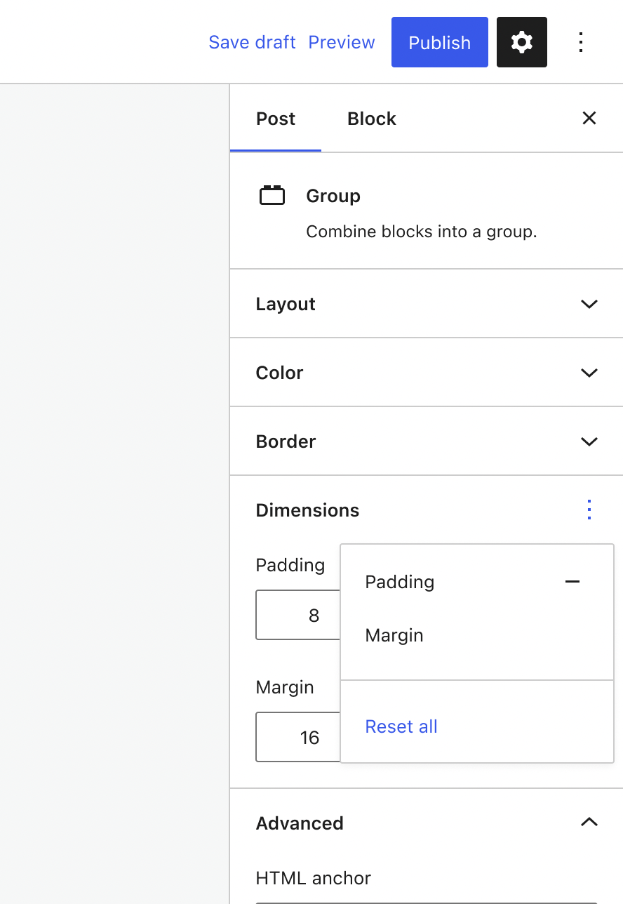
As an interim, perhaps we could reduce the menu width, and open it from the bottom-left of the ellipsis?

Before After
Screenshot 2022-06-08 at 14 17 07 Screenshot 2022-06-08 at 14 17 16

I appreciate it won't always be possible to do this, but I believe we could make these changes with relative ease, and that they would improve the quality of life while we work on a more holistic solution.

@mtias
Copy link
Member

mtias commented Jun 25, 2022

Can we just self close it? We have many menus that perform actions and self close.

@apeatling
Copy link
Contributor Author

Finding out more via #41546 (comment)

Sign up for free to join this conversation on GitHub. Already have an account? Sign in to comment
Labels
[Feature] Design Tools Tools that impact the appearance of blocks both to expand the number of tools and improve the experi Needs Design Feedback Needs general design feedback. [Type] Enhancement A suggestion for improvement.
4 participants