-
Notifications
You must be signed in to change notification settings - Fork 4.1k
New issue
Have a question about this project? Sign up for a free GitHub account to open an issue and contact its maintainers and the community.
By clicking “Sign up for GitHub”, you agree to our terms of service and privacy statement. We’ll occasionally send you account related emails.
Already on GitHub? Sign in to your account
Accessibility regression: The selected block isn't outlined any longer #23892
Comments
|
I'd like to note that in #10559 and also previously, it was mentioned that if users want a lighter UI, there's "Spotlight mode" for that. The default mode shouldn't compromise accessibility over "clean user interface" (whatever that means). I'd also like to note that changing, I would say unilaterally changing, important features that were already agreed upon doesn't encourage collaboration and trust across teams. |
|
+1; I've been meaning to report this. 5.5 is the first version of WordPress (relying on the Gutenberg built into the core version), that the outline does not appear. This regression first appeared in one of the previous releases of Gutenberg (as a plugin) although I can't remember immediately which one. |
|
I'm not sure why this is labelled regression. The initial decision of having sharp borders was because the concept of blocks was novel, thus we needed something to make it sharper and more clear as million of users were to be onboarded on a paradigm shift. It wasn't for accessibility reasons. The counter example is simple here: no text editor highlight the paragraph. The cursor is enough to know where the user is, and if a paragraph-level selection is necessary, one selects the paragraph. The current approach already provides more than that, by showing block-level guidance and selectors as needed, as well as (if one uses that mode) the toolbar right above the block. Plus there's hover status, focus status, select mode, and multi-select, all which correctly highlight the block as they operate at block level. There's no need of further indicators for the interface to be functional, and I find misleading to categorize this as an "accessibility" problem when it's mostly an opinion. As far as opinion go, I got first-hand a lot of feedback on how much admin debris (as Tufte refers to) the Gutenberg interface is having, thus we need to scale that down. Plus, I'm being puzzled because you keep mentioning "a consensus was reached" when reading these threads that's clearly not the case, and if anything, people already replied over and over on why this "issue" you keep raising isn't an issue. — I also just realized from your links above that you're the reason why Top Toolbar had a regression and the block outlines was reintroduced there. Top Toolbar was a mode specifically designed for people focused on writing, and now it regressed again to show borders around, thus breaking from the goal it was designed for. This is, more properly, a regression. |
For me the cursor has never been enough to know where I am on the page. Have you ever had to move your cursor, just to find out where it is? I have to do that more times a day that I can count and the border made it very easy for me to narrow down my current placement. |
|
Do you have the same issue on all text editors? |
I do and if they all had good indicators of focus on the current element that would be better for me. Sadly not all editors do and many of those are not very good for me to use :( |
|
I understand. What could be options that for you would work? I'm not sure if adding a border around a block would be the direct answer there. For example, if it's a long paragraph, you'd still have that same kind of issue right? So maybe we can review if there are other ways to approach that. Starting with the problem is always very helpful to explore than potential solutions. :) |
|
I do have a similar issue with very long blocks like you thought I might. I don't really know what a better solution for it is. The border is the best one I found so far. Happy to be a tester though if we can figure out other solutions to try. It is hard to know what is better without trying it out but testing various different things takes a lot of dev and testing time. There isn't really an ideal solution I can think of off the top of my head 🤔 |
Is this indicating that the borders are no longer necessary because this is no longer a novel concept?
I think the difference is that Gutenberg is always in a block-level control context. In Pages for instance, if you make a change in the "Format" dialog while the cursor is in a paragraph, the change happens to the word underneath your cursor. In Google Docs, the change only applies to the cursor for any new values typed. |
Novelty doesn't have to do anything with it. It's about maturity of an application. We over-emphasize things on purpose at the beginning, to facilitate onboarding.
Yet, this is also the case for some controls, right? So probably a better way to frame this is to think in terms of toolbar actions, and highlight differently if the toolbar action (hover or focus, for accessibility reasons) would act on the cursor, or would act on the block as a whole. This would be beneficial because it would also avoid the scenario where both the block and the cursors are visible, so it's not obvious on which of the two the action is going to trigger. |
|
It’s appropriate to note that this was openly iterated upon since Nov 2019, with subsequent improvements. Any interface is susceptible to evolve as they grow in complexity.
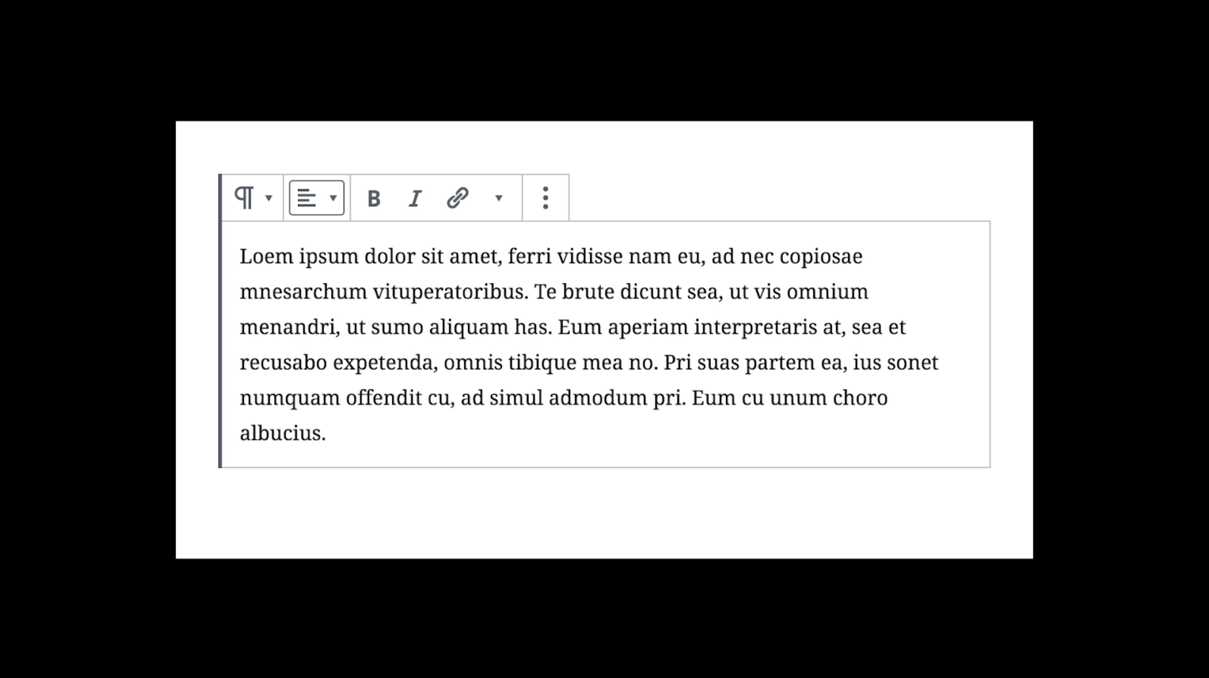
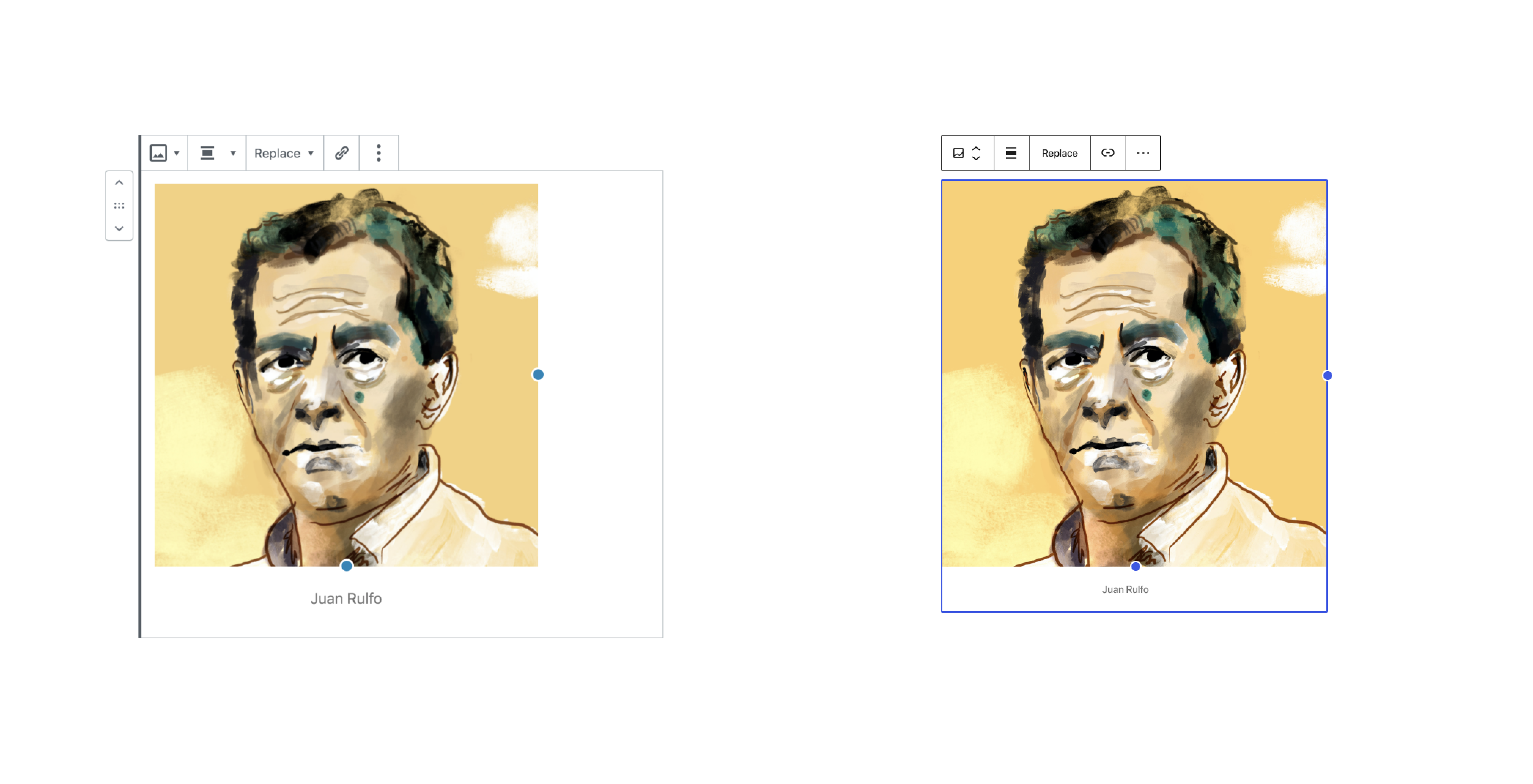
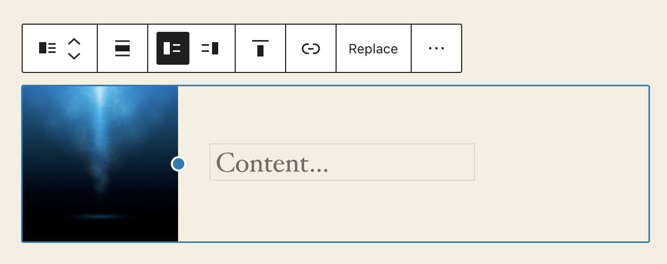
In the screenshot shared, it seems clear that the word “labore” is selected and that is what’s currently editable, not the entire paragraph. Since its inception almost 3 years ago, it's been apparent that the block had an extensive use of borders, with paradoxically unclear focus. In this screenshot, focus is on the alignment button in the toolbar. It seemed relevant to revisit those block borders to emphasize focus, providing clarity as to what has functional focus and what doesn't. The updated design aims to show clear focus outlines when it is considered most relevant to the current task: the action of moving, transforming, dragging, etc, all highlight the block with an outline. It’s worth discussing if other actions should do so as well. For example, copying an entire block flashes the outline to indicate the whole block was copied as opposed to part of its content. The select tool (the same as pressing the Escape key) also brings the outline into focus. This is useful to indicate, for example, what happens if the user presses Delete. It’s an important distinction for paragraphs since pressing Backspace can delete text or remove the entire block depending on what is actually selected, so it’s necessary to not use a block outline spuriously without awareness of context. There’s more work to be done to further refine all the cases and ensure the block boundary is there when you need to see it. As everything, this is an iteration. Comparing the previous version also shows that focus is indeed clearer in most cases. In both these examples below, the image block itself has focus, which means if you press the Delete key, the block gets removed. There isn't a clear focus indication in the left image. Like the image, the spacer block benefits from focus indication and removal of borders. |
|
Thanks for that explanation, @pablohoneyhoney. 👍 Following that, I really like a suggestion that @folletto made in Slack the other day.
That being said, the Block Transform button and Movers, when hovered, show a block border indicating their actions will affect the entire block. I think this is a great start! However, there are other buttons in the toolbar that also affect the entire block, so iterations there may be helpful as well. |
|
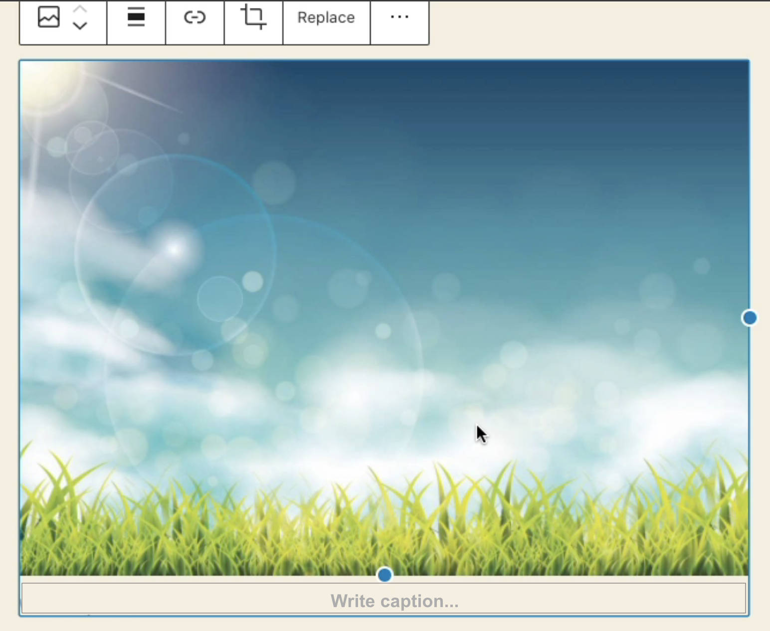
The addition of the blue border/outline interferes with resizing images by dragging the resize "handles". There is a thicker border on hover and while dragging which now overlays the new blue "box" border. Seems better to remove the old, thicker border. Another "visual bug" is that the placeholder text for the image caption is stuck to the new "box" on the left. |
Those huge threads are unwieldy and uninviting to those who are outside the group of decision makers. If you could use a more user focused method to announce questions and decisions that would be a huge improvement. As it stands I think only the current developer group participates in those type of discussion threads. |
|
It's a difficult balance to strike there. Broad, architectural decisions tend to go long. Do you have suggestions on how we can try to make these more approachable? |
|
One way to reach a wider developer group would be posts on the make blog. I would see announcements and calls for thoughts on open questions there. It doesn't reach you a vastly wide group of end users sadly but it does reach more people overall. The stakeholders here are end users but informed opinions could still be provided by a wider developer group if they were posted on the core side. That is the place the software ultimately lives after development concludes. |
|
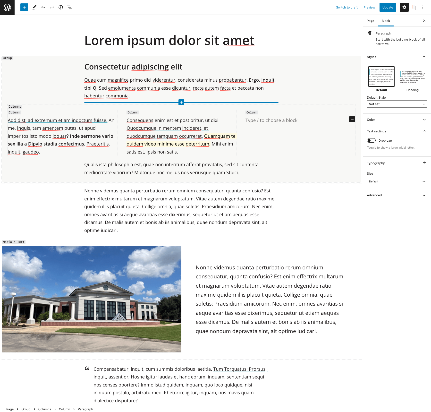
This outline is particularly useful when interacting with complex nested blocks, such as columns, but even in the case of theoretically simpler blocks -such as groups- it helps making it clear that the currently selected block includes all the blocks included within the dotted line. A middle ground might be to only use it for “parent” blocks, and omit this line for those blocks with a clearly defined border (images, spacers…). |
|
Note that the "middle ground" you mention is already the interaction pattern we are working toward: the control highlights the specific part that is actually interacting with. Pablo explained it better above, but in short: if the action is text-level, it will just act on the text (no block highlight); if the action is block-level, the block is highlighted. So yes, parent block actions that act on the block as a whole should show all the block being marked. If it's not happening, that's something we can iterate on and fix! :) |
|
I noticed that after I added my comment, but I was not sure. Thank you so much for taking the time to clarify, @folletto :) |
|
To make a comparison to a standard textarea, you would be expected to have a focus state on the entire textarea that indicates that the textarea is selected. This is separate from a selection of the textarea's contents or a cursor; each of those represents something slightly different. The same should be true here, as well: there should be constant focus, showing which block is active and two variable selection/cursor indicators, showing the specific selection & the location of the cursor. Eliminating the constant of focus on the grounds that there is the ability to activate a function that shows what you will act on is very limiting to the user's context awareness & confidence. |
|
That's not a correct comparison however. Gutenberg is a full document editor, not a single textarea in a form. Why none of these tools, some of them with large accessibility work done on them, provide block-level highlight? I might be mistaken, but my explanation is this one: because when writing an article, the focus in writing text is on the whole article. People write, edit, cut paragraphs in half, merge them back, rewrite them, move them up and down, and so on. The paragraph in isolation is not the focus (even if I acknowledge it is for some). The document is. And Gutenberg for millions of people is still a text editor. Then again, I might be mistaken as said. This is one of the things that are very hard to assess as they are very strongly context dependent. The cursor is a marker, and selection is too, so it technically fulfills WCAG guidelines. Yet I don't want to make a "strict adherence" to the guidelines case here, otherwise the cursor is enough: different shape, sharp contrast, different color, even animated. We are also speaking here mostly of one type of block: text blocks. Nobody is arguing that other kinds of blocks, more complex, layout, and so on, shouldn't have a selection around them. Which is why we improved exactly this in the past few months, and now we have a text-level and a block-level way to deal with things. It fulfills this difference, and avoids the ambiguity of having both a cursor and a block selected, and not knowing what is going to be affected. Am I operating on the block? Am I operating on text? I think this ambiguity and confusion to be far more limiting to the user's context awareness & confidence. Anyhow, I get this won't convince everyone, so I think there are two ways forward:
I'm sure there might be other options — these are the ones that I've been reviewing more in detail. [Updated] I forgot to write option 3 lol. |
|
It's fine for you to conceive of Gutenberg as a single focusable document editor. However, regardless of the intent, the practical user interaction is as a series of discrete editable regions, and knowing the limits of the region you're in is valuable.
The border that indicates which block is focused does not have to be the same as the design that indicates what selection is being acted on; that's a nice feature that is useful whether the whole block has a focus state or not. It would be ideal for these two indicators to complement each other. I certainly agree that we should not use WCAG as the sole criteria to judge accessibility on; it is only the minimum acceptable level of accessibility. When you say "when writing an article, the focus in writing text is on the whole article" you're talking about focus in the sense of attention: what somebody is paying attention to or working on is the whole article. However, when we talk about focus from the accessibility sense, we are always referring to programmatic focus: where is the current active point of focus in the DOM. This is what we expect for focus to meet accessibility criteria. |
|
Just to add to what @joedolson and @afercia have said in this thread, however much designers or developers may view the entire Gutenberg interface as a single experience, and editing an article within that as a unified thing, assistive technology doesn't see things that way, and neither do most users. In the specific examples of Keynote ETC., assistive technology like VoiceOver interprets it in discrete pieces. Same with Microsoft Word on Windows, which gets its own document object model for screen readers like Jaws and magnifiers like Zoomtext Fusion to work with. Gutenberg is on the web, not a native app, so that means things like Active Accessibility and UI Automation on Windows and/or Apple's equivalent are not available for use by developers or designers. Given this, you have to use what's available, and in this case, that's making sure that the selected block has an outline so that users can tell what they're doing and where the boundaries ofr that block are. |
This seems something we can look into. Can you outline the differences in how VoiceOver deals with a full document, compared to what happens in Gutenberg? |
|
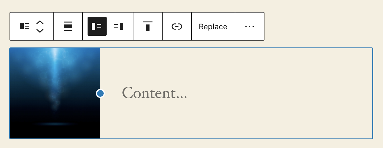
Giving animated examples of todays interactions with various blocks. Selecting and editing brainstorming Image Block.Selected. Placeholder: Write caption... --> Is on the left. Placeholder can be moved to the center (I made this centering Image Block caption issue: #24238 ). Suggestion: Adding an outline to the placeholder: "Write caption..." Caption is centered. If the user clicks into the area the mouse becomes a cursor. It is like so today but the border is invisible. Media & Text BlockSelected. Suggestion: Adding an outline to the placeholder "Content..." Quote BlockSelected. Suggestions: Paragraph BlockSelected -> Edit. The difficulty here is that select and edit are mixed into one. Writing some text and clicking the Paragraph Block, it automatically goes into edit mode. For instance clicking outside the hot zone areas for text in the Quote Block shows the outline of the block as seen above. One can not click outside (that I know of) the Paragraph or the Heading Block to select the blocks in this way. One can use the esc key and that will show an outline of the Paragraph/Heading Blocks, or hover over the block type. Clicking esc shows it like so: Hovering over the Block type shows the outline. Here is an example outline similar to how I showed the Quote Block. The problem... A suggestion for all blocks. |
I really don´t know. Your target is theme editor. Without clear block borders it would be chaos. I know you aim to make editor experience close to front-end experience but cannot understand why are you obsesed with some details and not the others. I mean it is somehow connected with your GIF example. No need to economize on some pixel here and there when on default it is white Sahara, and people don´t exeperience mouse scroll/finger drag as problem. Look at the block descriptions. Why you think borders/outlines would stand in our way and that we need those descriptions visible all the times after say 8 years. |
|
I think that the lengthy and impassioned discussion here has scared a lot of contributors away from this issue 🙂 How can we move this forward? Reading through the thread, I see no consensus about restoring the block outline which was intentionally removed. I see a few little spots of consensus about adding a "mode" which restores the block outline. Is this a direction the Editor team would like to explore? |
|
Removing this from the 5.6 board because we're in Beta phase now and it's not a bug fix. |
|
As was suggested by @drake1337 @StaggerLeee & @pattonwebz, I would also like to see block borders. I don't know/remember what it looked like before outlines were removed, as I have avoided the block editor until recent months. But having built 2 websites with it in the last month, the most frustrating thing for me when laying out blocks is working out where on the page I can click to select a block, and unselect a block. I've just been slapping this css into the sites I'm building, which in my opinion, makes working with blocks significantly easier, as I am not spending 1/2 of my time working out where to click. I can focus on laying out blocks. .wp-block {
outline: 1px dotted rgba(0, 0, 0, .25);
outline-offset: 5px;
}This gives you a UI that looks something along the lines of this: I'm aware that blocks are somewhat outlined in "select" mode, at least, when you hover over them. But this doesn't solve the issue for me. I don't want to constantly switch modes, and I don't want to keep hovering over elements until I work out which one I need. |
|
+1 for some sort of border/indicator too. I have many clients who regularly get lost in a sea of nested block when layouts are anything more than simple text. Columns and Groups are prominent culprits, hell I even struggle with them. On a side note, the upcoming Gravity Forms v2.5 beta with a Gutenberg based form editor implementation is lovely so far. There selection indictor for me largely solves the issue, granted they've not had to implement nesting, but they have a nice take on column control. Already feels like a better Gutenberg than Gutenberg! GF details for reference: https://www.gravityforms.com/gravity-forms-2-5-demo/ |
I would love if there was an option added for this ❤️ |
|
That would be a nice option however not until the profile storage is sorted out and moved to user_meta so they can be persistant and set as a defaults. It's bad enough still having to deal with the full screen default that Matt rammed through. |
|
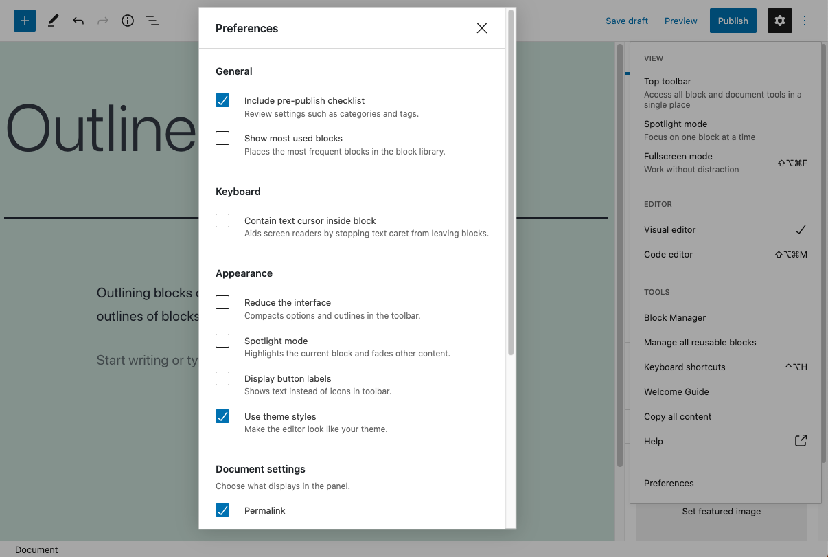
Preferences/Options is getting a nice UI update here: Perhaps Nik @ntsekouras could at a later time with some help from @jasmussen add a block outline into the options area as I mention here: #23892 (comment) |
|
I think this is a required 'quick win' to add some sort of outline for blocks in the editor as we currently using this on live sites and asking 'users' to deal with the mess of not knowing where to click to access blocks etc is a bit much. |
|
A new feature is included in Gutenberg plugin version 10. It will be released on Wednesday. Here is a video preview of hovering over Parent block. It shows an outline of the parent block. Outline-Gutenberg-plugin-10.mp4In regards to adding outline to preferences/options then I believe someone needs to create a new issue for it. |
|
From the #accessibility weekly bug-scrub: This issue began a conversation around how difficult it could be to see an inactive block which appears to be empty, either due to the text color matching the editor background color, due to content not existing, or some other scenario. Generally from an a11y perspective we want to ensure that interactive elements are easy to identify. I've taken a minute to put together a suggestion for adding block outlines as an answer to this problem in a low-impact way for the short-term until a more permanent, well thought-out design change can be implemented: 1- Add "Outline View" button to toolbar that toggles inactive state outlines: 2- Add inactive state outlines when "List View" is enabled: I think the second solution is probably less confusing for the end user in the short-term and easier to implement. It bundles the outlines into a view that already adds extra information, and doesn't pollute the edit post toolbar with extra information. |







Describe the bug
A selected block needs to be outlined to give users a clear indication of which block is being edited and what its boundaries are.
This was previously discussed at length. For example, in #10559 created by @Ryokuhi from the accessibility team for a similar problem with the "top toolbar" setting. In that issue a consensus was reached and it was agreed to make the selected blocks have an outline.
In WordPress 5.4 selected blocks do have a visible outline, which is actually made of:
Screenshot:
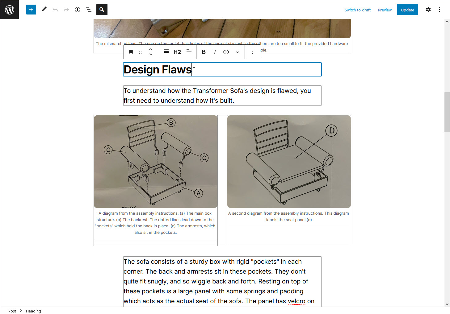
In WordPress 5.5 the "outline" is gone. Screenshot:
Looking at the screenshot above, it's pretty evident that as a user:
The text was updated successfully, but these errors were encountered: