#54489 closed task (blessed) (fixed)
Update the Dashboard welcome banner for 5.9
| Reported by: |
|
Owned by: |
|
|---|---|---|---|
| Milestone: | 5.9 | Priority: | normal |
| Severity: | normal | Version: | |
| Component: | General | Keywords: | has-patch has-copy-review commit dev-reviewed |
| Focuses: | css, administration | Cc: |
Description
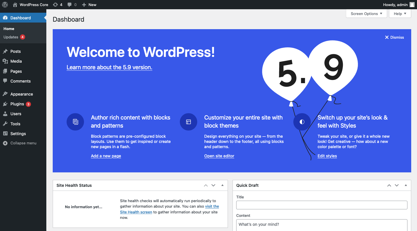
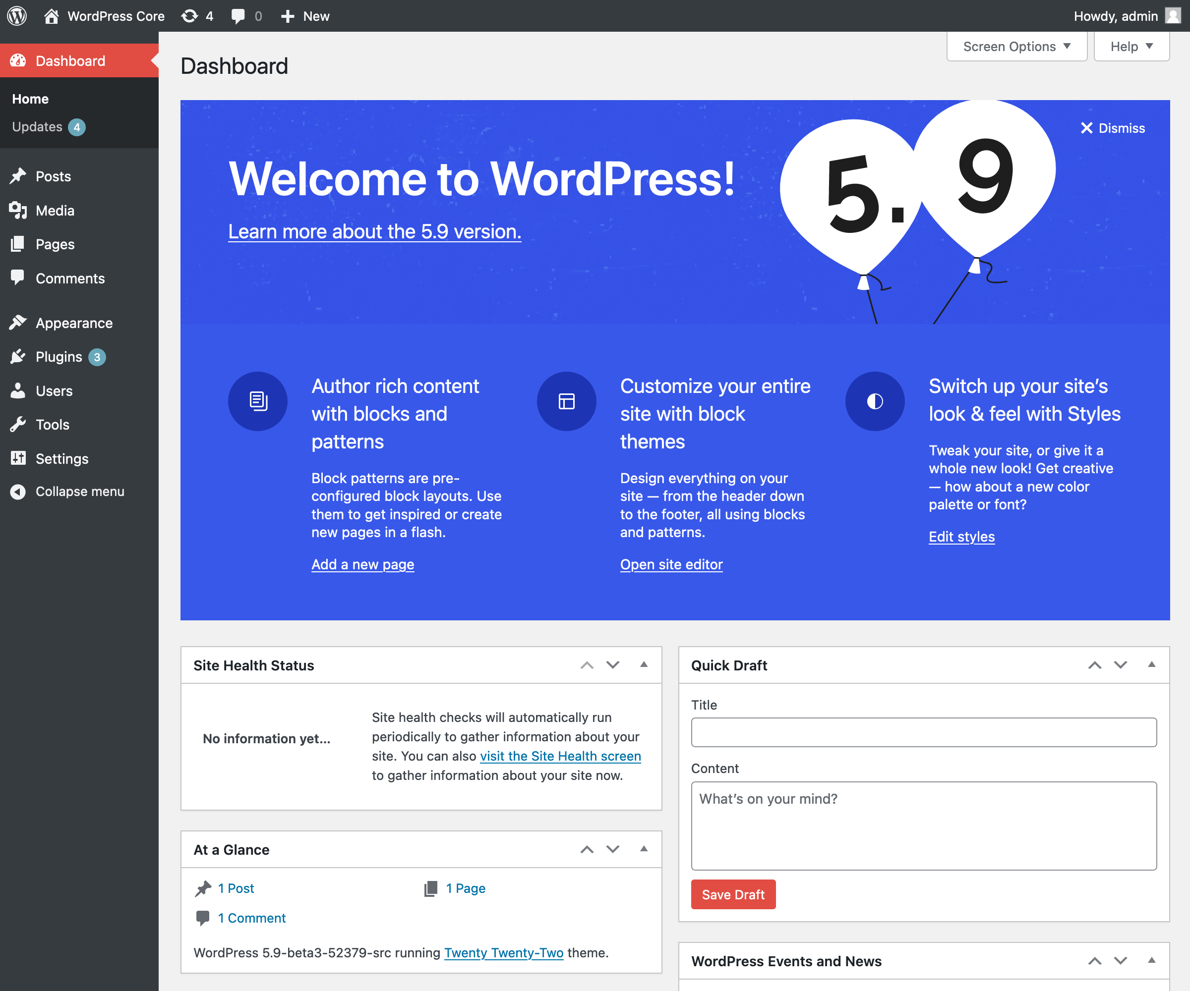
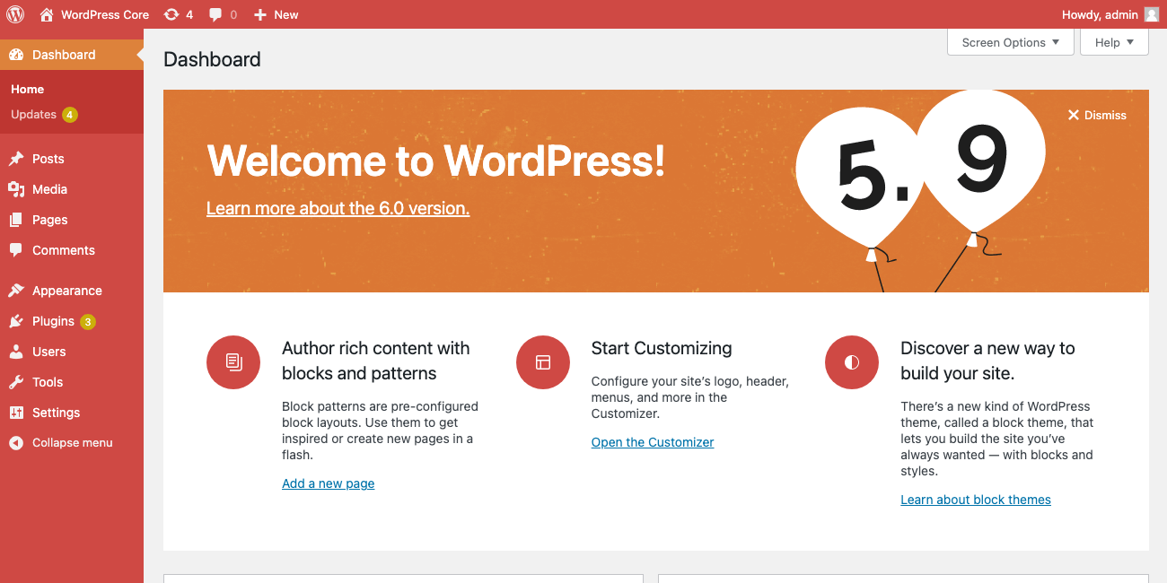
As noted by Matias in https://github.com/WordPress/gutenberg/issues/36578 the release of 5.9 feels like a good moment to revise the welcome banner on the Dashboard so that it introduces concepts like blocks, patterns, styles, and the site editor.
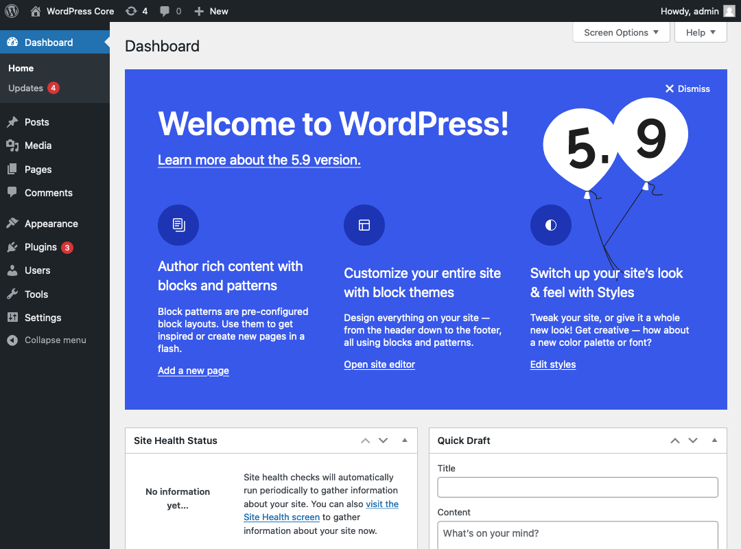
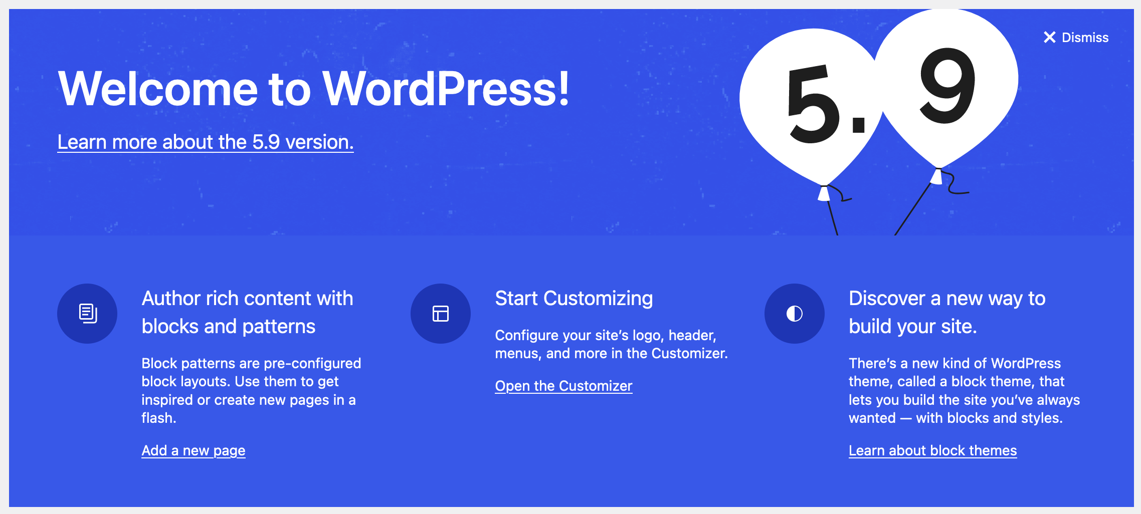
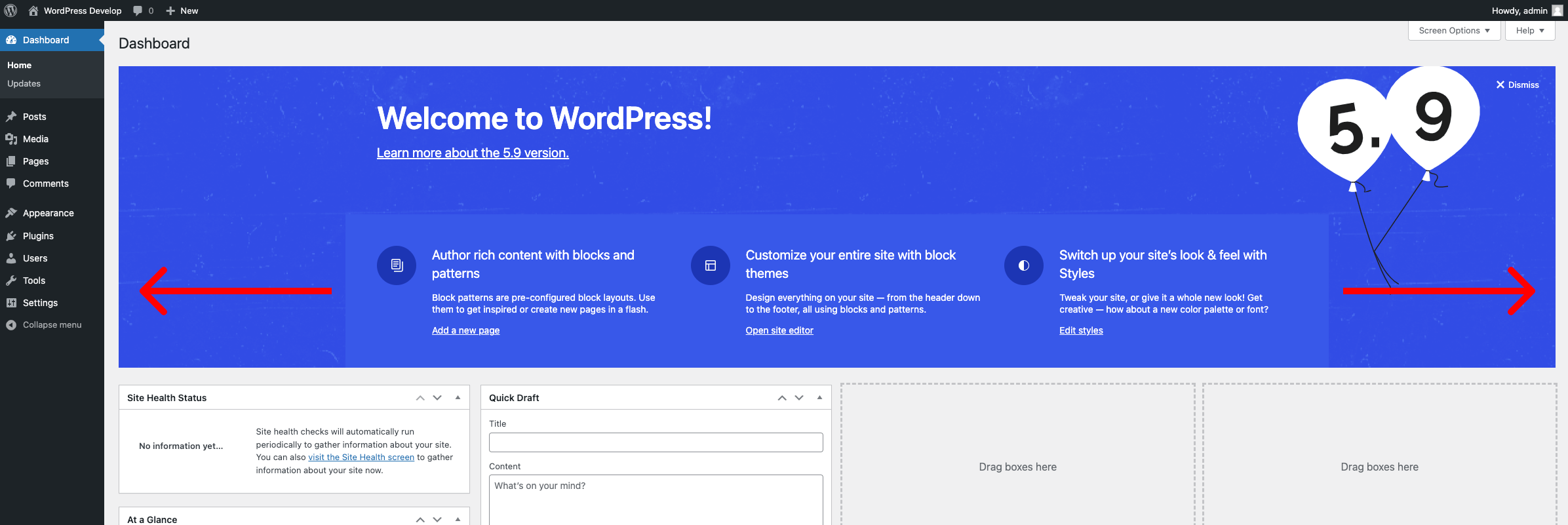
I'm attaching a couple of designs – not as proposals – but as conversation starters. One is inspired by the design language in recent release's About pages, and the other takes cues from the welcome guides in Gutenberg. For the "Add an about page" link I figured it might be neat to send folks to an editor instance with a nice "About page" pattern pre-loaded so that they just need to 'fill in the blanks'.
All that said, I think pretty much everything is fair game here, so hopefully y'all have some ideas to share as well.
Attachments (4)
Change History (93)
#1
 @
@
3 years ago
- Focuses administration added
- Milestone changed from Awaiting Review to 5.9
Thanks for opening this, @jameskoster! Moving to the 5.9 milestone for visibility.

This ticket was mentioned in Slack in #design by jameskoster. View the logs.
3 years ago
#4
follow-up:
↓ 11
 @
@
3 years ago
- Keywords needs-design-feedback needs-copy-review added
Thanks @jameskoster!
Personally I like the first design as the CTAs are clearer and we won't have to update it every release when the about page design language changes.
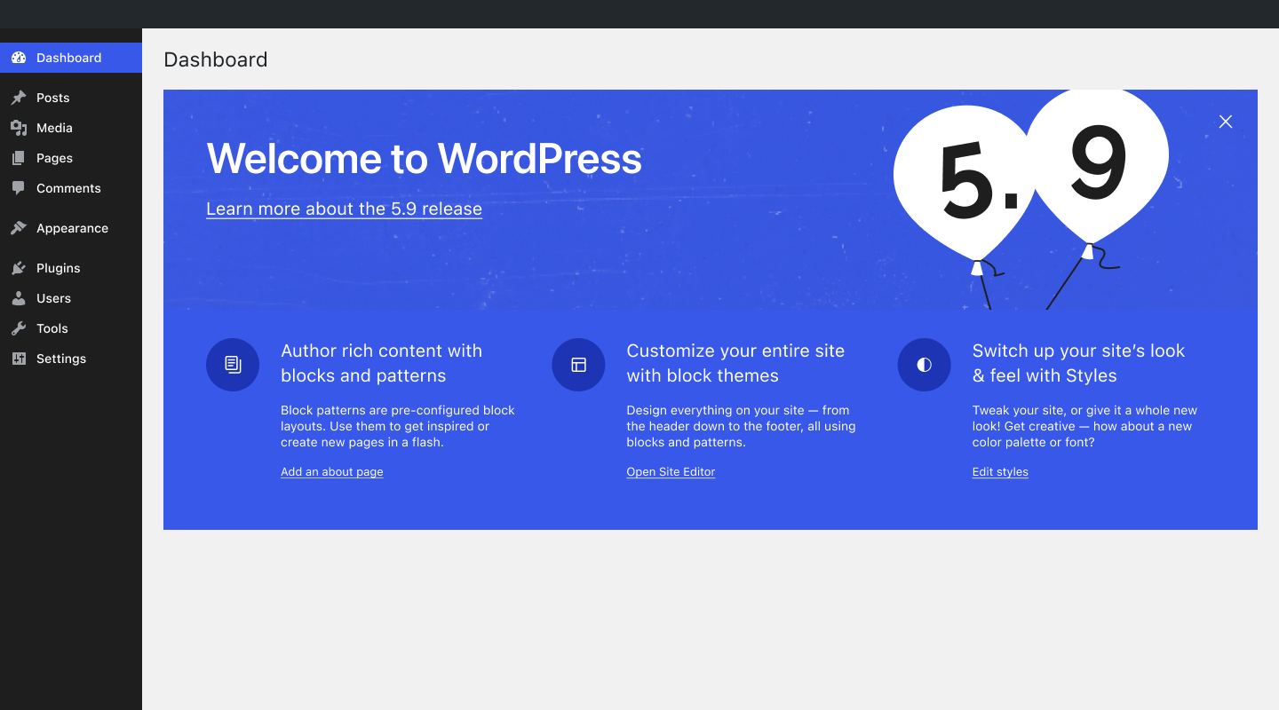
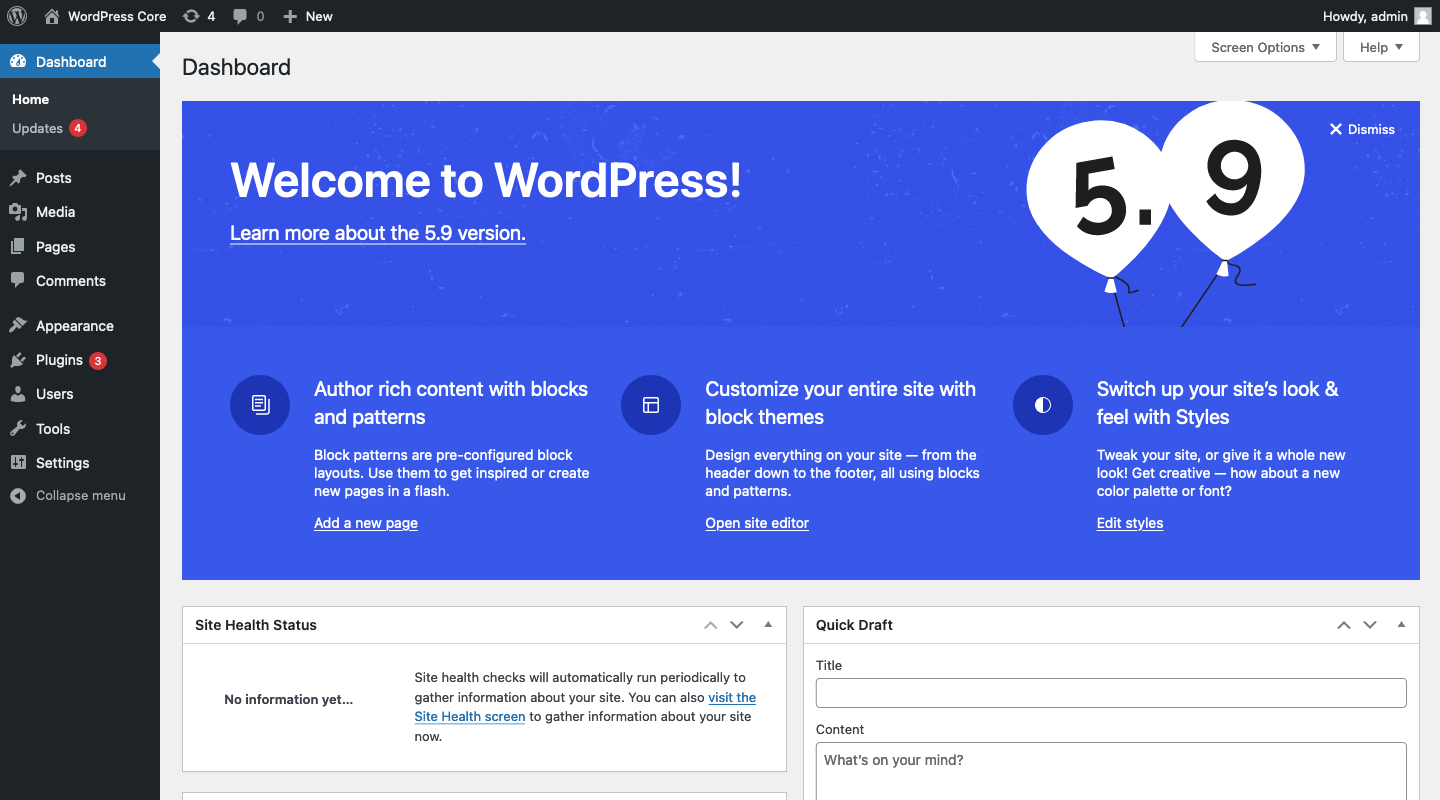
The buttons in your mockup use the Gutenberg design language (white background). This might look a bit weird on the Dashboard where every other button uses the older WP Admin design language (grey background).

This ticket was mentioned in Slack in #design by noisysocks. View the logs.
3 years ago
#7
 @
@
3 years ago
Nice! I personally prefer the second approach that utilizes the “jazzy” look because it's more harmonous with the style of the About page and is a nice tie-in with the jazz-themed release names.
FYI I’m helping with the design for the About page for WP 5.9 and am working on creating updated header artwork to give the page a fresh look for the new release. If we do go with direction 2, I would be happy to help create or share updated assets next week as the design gets more underway.
we won't have to update it every release when the about page design language changes
@noisysocks This is defintely something to keep in mind — if we go with direction 2, hopefully we could design it in a templated way to make future updates as simple as possible. But I would also be onboard with a less stylized direction like the first approach if others think that's the best path forward.
#8
 @
@
3 years ago
I do think it’s about time for an update also so this is great. I like the first version’s calls for action, but they are very hidden with so many and the dashboard seems so lost closed like that by default. I wonder if that is a step too far in this version also and doesn’t solve the need for a deeper redesign?
I would lean probably to the second for the styling as it reflects a theme across the site and has a stronger cohesive feel. I also am very unsure about bringing in the different buttons that don’t work so well yet outside the editor in version one.
I actually don’t mind it changing a bit header wise each release but that’s a decision to take and work to keep up if we do it.
#9
 @
@
3 years ago
the dashboard seems so lost closed like that by default
Ah, I'm not suggesting we do that. I left them closed in order to focus on the welcome banner, and frankly because I was too lazy to recreate every single Dashboard widget in Figma 🙊
#10
 @
@
3 years ago
Personally, I like the layout of the second option. I do like the design, but I do have one question/flag to raise about that.
Above it says that the banner was inspired by the about page. However, the About page design currently changes every release. I know there are some discussions to standardize this more, and potentially pivot how the About page is used with major updates happening automatically by default for all new installs. If we choose to go ahead with the second design, does this mean that this has to be redesigned/styled every release? That seems like something we don't want to maintain.
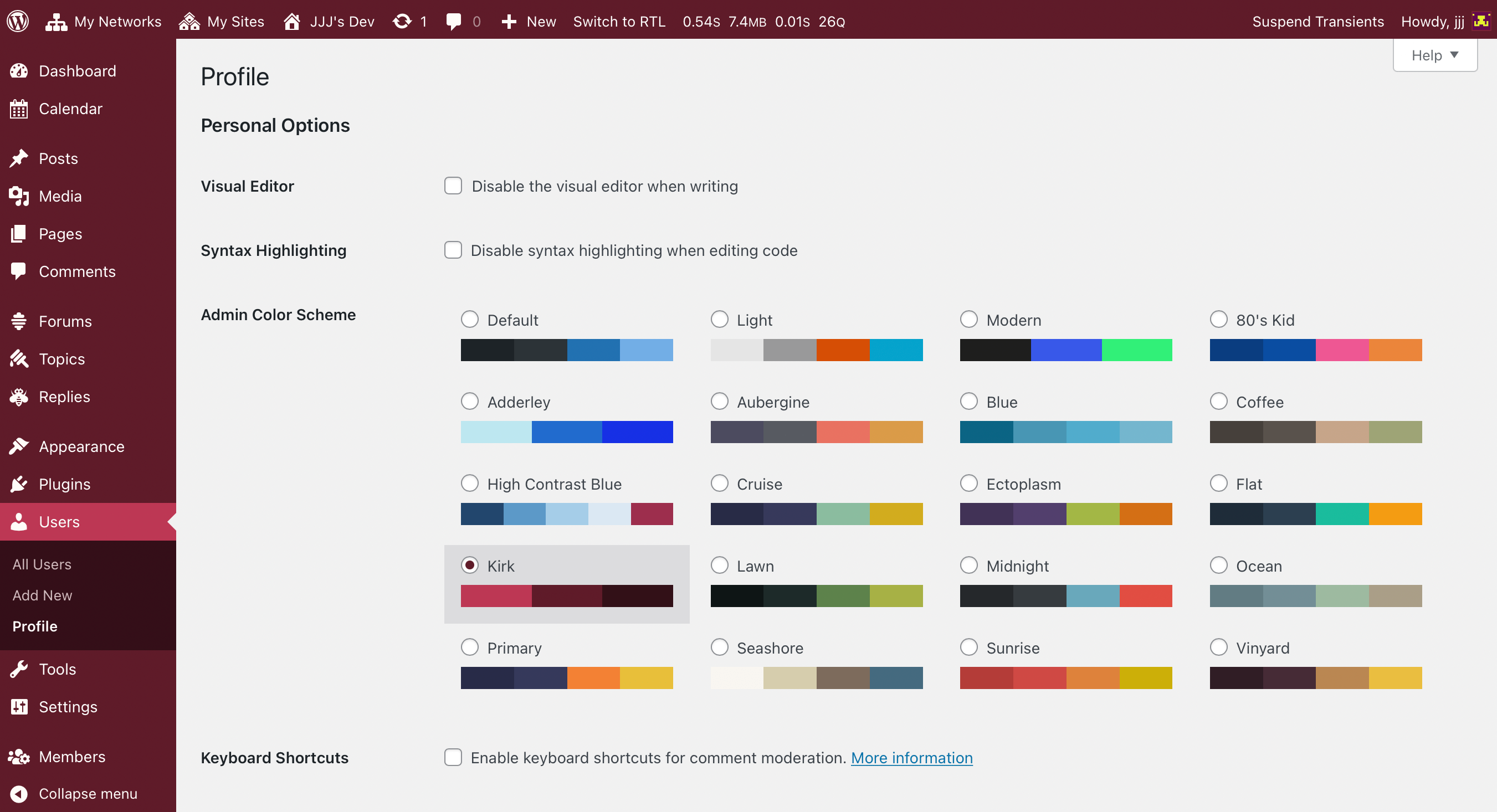
Also, the highlighted admin menu item is the same color scheme as the banner. However, the About page's color scheme is always independent of the admin color scheme that the current user has selected. I recommend leaving the menu styles as is for this.
#11
in reply to:
↑ 4
 @
@
3 years ago
Replying to noisysocks:
Personally I like the first design as the CTAs are clearer and we won't have to update it every release when the about page design language changes.
Whoops! I missed that this was discussed out above.
I think I'd be more likely to support the design if we could come up with an easy way for the styles to be shared in both locations. The About page takes quite a bit of time each release as it is.
#12
 @
@
3 years ago
- Type changed from defect (bug) to task (blessed)
Switching this one to a blessed task as it goes along with the About page. It's new classification lets it continue on in the beta cycle to give it time for design feedback and implementation.

This ticket was mentioned in Slack in #core-editor by noisysocks. View the logs.
3 years ago
#14
 @
@
3 years ago
Hi @jameskoster
The second design looks good, it gives jazzy look. But in second design instead of giving option for "add an about page", i think we should give option for add an post or page just like first design, Because if user is not familiar with gutenberg blocks and patterns then user can easily create some draft page and can use some blocks and gets familiar. So I think this is a good way for design and UI.
Thank you.
#15
 @
@
3 years ago
My thinking with the specific "add an about page" link is that it allows us to introduce block patterns. So when you click that link you'd be taken to the editor with an "About page" block pattern pre-inserted. I agree this doesn't make much sense for established sites though.
Perhaps we can check the fresh_site flag, and only display the "add an about page" link when the site is fresh, and otherwise display a generic "Add a new post" link.
Edit: Then again, perhaps a better approach would be a dedicated pattern introduction flow in the editor itself. That would probably be more flexible (maybe the user wants to create a contact page first).

This ticket was mentioned in Slack in #accessibility by shaunandrews. View the logs.
3 years ago

This ticket was mentioned in Slack in #core by critterverse. View the logs.
3 years ago

This ticket was mentioned in Slack in #core-editor by noisysocks. View the logs.
3 years ago

This ticket was mentioned in PR #2030 on WordPress/wordpress-develop by ryelle.
3 years ago
#19
- Keywords has-patch added
First pass at the new dashboard Welcome panel content.
Trac ticket: https://core.trac.wordpress.org/ticket/54489
#20
 @
@
3 years ago
Added a PR for the first pass of this new content: #2030
I have a few questions from pulling this together. What should the site editor section (second) say/link to if you're not using a block-based theme? In the PR now it falls back to the customizer.
What is the link destination for the Styles section (last)? What should this say/link to if the current theme is not a block theme?
Do we expect the copy in the panel to change with each release now, or is this longer-lasting content (like it's been)? If longer-lasting, we might want to remove the "new" from the copy.
Also, the @deprecated comments are just an idea, something we've kicked around with the #core-css chats and #53070. I can remove them if they add more noise than help.

This ticket was mentioned in Slack in #core-editor by noisysocks. View the logs.
3 years ago
#22
 @
@
3 years ago
I have a few questions from pulling this together. What should the site editor section (second) say/link to if you're not using a block-based theme? In the PR now it falls back to the customizer.
I think linking to the Customizer makes sense here but the copy needs to be adjusted to not say "entire site" and "using blocks".
What is the link destination for the Styles section (last)?
We can link to site-editor.php?styles=open. This will automatically open the Styles panel.
What should this say/link to if the current theme is not a block theme?
Perhaps in this case we could swap the third section out for one that links to the theme selector? Switching theme is, I think, the primary way to change the appearance of your site in the pre site editor era.
Alternatively we could just show the old welcome box if a classic theme is activated.
Do we expect the copy in the panel to change with each release now, or is this longer-lasting content (like it's been)? If longer-lasting, we might want to remove the "new" from the copy.
I think saying "new" is okay but maybe let's create a ticket to update the copy in WP 6.1 or thereabouts when it is no longer new.

noisysocks commented on PR #2030:
3 years ago
#23
#24
 @
@
3 years ago
Another situation we need to account for is what happens when the user doesn't have permission to access the Site Editor or Customizer. For example, if you're logged in as an author and not an editor. In this case the Customize Your Site and Edit styles links won't work.
#26
 @
@
3 years ago
For example, if you're logged in as an author and not an editor. In this case the Customize Your Site and Edit styles links won't work.
The welcome panel only shows up if you have edit_theme_options, which works for the Customizer link… but I realize I don't know which capabilities are needed for the site editor/styles. Is is still edit_theme_options?
Perhaps in this case we could swap the third section out for one that links to the theme selector? […] Alternatively we could just show the old welcome box if a classic theme is activated.
This new box is much nicer :) I think linking off to the Theme page would be fine, but we'd need different copy again. What about using this area to link off to user documentation about block-based themes, if such a page exists?
Sounds like this patch needs more copy work— for the last two sections when a user doesn't have a block-based theme.
#27
 @
@
3 years ago
Excited to see progress here 🥳 I think there was a slight preference for the second design direction though? I'm not sure if this was discussed elsewhere prior to implementation.
I think @critterverse may have some small cosmetic tweaks to bring it more into alignment with the about page.
#28
 @
@
3 years ago
I think there was a slight preference for the second design direction though?
Ah really? I didn't see a consensus, and thought the issues about needing to update the second design to match the about page every release had put that one out of the running.
I'm happy to tweak anything, but I don't think we should aim for About Page style unless we're planning on updating this every release. Also, IMO, the bright blue clashes with some of the other admin schemes, which is fine on the about page but (personally) would make me close this very quickly on the dashboard. This more subtle design works well with all the schemes.
#29
 @
@
3 years ago
Hey all, I wanted to share some updated visuals from the About page for this release. I was also under the impression that we had a consensus around the jazzy direction so I did some mockups to test whether we would be able to build this in such a way that it could be a super simple image + copy update for each release. I’m attaching images of the proposed template using the artwork from both 5.8 and 5.9 to show how this could work.
IMO the blue/jazzy direction is more visually engaging and it would be nice to have a cohesive look & feel with the visuals from the About page. Hopefully we can still use the existing PR that @ryelle shared and just adjust the styling!
One thing to mention is that I’ve replaced the line “We’ve assembled some links to get you started” with a link that says, “Learn more about the 5.9 release.” Does it seem like a good idea to drive to the About page from here? I figure we will have a lot more descriptive text and links out to other resources there.
What about using this area to link off to user documentation about block-based themes, if such a page exists?
Another option might be to hide the third category all together if a classic theme is active, but I prefer the above suggestion if we can find something to link to.
#30
 @
@
3 years ago
This does work for this release & last, because the About page didn't really change. Do you think we're not going to change the About page with each release anymore?
I did some mockups to test whether we would be able to build this in such a way that it could be a super simple image + copy update for each release.
The About page should also be an image + copy (and color) update with each release, but the design needs mean we end up needing to rewrite parts with every release. I can easily see that happening here too.
I feel like I'm hearing conflicting things about whether this will be another step for release, with both "maybe we'll revisit the copy in 6.1" and "the design will change every release". It's hard to get the design/copy down for the About page, I'm worried about the timeline if we need to wait for the About page visuals to be done before we can make the dashboard updates every release.
#31
 @
@
3 years ago
Do you think we're not going to change the About page with each release anymore?
Ideally, the design/structure of the About page would not keep changing with each release moving forward, and it will just be a matter of swapping in the header artwork and content each time. I believe the idea of a more holistic redesign has come up before — but if the design does get revisited in the future, we could think of it as a new template to be used moving forward.
I'm worried about the timeline if we need to wait for the About page visuals to be done before we can make the dashboard updates every release.
I think the Dashboard would just be an image and release number that gets updated each time (with the rest of the copy being high-level enough to keep for a while hopefully). I definitely understand the concern about waiting on the About page artwork but maybe there are ways to streamline the process and make sure it's only an image handoff for each release. For example, we could set up a background image Figma file for the asset creation so there would be a template with the exact dimensions and output instructions to follow for whoever helps with the design for the next release.

This ticket was mentioned in PR #2049 on WordPress/wordpress-develop by ryelle.
3 years ago
#32
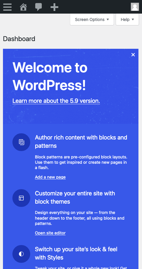
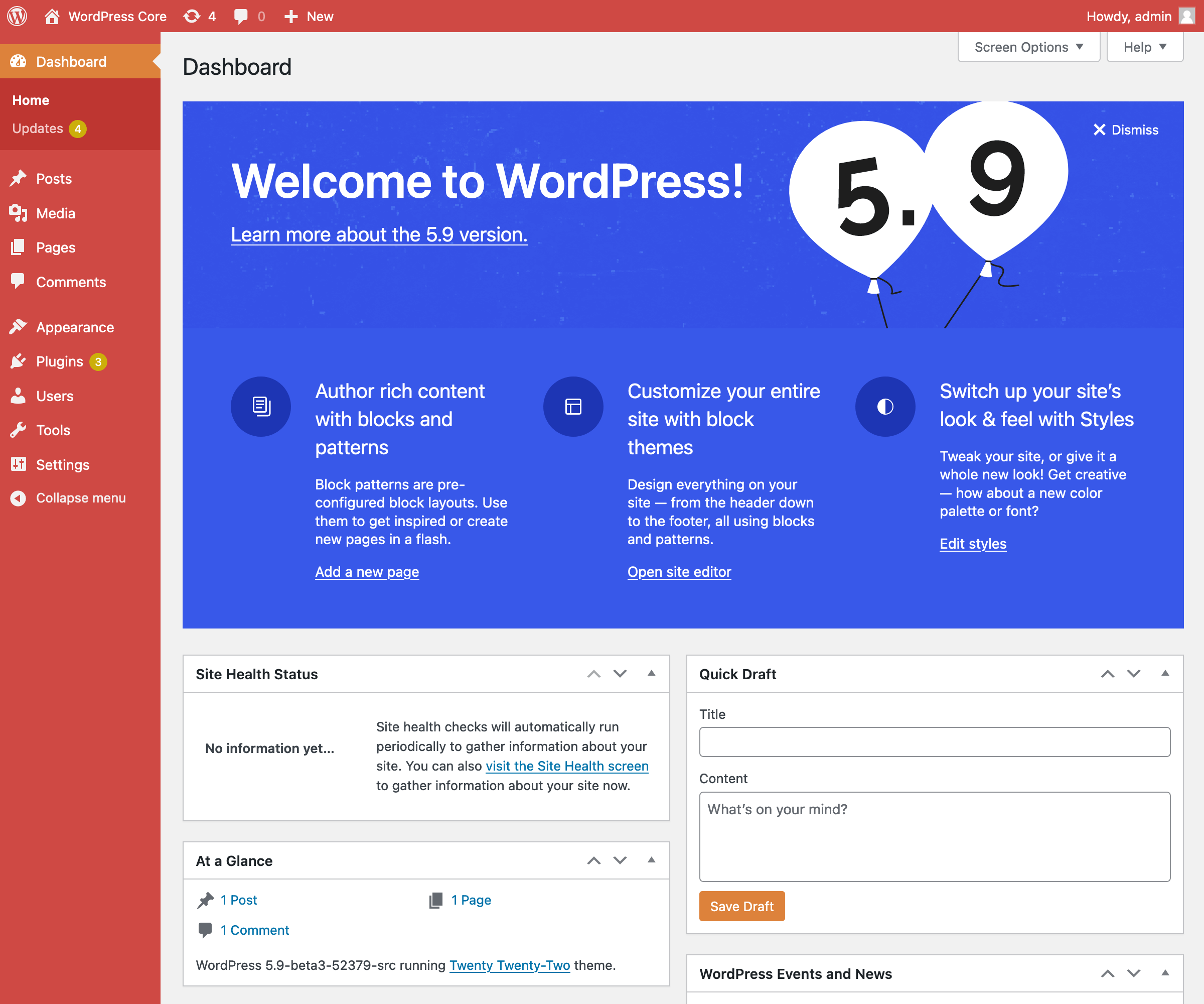
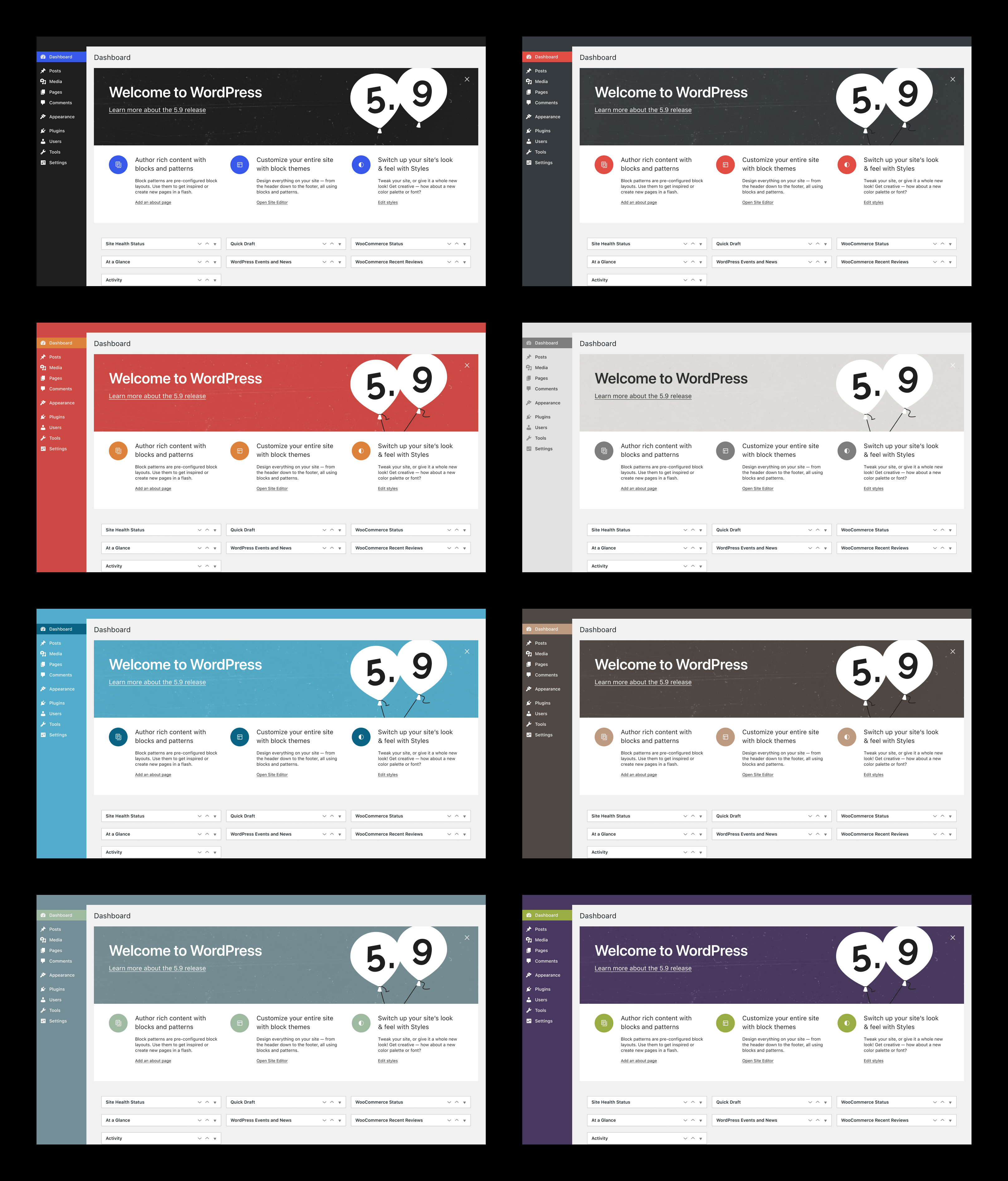
This is the "jazzy" design for the new Welcome panel, with new content. This does not include the textured background, I don't know how to export it from figma. I'll need a repeating texture, as small a filesize as possible :)
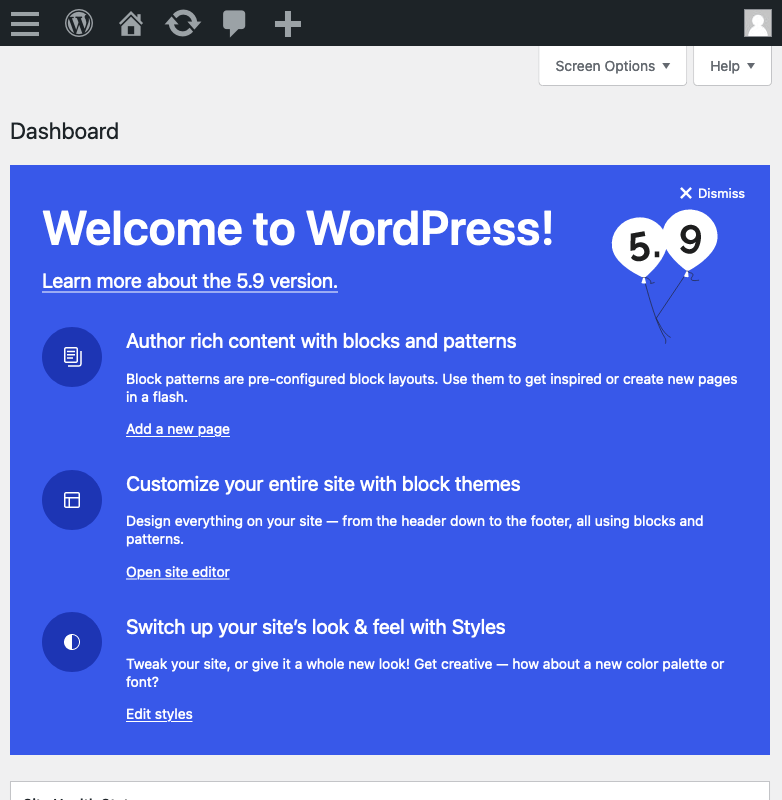
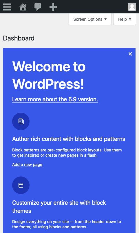
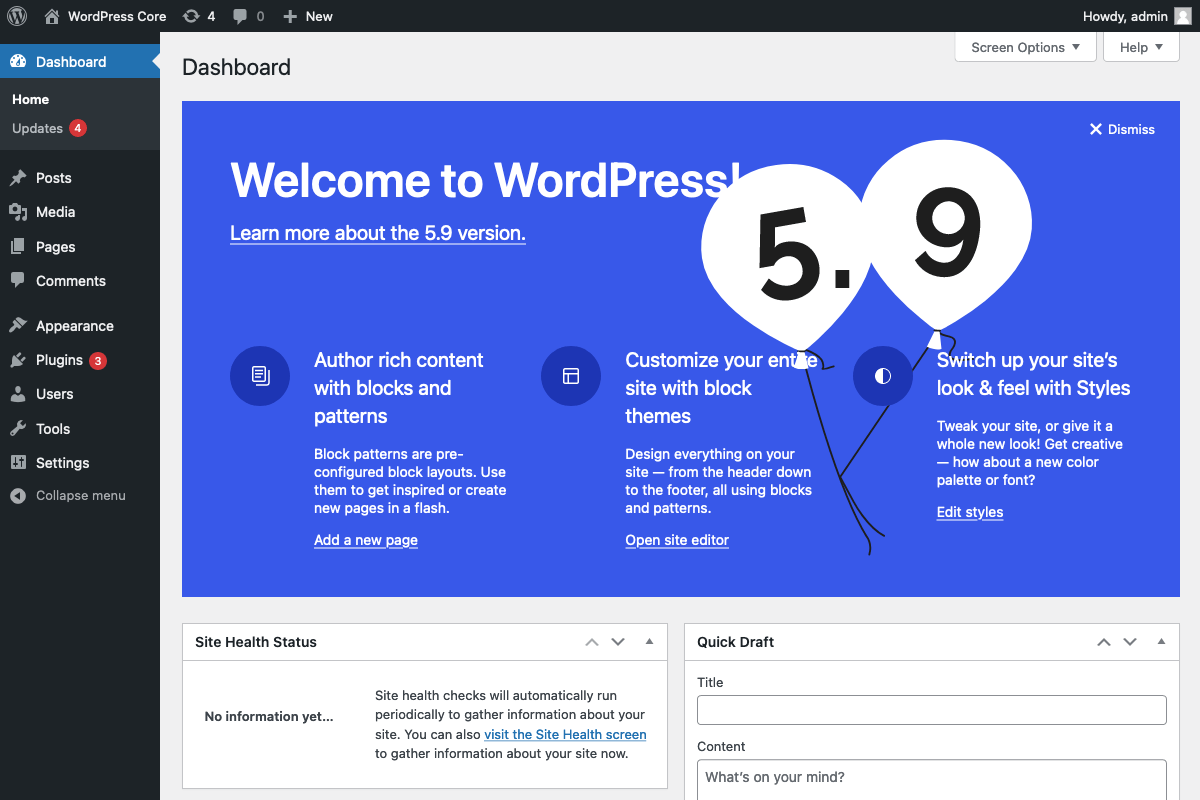
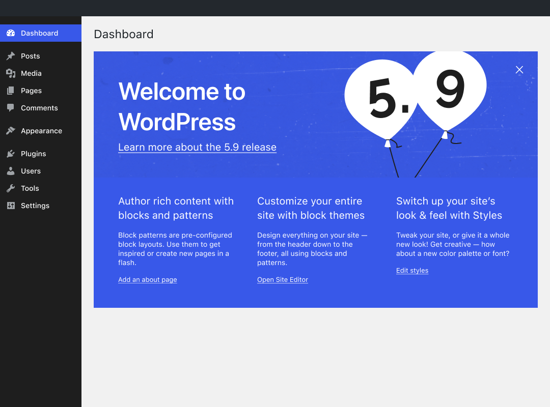
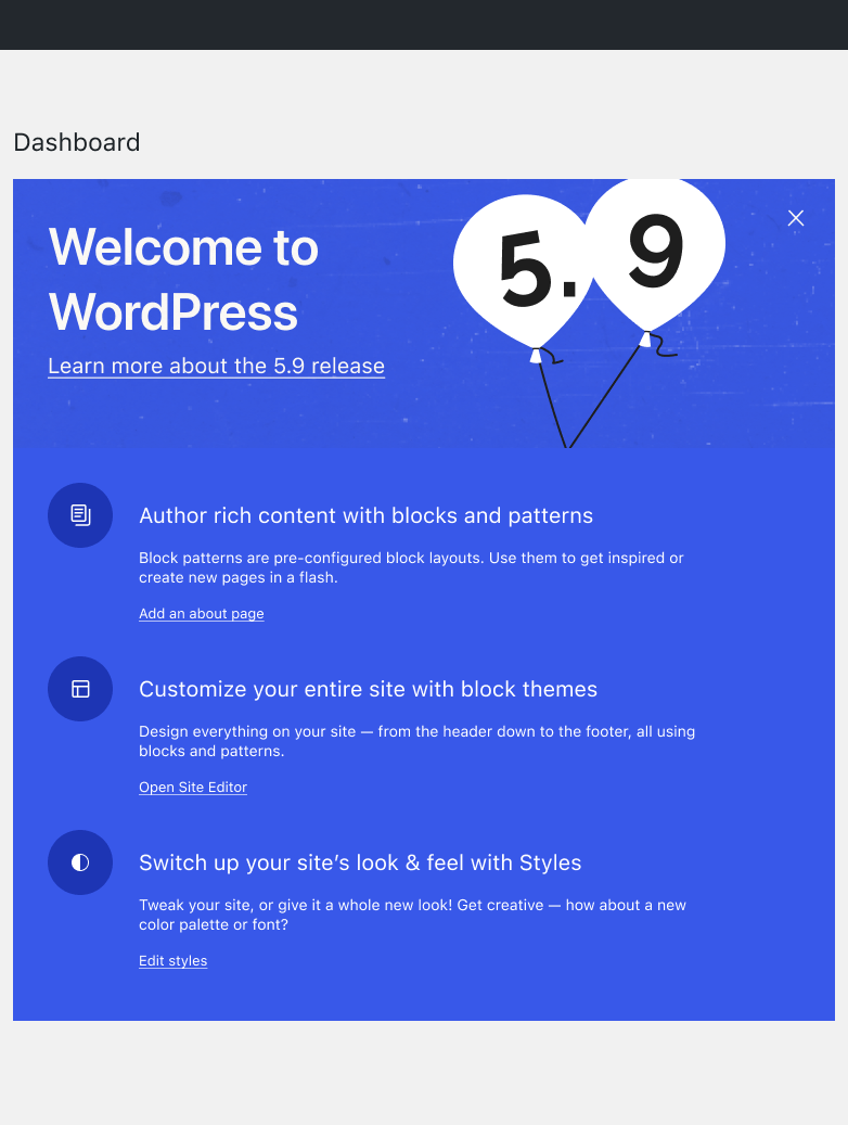
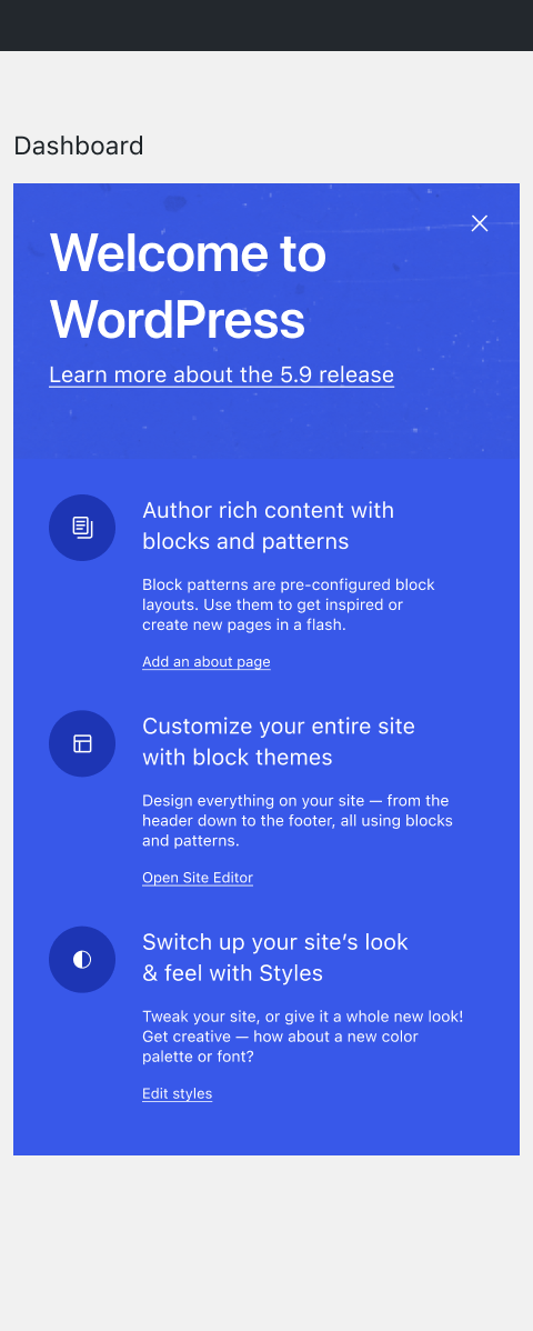
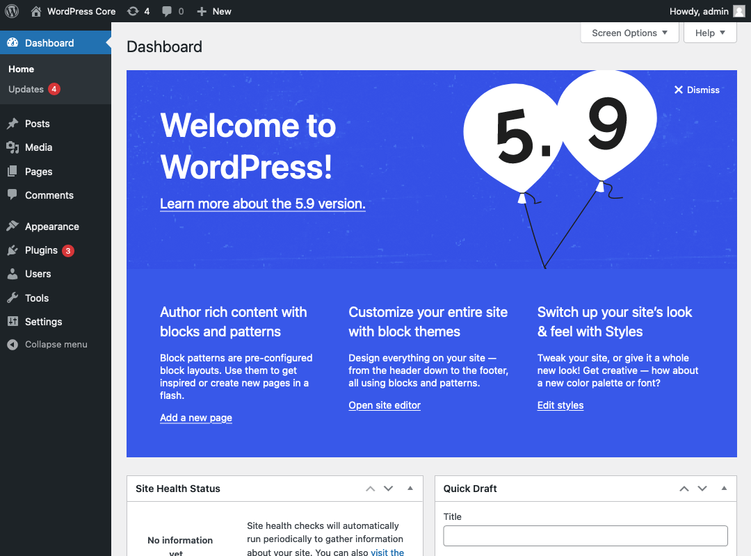
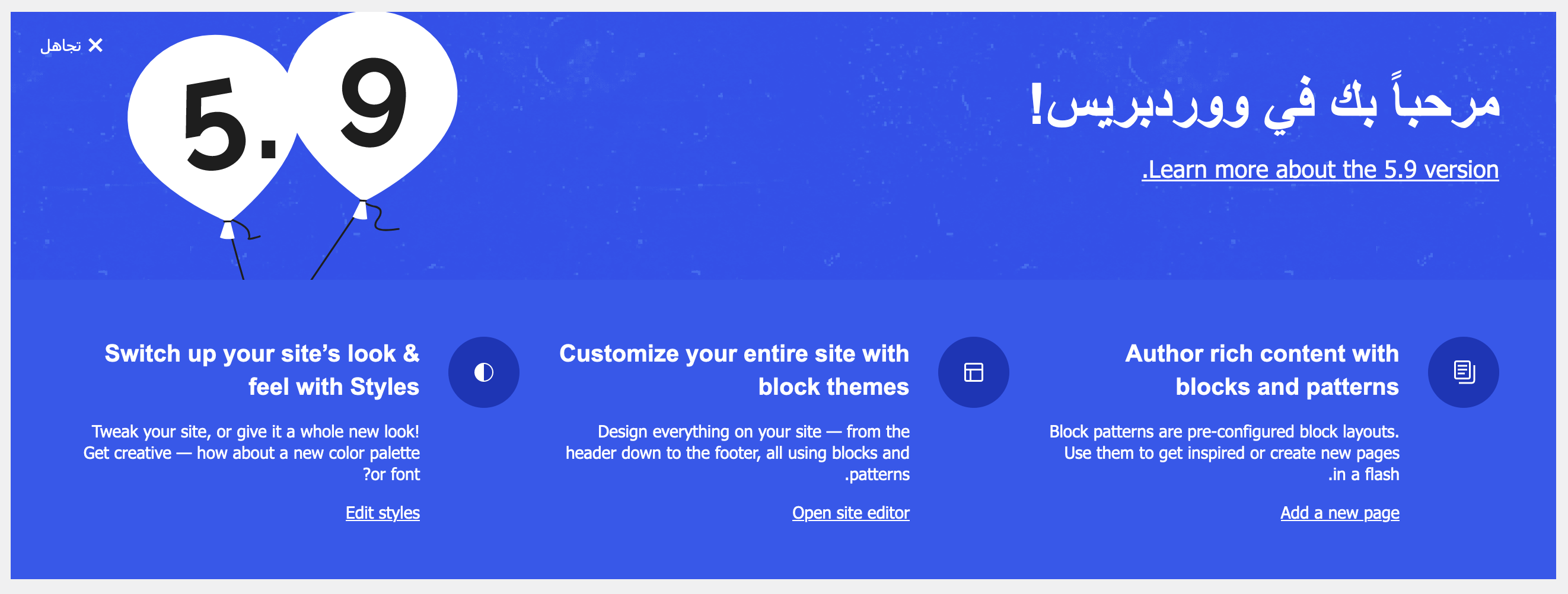
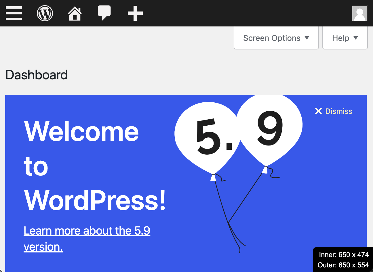
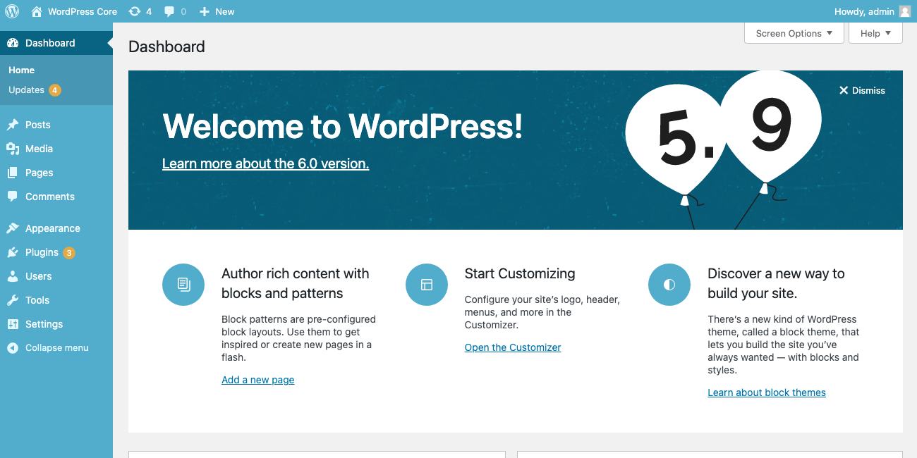
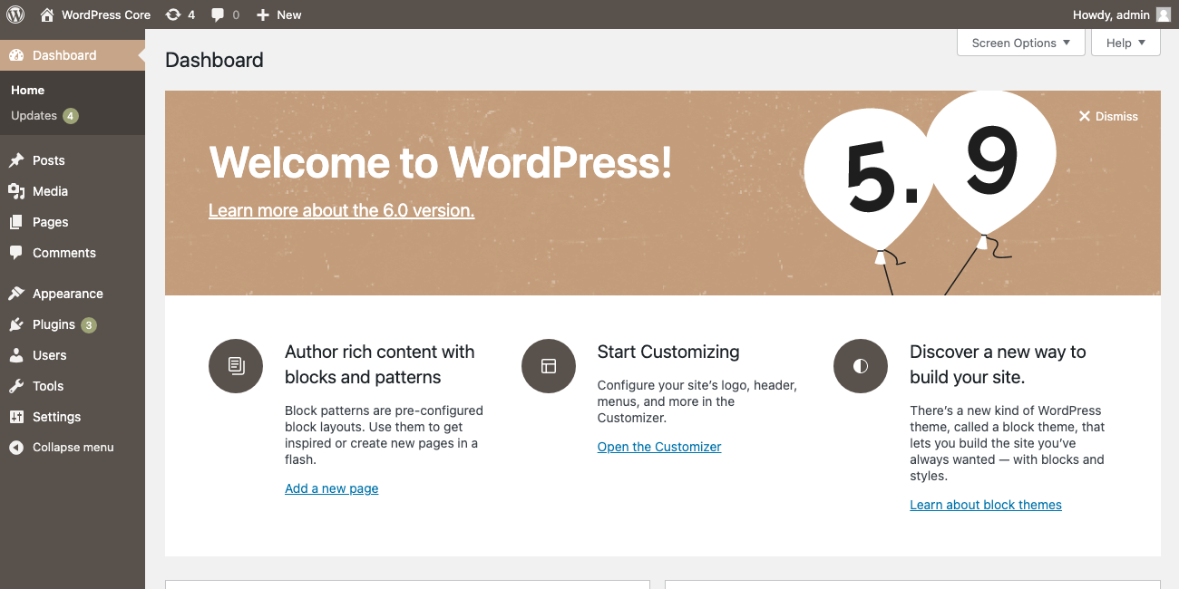
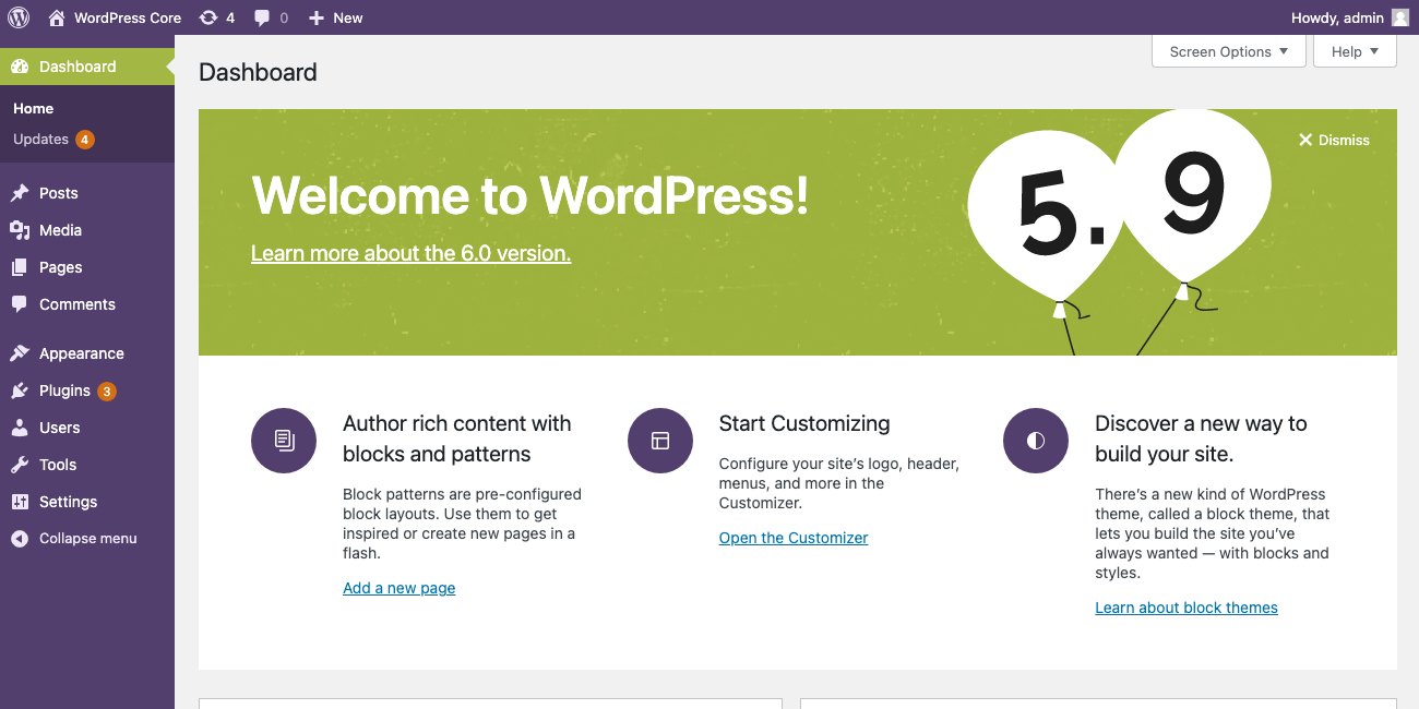
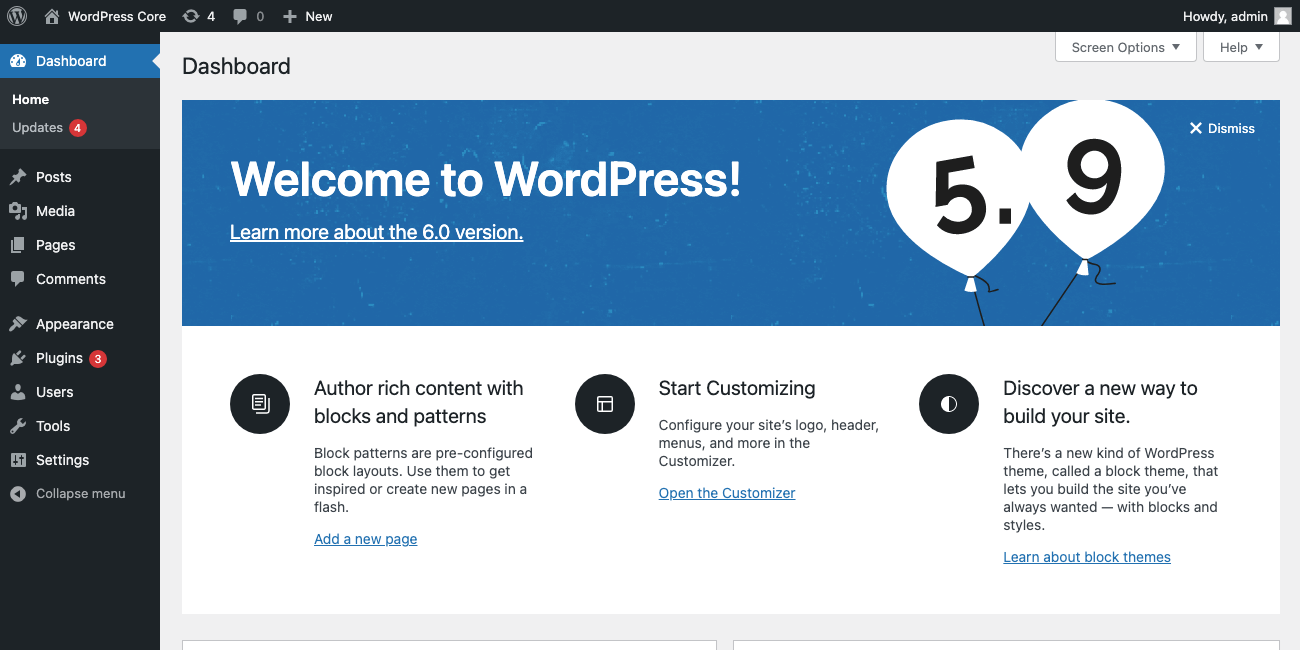
I had to do some fussy positioning to get the balloons & columns to look good/be readable across screen sizes. Here are a few breakpoint screenshots:
Unfortunately there are still some intermediate sizes where the balloons & text overlap:
Trac ticket: https://core.trac.wordpress.org/ticket/54489
#33
 @
@
3 years ago
Okay, I've created a new branch with the "jazzy" design.
I made a google doc for the copy, I thought that would be easier to understand/comment on than the thread here. Anyone should be able to comment & make suggestions, so we can figure out what should go in the second 2 columns when not using a block-based theme.
I mentioned in the PR, but I also need an export of the textured background, if we want to include that.
if the design does get revisited in the future, we could think of it as a new template to be used moving forward.
That was the intention with the current About page design too. There was a Sketch template, a Figma template (I think), and we wrote up documentation about how elements can be laid out on the page, but different designers work on it every release, and tools change, so it’s hard to keep things consistent. I won't be a blocker on this for the welcome panel, but just sharing some more historical context.

This ticket was mentioned in Slack in #core-editor by noisysocks. View the logs.
3 years ago

critterverse commented on PR #2049:
3 years ago
#35
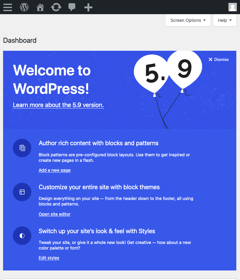
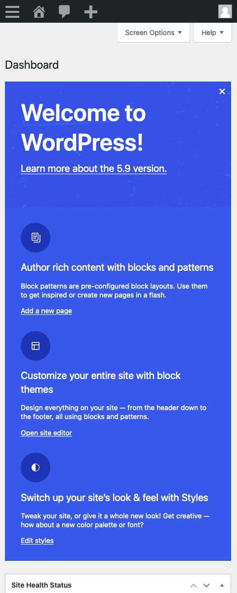
Thanks so much for working on this, @ryelle! You're right that the layout isn't working great across every size 😅 I took a pass on these breakpoint sizes in Figma to see if we could get the balloons and text to play a little more nicely together: https://www.figma.com/file/MfN5ccveFY5RncaUaegNec/Welcome-banner?node-id=119%3A2444
1440:
1080:
782:
480:
A few notes:
- I wonder if we should create a top area to contain the balloon artwork and texture within. This area could remain the same height across breakpoints.
- When responding down, ideally the balloon image could shrink about 10% between each breakpoint and stay anchored to the upper right (the size/position of the balloons has also been updated from the previous version).
- The icons don't seem to work as well when stacked vertically with the text so it would be nice if they could stay locked to the left of each blurb. Would it be weird to hide them between the two largest breakpoints when the spacing gets too tight? They could show again on the smaller sizes once the horizontal columns stack into a single column.
- When the layout switches to a single column around 782 px, we could limit the text from going the full width of the banner to help with line length/readability.
- Can we maintain a minimum distance between the top text and bottom text so there’s always some breathing room between the two sections? Noticed that it was getting tight on the smaller screen sizes and think the banner could be a bit longer in those contexts.
Trac ticket: https://core.trac.wordpress.org/ticket/54489

3 years ago
#37
I think I've addressed the feedback - I aimed to match the mockups. I also figured out how to export the texture and made a smaller repeating version 🎉
The new layout adds a bit more space between the heading and the columns, but I'm not sure if that matches what you're describing, @critterverse, so let me know if this needs more work.

This ticket was mentioned in Slack in #core by ryelle. View the logs.
3 years ago

critterverse commented on PR #2049:
3 years ago
#41
Wow this looks so good, thank you @ryelle! 💙
I only had a couple of notes —
- Could we still keep the icons to the left of the text (rather than vertically stacked) in the 480 view?
- It's nice how the word "Dismiss" next to the close button is hidden at the smallest breakpoint — could this happen sooner around 782px? I'm thinking that would help with some of the intermediate sizes around the 650 range if the balloons could be a bit closer to the right edge of the banner:
Side note that I wasn’t able to see the texture when testing but I’m sure this is probably something I did wrong with the setup — it looks great in your screenshots above!

3 years ago
#42
Okay, I've change the breakpoint where "dismiss" disappears, so we can move the balloons over a little early. I also put the icons back next to the text on the mobile breakpoint, but also added another "very small" breakpoint where the icons are hidden & the text is full-width.
I'm not sure why the texture wouldn't show up for you, but it might be how you're applying the patch? You can download it directly and drop it in the folder src/wp-admin/images (or build/wp-admin/images).

critterverse commented on PR #2049:
3 years ago
#43
Awesome, this looks great 🎉 Here's what I'm seeing:
I'll drop this in the Design channel on the Making Wordpress Slack as well for more visibiity!

melchoyce commented on PR #2049:
3 years ago
#44
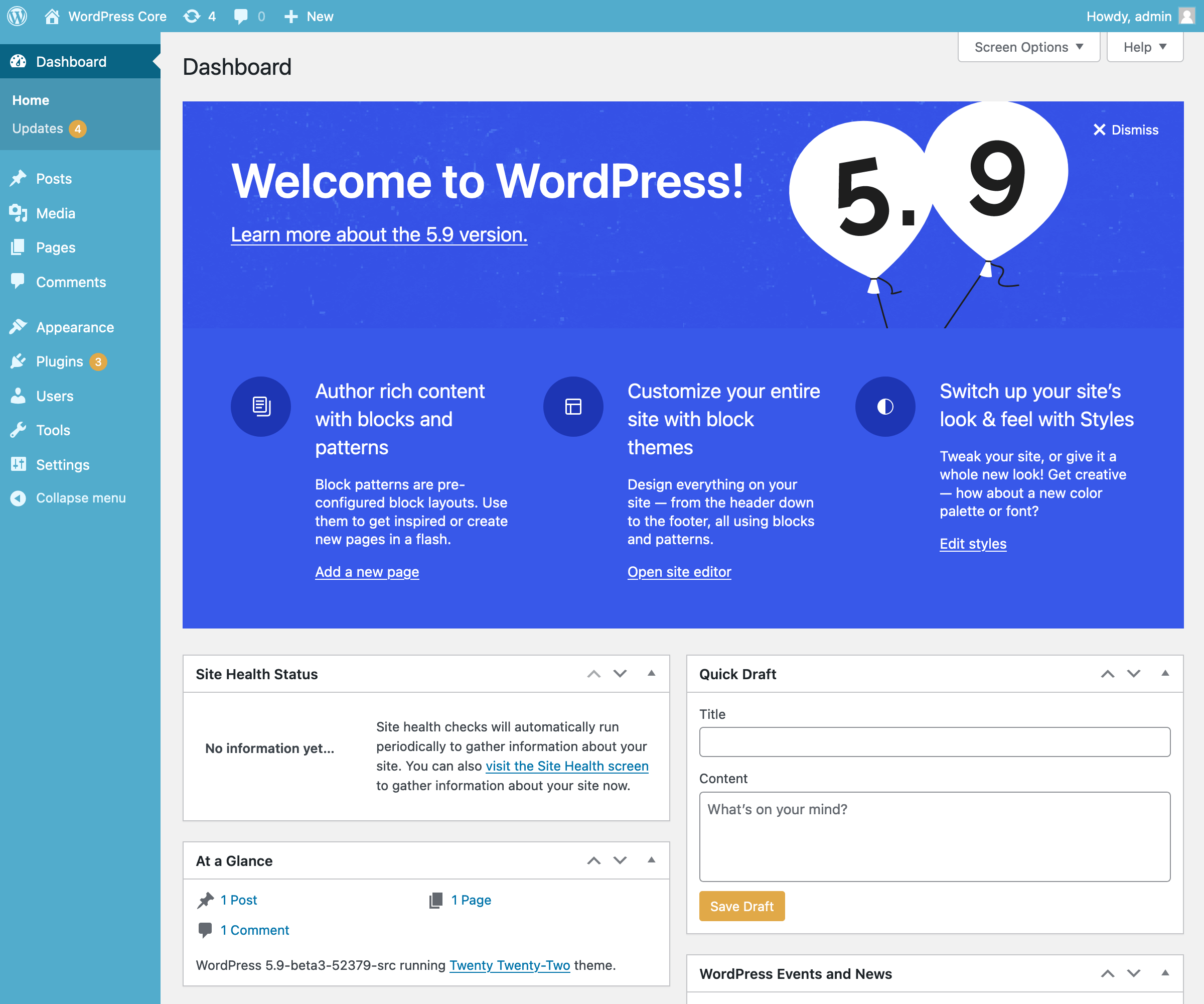
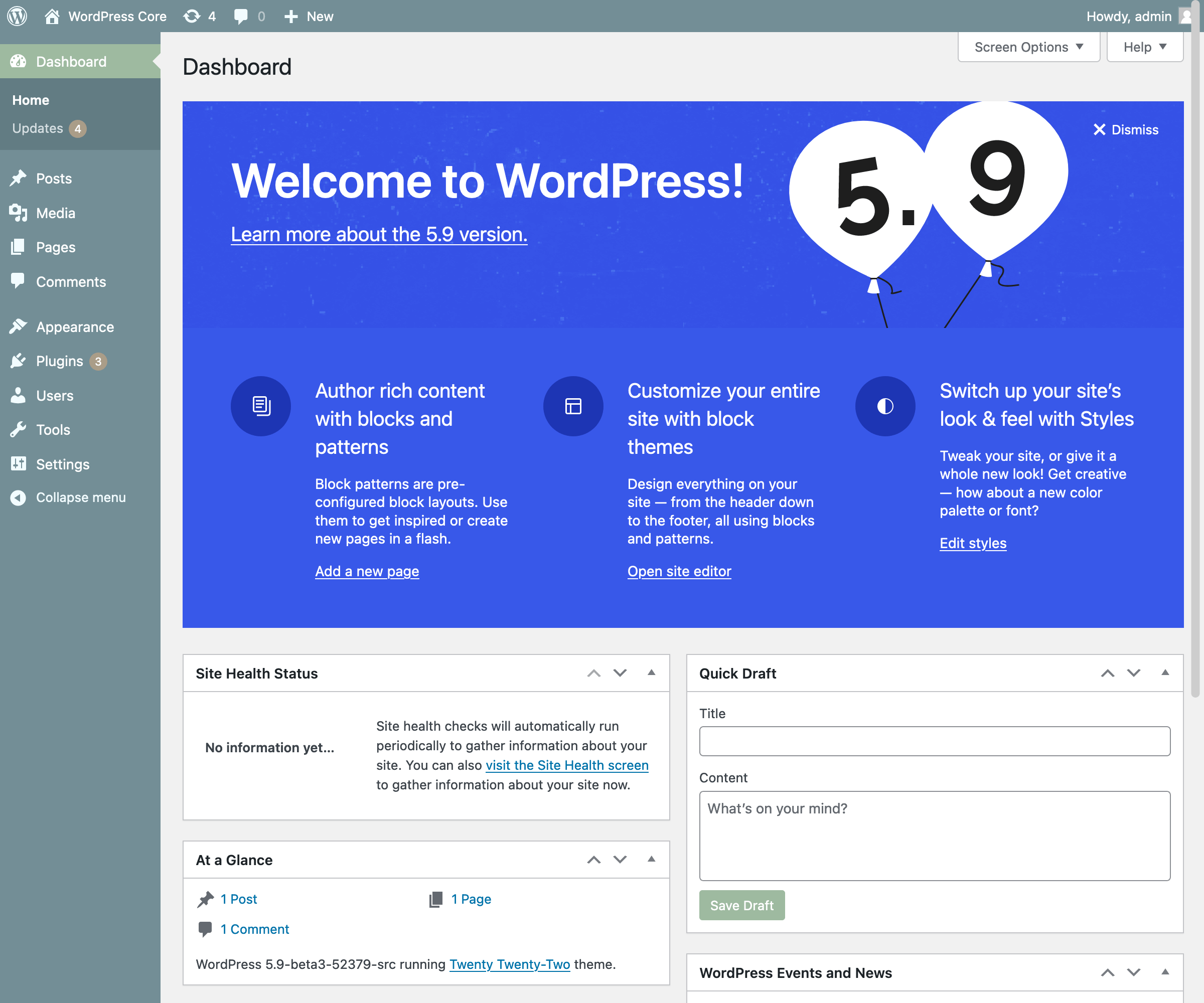
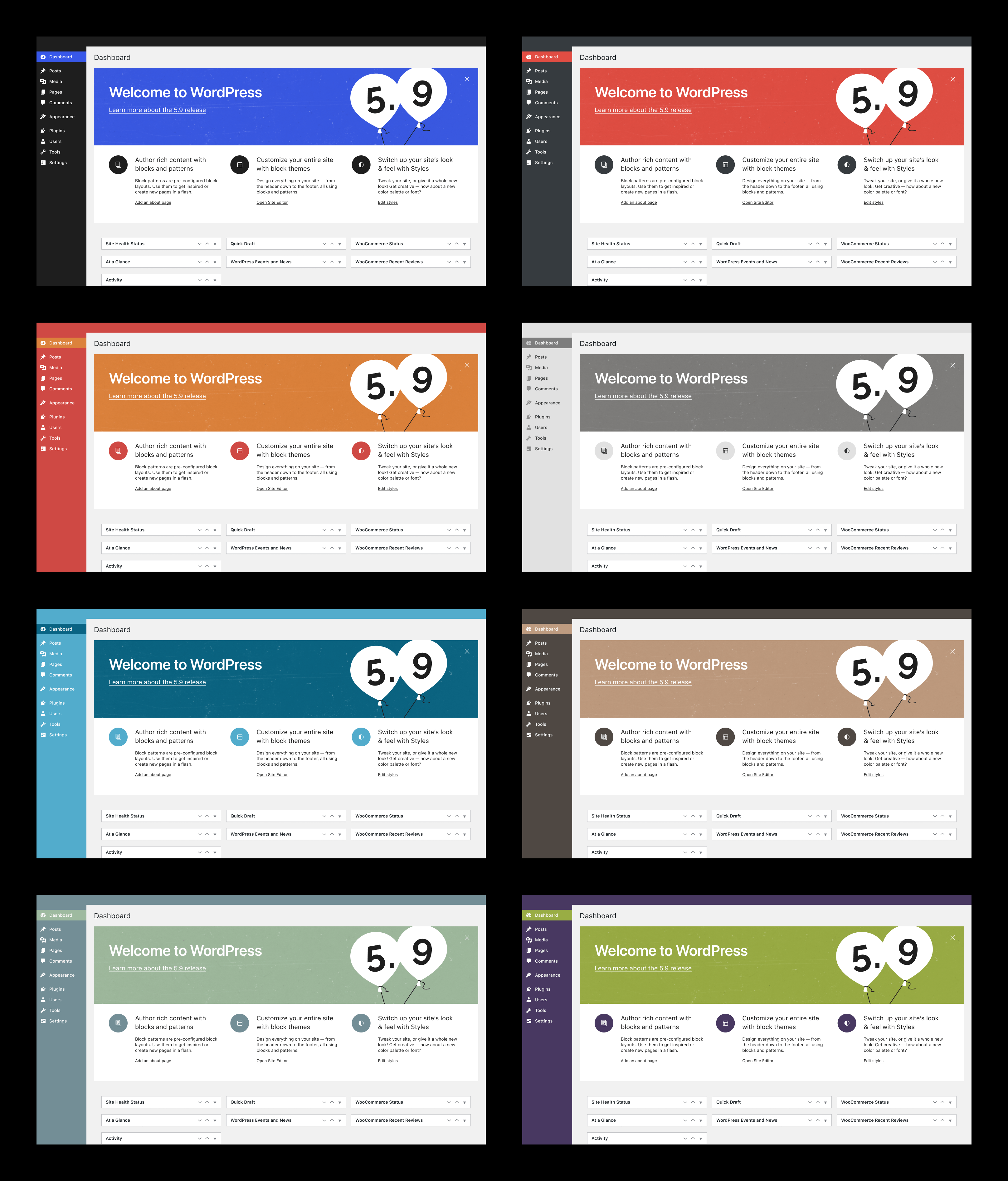
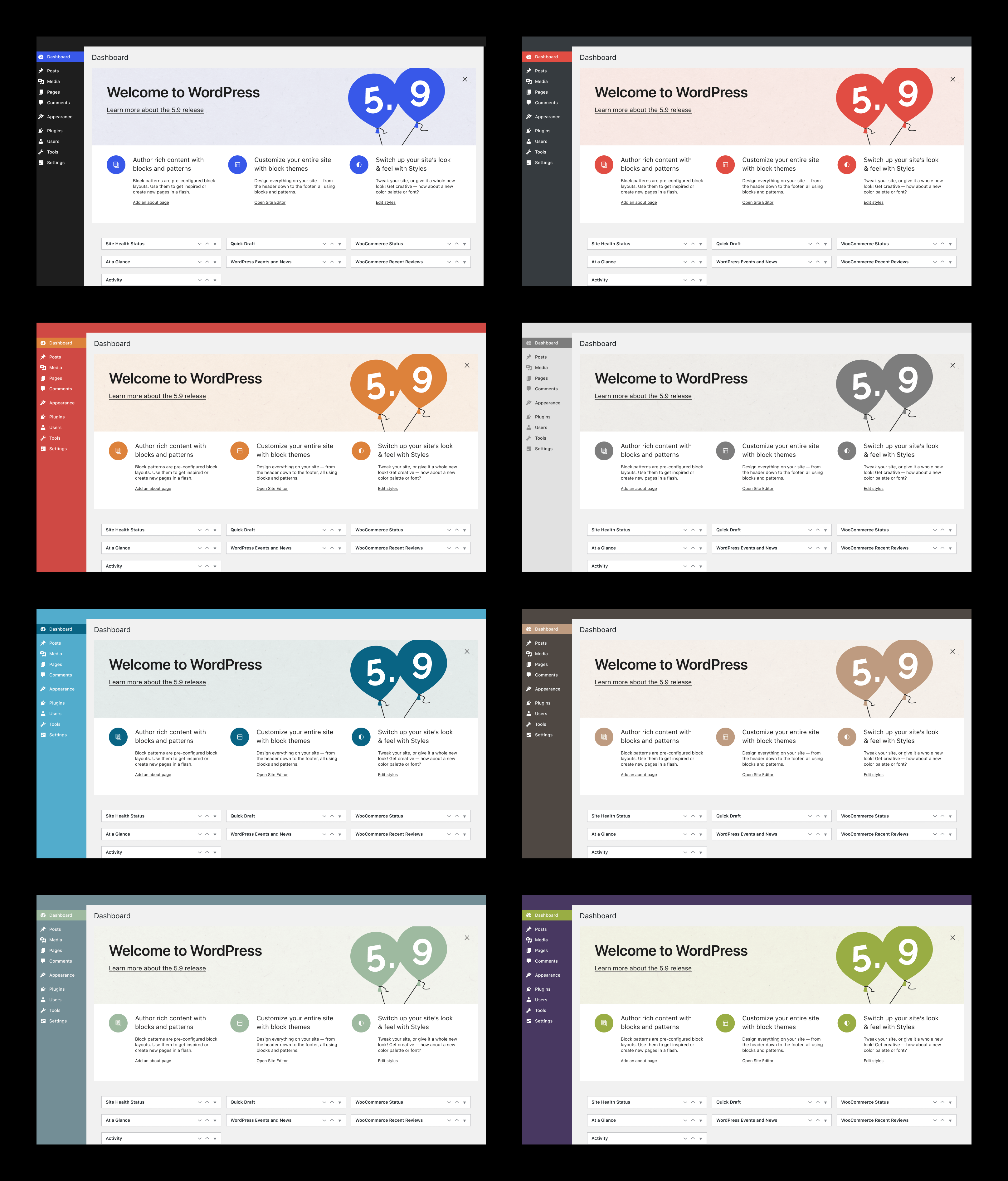
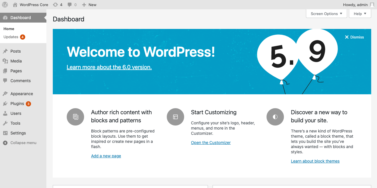
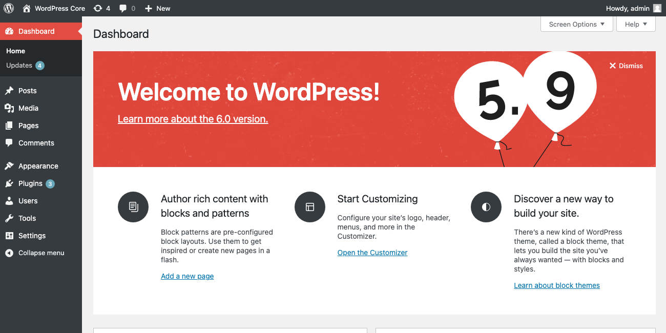
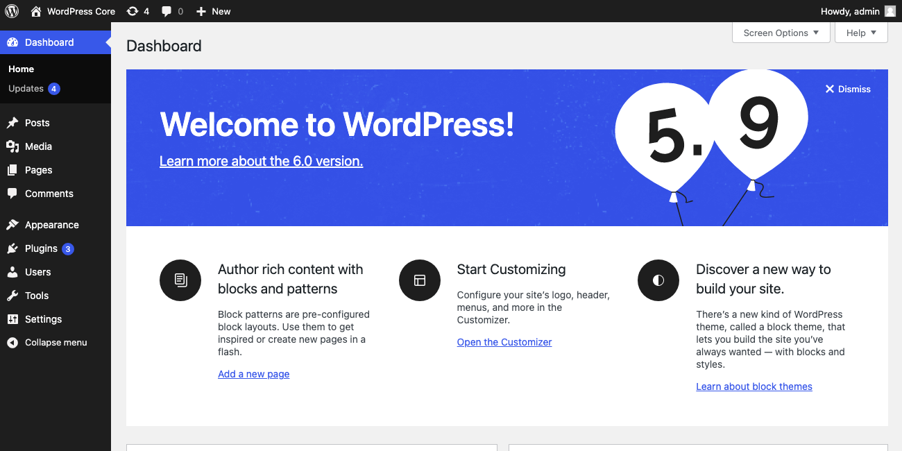
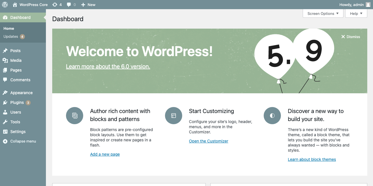
How's this work on other admin color schemes? Any way to update the background and text color depending on which color scheme's activated? 👀

3 years ago
#45
Screenshots from a few other schemes.
Any way to update the background and text color depending on which color scheme's activated?
That sounds fun, but this is meant to mirror the about page and I don't think that's in the plans there. On the other hand, if the about page style will stay consistent over releases, maybe it would be good to bring in the color scheme colors. @critterverse any thoughts about this?
#46
 @
@
3 years ago
I also want to flag that we still need copy review and copy to be written for when you don't have a block theme active. Here's that google doc again.

This ticket was mentioned in Slack in #core by hellofromtonya. View the logs.
3 years ago
#48
 @
@
3 years ago
About the copy, I am not invested in whether the term "Site editor" or "Editor" is used for the view where the site templates and global styles are available: But it is important that the same terminology is used to describe the same editor view across the WordPress project.
I think changing that single phrase "Open site editor" to "Edit your site" would be absolutely fine.

3 years ago
#50
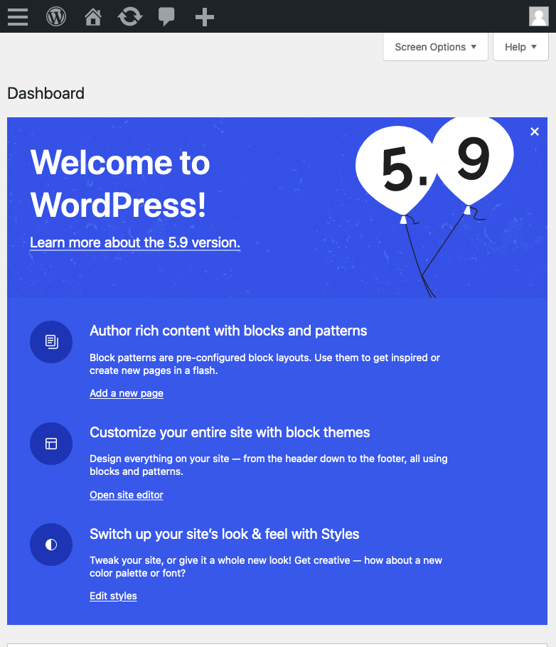
Latest iteration, if a block theme is active:
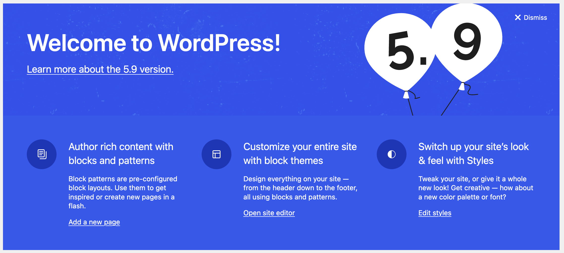
Note: that last link goes to a draft support article, a user support doc for block themes, and I'm just assuming the URL. I'm pretty sure it should be in the string for translation so it can be updated to the locale site if available, but I can remove it if not.
#51
 @
@
3 years ago
- Keywords needs-design-feedback needs-copy-review removed
Updated with copy from @marybaum & @webcommsat (thanks!)

critterverse commented on PR #2049:
3 years ago
#54
Thanks @ryelle, this is looking great!
Definitely an edge case but on super large screen sizes — could we make the blue background (without the noise texture) extend edge-to-edge?
Any way to update the background and text color depending on which color scheme's activated?
This is a really fun idea @melchoyce @ryelle 😁 For the sake of trying it out, the color coordination system could be:
- The background color behind the 3 columns of text would always be white
- The background color of the top textured area comes from the highlight color of the active menu item in wp-admin
- The text color in the top textured area comes from the text color of the active menu text in wp-admin
- The background color for the icons comes from the color of the wp-admin sidebar
- The icon color comes from the text color of the default/inactive menu text in wp-admin
Another possibility is the reverse (which may have slightly better contrast but it's hard to say universally):
- The background color behind the 3 columns of text would always be white
- The background color of the top textured area comes from the color of the wp-admin sidebar
- The text color in the top textured area comes from the color of the default/inactive menu text in wp-admin
- The background color for the icons comes from the highlight color of the active menu item in wp-admin
- The icon color comes from the color of the active menu text in wp-admin
The colors do feel more harmonious and the design still ties in nicely with the About page through the graphic elements/texture. The main drawbacks IMO are that some of the color schemes don't pass color contrast standards and a few feel a bit dated.
If we do stick with the Blueberry color, it might help to use the white background behind the columns of text as shown in the examples above so there's a smaller area of color.
What do others think?

3 years ago
#55
Definitely an edge case but on super large screen sizes — could we make the blue background (without the noise texture) extend edge-to-edge?
Are you on the latest version of the PR? that was fixed already. Maybe try clearing cache and refreshing?
For today let's focus on getting this PR as it is committed, since we're running against string freeze in 3hrs. I can try playing around with the color schemes later this week if there's interest (I do like it 😁 )
The main drawbacks IMO are that some of the color schemes don't pass color contrast standards and a few feel a bit dated.
hah, fair point. About contrast, that's fine since these are opt-in themes, not the default (also, some people prefer lower contrast themes, that's why we have options).

melchoyce commented on PR #2049:
3 years ago
#56
Love that first set! Using the highlight colors really brings attention to that section 😃

This ticket was mentioned in Slack in #core by hellofromtonya. View the logs.
3 years ago

3 years ago
#58
Just noting that translatable url in html links should rather use this kind of code:
echo esc_url( __( 'https://wordpress.org/support/article/block-themes/' ) )
(see example on line 2044)

critterverse commented on PR #2049:
3 years ago
#61
Are you on the latest version of the PR? that was fixed already. Maybe try clearing cache and refreshing?
My mistake, this looks good ✅
For today let's focus on getting this PR as it is committed, since we're running against string freeze in 3hrs. I can try playing around with the color schemes later this week if there's interest (I do like it 😁 )
Sounds like a plan! Leaving one more possibility for the color scheme-specific version here to make sure I've exhausted all the possibilites 😂 This version uses the color more sparingly so the the balloon image asset could always be the Blueberry color (i.e. a hybrid approach) or it could use the scheme highlight color if possible:

This ticket was mentioned in PR #2113 on WordPress/wordpress-develop by audrasjb.
3 years ago
#62
Trac ticket: https://core.trac.wordpress.org/ticket/54489
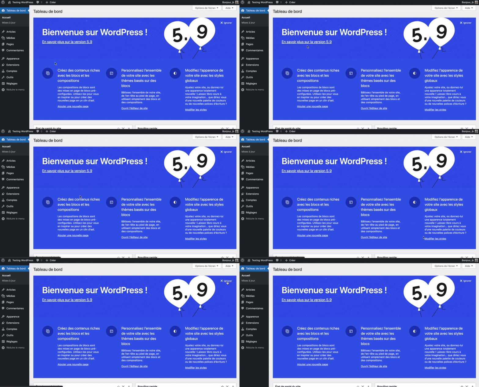
This change adds hover/focus styles to Welcome Panel links.
See video screenshot below:

3 years ago
#63
oupsie, I made a mistake when generating the PR.
I'll fix this tomorrow in (my) morning.
The only intended changes are located in dashboard.css.

3 years ago
#64
Plus, I just had a look at #2049 and it makes my PR obsolete. Let's close this for now, waiting for the new design of the welcome panel :)
#66
 @
@
3 years ago
To me, the graphic with the baloons and version number feels like a content-bearing image, and should have some form of alternative text. Adding accessible text to :before content is not the most widely supported method, but it would be better than nothing, e.g.e
`:before {
content: 'Balloon graphic 5.9';
}`

This ticket was mentioned in PR #2122 on WordPress/wordpress-develop by ryelle.
3 years ago
#67
This PR uses the first styles in comment:54, using the highlight color for the background.
It also adds the suggested "alt text" for the balloons, which ends up adding a new string to be translated, so that will either need to be communicated to translators, or scrapped until a point release (since we're past hard string freeze).
| | | |
Trac ticket: https://core.trac.wordpress.org/ticket/54489
#68
 @
@
2 years ago
- Focuses css added
In addition to changing color and underline for hover and focus states, the focus outline should be more noticeable than the blue box-shadow against blue backgrounds. Using currentColor is an option, which might work with multiple color schemes. (Plus, I like adding a small offset and removing the blue shadow, though those changes are not as important.)
.welcome-panel-header a:focus,
.welcome-panel .welcome-panel-close:focus {
	outline-color: currentColor;
	outline-offset: 1px;
	box-shadow: none;
}
#69
 @
@
2 years ago
The balloon "alt" text is slightly visible; the g and p descenders in "graphic" can show. One way to hide it is with text-indent (and any of you may know a better way):
	text-indent: 100%;
	white-space: pre;
	overflow-x: hidden;
For what it's worth, I'm not convinced that saying what the graphic displays would help in the welcome banner. The version number is already in the text, and I would consider a balloon-only image merely decorative (with no text alternative). The idea this image conveys—"5.9 is here! Let's celebrate!"—fits better on the About page, where the header text does not mention the version number. And any new alternative text theoretically could be added to both pages.
#70
follow-up:
↓ 71
 @
@
2 years ago
For reference, the version number is in the header on the About page for screen readers, but it's hidden visually - so adding any "alt text" to the about header would duplicate the heading.
I'm not convinced that saying what the graphic displays would help in the welcome banner.
I agree. I had been considering this a purely decorative image. I'm happy to follow whatever the recommendation is from the a11y team, though.
#71
in reply to:
↑ 70
 @
@
2 years ago
the version number is in the header on the About page for screen readers, but it's hidden visually
Oops...perhaps I could have tested with a screen reader...before talking about alternative text :)
This case fits the first decision tree example of an image containing text that is also present as real text nearby. However, maybe the image could/should include other alternative text.

This ticket was mentioned in Slack in #core by hellofromtonya. View the logs.
2 years ago
#74
 @
@
2 years ago
- Keywords commit added
I tested the PR and I think we're good to go 👌
Marking for commit. Ping @ryelle for proper commit :)
#77
 @
@
2 years ago
- Keywords dev-reviewed added; dev-feedback removed
Marking as dev-reviewed for 5.9 backport.
#80
follow-up:
↓ 81
 @
@
2 years ago
Nice! This looks great and I saw that it was just committed so feel free to ignore me if this needs to be locked down from here 🔒
Higher priority:
- I’m currently seeing “Learn more about the 6.0 version” (rather than 5.9) in the header area.
Nice-to-have:
- Remove the period from that subhead in the header area
- Remove the period from the third column headline on the classic theme version (”Discover a new way to build your site”) to match the other columns
- The noise texture feels a bit noisey on a few of these color schemes, we could probably stand to knock that image back to 60% opacity.
Thanks all!
#81
in reply to:
↑ 80
 @
@
2 years ago
Replying to critterverse:
I’m currently seeing “Learn more about the 6.0 version” (rather than 5.9) in the header area.
That's because it's a dynamic value - the 5.9 branch has already branched, so if you're on trunk, that is already version 6.0 🙂 It'll be correct in the release, but this will avoid having to re-translate strings just because the version updates. You'll probably see the same on the About page.
Unfortunately I think it's too late for copy changes, especially if nothing is technically incorrect.

This ticket was mentioned in Slack in #core by hellofromtonya. View the logs.
2 years ago
#83
 @
@
2 years ago
- Severity changed from normal to critical
This completely wipes out our Welcome that we use to communicate with our clients.
We need the ability to Dismiss Your Welcome screen w/o having to disable the Welcome Screen in the Screen Options!
Did it not occur to anyone that we might actually be using that area as well?
This is a critical issue as we have no global way of communication with our clients once logged into the dashboard!!!
Chris Sgaraglino CTO,
ILGM, Inc.
#84
 @
@
2 years ago
- Severity changed from critical to normal
Hello and thanks for the feedback, @csgaraglino
How do you hook into dashboard screen to add your widget? Can you share us some code to make sure it is not a misconception on your side?
It shouldn't change anything if you are correctly hooking into this screen. Maybe you're simply overriding the Core welcome widget. In that case, you have to update your CSS code to make sure it doesn't break. And you need to do this before each release of WordPress. But if you are in this case, I'd suggest you to change the way you hook into the dashboard :)
Thank you.
(removing critical severity keyword)
#85
 @
@
2 years ago
Real simple, there are several plugins that do this. The one we use is: The Divi Dashboard https://divilife.com/downloads/divi-dashboard-welcome/
We host or manage over 3k sites - and since they are all using Elegant Theme's Divi - this is the one we went with.
Up until this last update - we have never had an issue. Typically after it's posted once and dismissed - we never see it again.
#86
follow-up:
↓ 87
 @
@
2 years ago
The author of this premium plugin need to update their code to make it works with the latest release of WordPress.
Moreover, they should use a more robust way to hook into the dashboard.
Anyway, you can probably send them a request in their support forum. The issue is for their side, that's not something Core can or should fix since they are probably not using proper hooking methods for such feature.
Thank you
#87
in reply to:
↑ 86
 @
@
2 years ago
Replying to audrasjb:
The author of this premium plugin need to update their code to make it works with the latest release of WordPress.
Moreover, they should use a more robust way to hook into the dashboard.
Anyway, you can probably send them a request in their support forum. The issue is for their side, that's not something Core can or should fix since they are probably not using proper hooking methods for such feature.
Thank you
I think you have it backward. Over two dozen plugins hook in the same way - this one is just more Divi Friendly, which has nothing to do with how the welcome screen is dismissed.
This welcome message is persistent, meaning that it does not "dismiss". Now the only option is to hide the Welcome Message via Screen Options. Which disables ALL plugins that use that space!
I understand WP is going t make changes, but as they expect others to play nice with them, so should they play nice with others! This change has no bearing on the functionality of the Core Word Press - honestly, I see it as an oversight change on the side of WordPress. There is NO need to break dozens of plugins installed on thousands of websites.
#88
 @
@
2 years ago
I understand WP is going t make changes, but as they expect others to play nice with them, so should they play nice with others!
In fact, these plugins are overriding the dashboard screen the wrong way. The JS methods they use has never been supported or encouraged by WP documentation. They should hook correctly into the dashboard… or follow closely the changes happening in the interface to adapt their code when things change :)
#89
 @
@
2 years ago
Also, please note that this is a closed ticket in a closed milestone.
If you want to propose another way to handle this specific issue or discuss changes happening to the Welcome banner, please open a new ticket.
Once again, sorry to heard that you have issues with WordPress, and thank you for your feedback :)
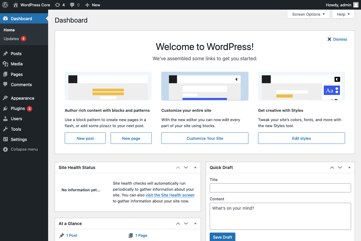
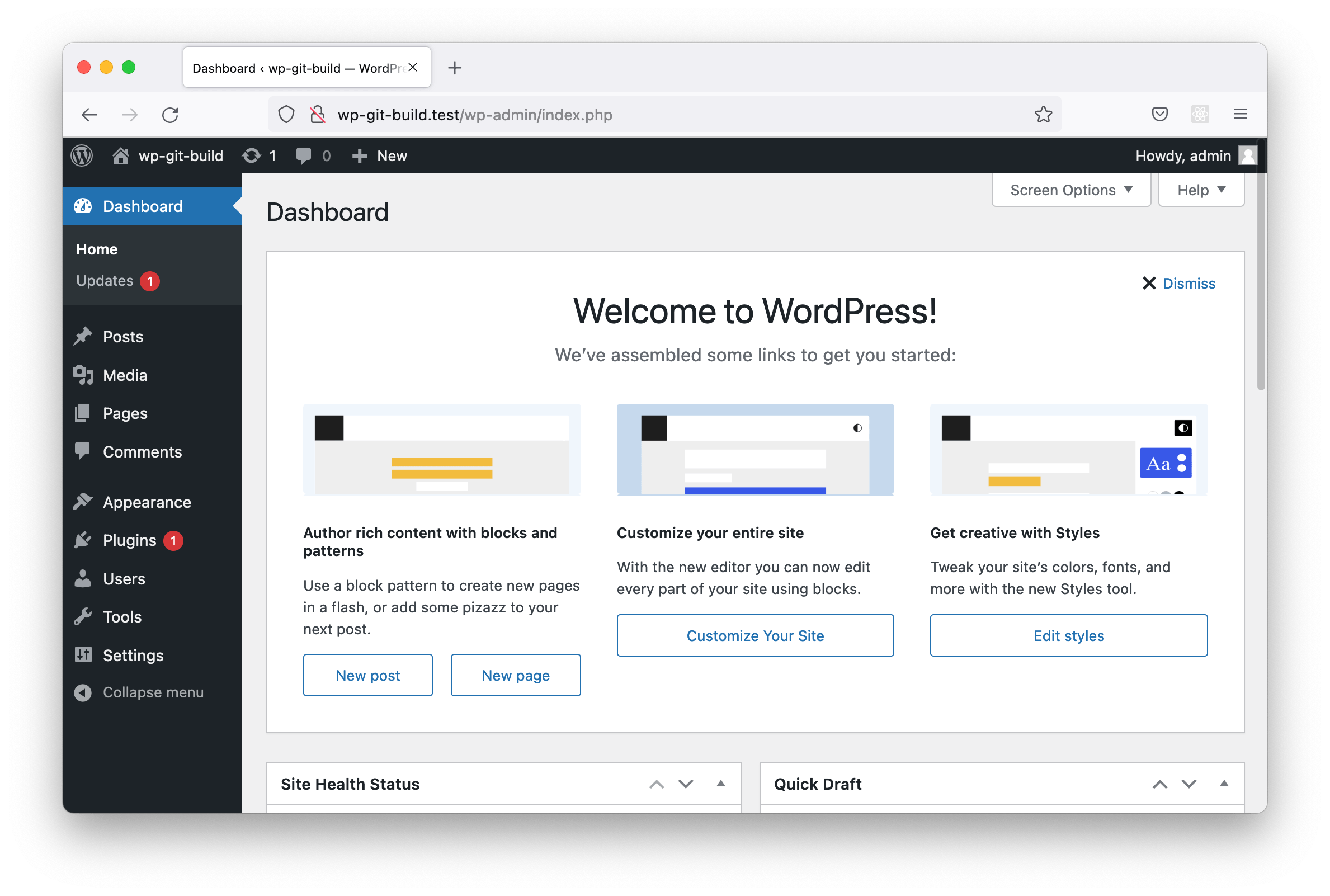



Welcome banner inspired by the welcome guides in Gutenberg