-
Notifications
You must be signed in to change notification settings - Fork 4.1k
New issue
Have a question about this project? Sign up for a free GitHub account to open an issue and contact its maintainers and the community.
By clicking “Sign up for GitHub”, you agree to our terms of service and privacy statement. We’ll occasionally send you account related emails.
Already on GitHub? Sign in to your account
Spacing presets: add editor UI support #42173
Conversation
|
Size Change: +9.14 kB (+1%) Total Size: 1.28 MB
ℹ️ View Unchanged
|
c555f7a
to
23a403f
Compare
packages/block-editor/src/components/spacing-sizes-control/all-input-control.js
Outdated
Show resolved
Hide resolved
| @@ -71,6 +71,7 @@ export default function CustomSelectControl( { | |||
| /** @type {import('../select-control/types').SelectControlProps.size} */ | |||
| size = 'default', | |||
| value: _selectedItem, | |||
There was a problem hiding this comment.
Choose a reason for hiding this comment
The reason will be displayed to describe this comment to others. Learn more.
These changes were a temporary proof of concept for testing reflecting changes in canvas when hovering a select list. Using this will need to wait of a rewrite of this component which is underway, so these changes will be removed before this PR is merged.
|
@jameskoster the designs for the UI link the concept of a In terms of font sizes, there is a In this instance, the block will If the user selects a specific font size then attributes are attached to the block and the styles linked to that font size preset will be applied to the block to override the inherited If they then switch back to If a default font size for a block is specified in global styles, the selected size is reflected in how big the font shows in the editor and front end, but the size selected in global styles is not indicated in any way in the font size selector for an individual block - it still shows default as indicating 'not set'. There isn't an easy way to dictate what the 'default' space size setting might be across all blocks in all contexts, eg. a Group block has a I might have missed another discussion somewhere though about a global |
packages/block-editor/src/components/spacing-sizes-control/index.js
Outdated
Show resolved
Hide resolved
| return ( | ||
| <fieldset role="region" className="component-spacing-sizes-control"> | ||
| <HStack className="component-spacing-sizes-control__header"> | ||
| <Text as="legend">{ label }</Text> |
There was a problem hiding this comment.
Choose a reason for hiding this comment
The reason will be displayed to describe this comment to others. Learn more.
Need to fix this up as legend needs to be first child of fieldset ... but that makes some of the layout needed here difficult ... working on it
There was a problem hiding this comment.
Choose a reason for hiding this comment
The reason will be displayed to describe this comment to others. Learn more.
We could leverage CSS grid here despite the Chrome bug where a fieldset with display: grid won't work properly.
If we apply display: grid; to the wrapping ToolsPanelItem we can set display: contents; on the fieldset itself. This allows us to make the legend an immediate descendant of the fieldset. Such an approach will require a few other style tweaks but quickly hacking around in dev tools showed it should have some legs.
Also, legends get some default padding via browser user agent styles, so we should probably strip that as well to line things up.
Click for CSS snippets and demo video of results
Screen.Recording.2022-07-26.at.4.46.40.pm.mp4
ToolsPanelItem
    display: grid;
    grid-template-columns: repeat(2, 1fr);
fieldset
display: contents;legend
    /* Quick vertical alignment and spacing tweaks. There's likely a better approach */
    display: flex;
    align-items: center;
    padding-left: 0;
    margin-bottom: 12px;
}
span
	/* aligns the button to the right and tweaks spacing, cleaner approaches likely as well. */
	text-align: right;
.component-spacing-sizes-control :nth-child(1n+3)
grid-column: span 2;There was a problem hiding this comment.
Choose a reason for hiding this comment
The reason will be displayed to describe this comment to others. Learn more.
Great, thanks, will have a play around with this.
There was a problem hiding this comment.
Choose a reason for hiding this comment
The reason will be displayed to describe this comment to others. Learn more.
This is looking really good so far @glendaviesnz, massive effort! 🙇
✅ Unit tests are passing
✅ Adjusting values via presets or custom values, all sides or single, are reflected in editor and frontend
❓ When switching to custom value input for the linked control, the custom value appeared to be an index not real value
❓ Moving the presets slider all the way to the right results in horizontal scrollbar for sidebar
❓The control's layout is a bit funky when custom select control is used due to spacing scale with more than 7 steps.
Custom value issue for all sides control
Screen.Recording.2022-07-26.at.5.47.06.pm.mp4
Component layout with custom select control
Screen.Recording.2022-07-26.at.5.55.33.pm.mp4
I've left a number of inline comments, mostly small stuff like typos or copy/paste issues.
Hope this helps. Happy to test/review again whenever you need it. 🙂
Also, as we discussed internally, we'll need to update the Global Styles dimensions panel so it matches the block editor's.
packages/block-editor/src/components/spacing-sizes-control/index.js
Outdated
Show resolved
Hide resolved
packages/block-editor/src/components/spacing-sizes-control/all-input-control.js
Outdated
Show resolved
Hide resolved
packages/block-editor/src/components/spacing-sizes-control/axial-input-controls.js
Outdated
Show resolved
Hide resolved
packages/block-editor/src/components/spacing-sizes-control/axial-input-controls.js
Outdated
Show resolved
Hide resolved
| return ( | ||
| <fieldset role="region" className="component-spacing-sizes-control"> | ||
| <HStack className="component-spacing-sizes-control__header"> | ||
| <Text as="legend">{ label }</Text> |
There was a problem hiding this comment.
Choose a reason for hiding this comment
The reason will be displayed to describe this comment to others. Learn more.
We could leverage CSS grid here despite the Chrome bug where a fieldset with display: grid won't work properly.
If we apply display: grid; to the wrapping ToolsPanelItem we can set display: contents; on the fieldset itself. This allows us to make the legend an immediate descendant of the fieldset. Such an approach will require a few other style tweaks but quickly hacking around in dev tools showed it should have some legs.
Also, legends get some default padding via browser user agent styles, so we should probably strip that as well to line things up.
Click for CSS snippets and demo video of results
Screen.Recording.2022-07-26.at.4.46.40.pm.mp4
ToolsPanelItem
    display: grid;
    grid-template-columns: repeat(2, 1fr);
fieldset
display: contents;legend
    /* Quick vertical alignment and spacing tweaks. There's likely a better approach */
    display: flex;
    align-items: center;
    padding-left: 0;
    margin-bottom: 12px;
}
span
	/* aligns the button to the right and tweaks spacing, cleaner approaches likely as well. */
	text-align: right;
.component-spacing-sizes-control :nth-child(1n+3)
grid-column: span 2;
packages/block-editor/src/components/spacing-sizes-control/linked-button.js
Outdated
Show resolved
Hide resolved
packages/block-editor/src/components/spacing-sizes-control/spacing-input-control.js
Outdated
Show resolved
Hide resolved
packages/block-editor/src/components/spacing-sizes-control/utils.js
Outdated
Show resolved
Hide resolved
packages/block-editor/src/components/spacing-sizes-control/utils.js
Outdated
Show resolved
Hide resolved
| @@ -15,6 +15,7 @@ import './duotone'; | |||
| import './font-size'; | |||
| import './border'; | |||
| import './layout'; | |||
| //import './spacing-size'; | |||
There was a problem hiding this comment.
Choose a reason for hiding this comment
The reason will be displayed to describe this comment to others. Learn more.
🧹 I take it this isn't needed and can be cleaned up?
Ah yes, I've ran into this issue a couple of times now. Something to address for sure (imo), but not here. One other small issue I noticed is that if you scroll up / down the range quickly, the on-canvas rendering doesn't work perfectly. Notice how the content starts to bleed into the padded area: padding.mp4 |
Thanks @jameskoster, that visualiser is a bit flakey in a number of situations, we will take a look at it, but it may be as a separate PR. With the z-index on the slider thumb another dev has checked the branch out and run locally and the new z-index is applied for them. Do you use wp-env to run it locally? If so and you don't have any critical data in your local env try running |
There was a problem hiding this comment.
Choose a reason for hiding this comment
The reason will be displayed to describe this comment to others. Learn more.
Thanks, for the quick iterations on this @glendaviesnz. 🚀
I appreciate your still working on things like moving the legend and updating the Global Styles panel but I've given it another quick once-over. It's taking shape nicely!
✅ Unit tests still pass
✅ Applies the spacing correctly in both editor and frontend
✅ Custom value bug for all inputs slider control has been resolved
✅ Layout for the custom select control looks neater
While testing this again, I noticed some other issues we might wish to address.
Position of LinkedButton
When the control is used within the sidebar alongside others, such as the BoxControl or BorderRadiusControl, the position of the linked button looks out of whack. I'm assuming this was due to restricting the control's width to avoid the horizontal sidebar? Is there a different approach we can take to avoid it?
Disjoint between mode value and slider position
After expanding the control and adjusting the different side values, the correct mode value is displayed as help text underneath the main label. Can we update the slider's value/progress to reflect that? It's a little odd to set mostly x-small values for the sides, collapse the control, and still see the slider halfway.
Custom select control view
When using a custom select control due to the spacing scale's steps being greater than 7, after selecting an option, if you switch to the custom value input, the value isn't shown. Also, After selecting a value in the primary select control, if you switch to the unlinked sides, they don't have that value set.
Demo video
Screen.Recording.2022-07-27.at.9.04.06.pm.mp4
Other minor nits
There's a little extra clean-up we can do in terms of typos etc. I've created a diff below that you can apply if you feel so inclined.
Suggested changes
diff --git a/packages/block-editor/src/components/spacing-sizes-control/index.js b/packages/block-editor/src/components/spacing-sizes-control/index.js
index a005df8b63..6e8bdcad32 100644
--- a/packages/block-editor/src/components/spacing-sizes-control/index.js
+++ b/packages/block-editor/src/components/spacing-sizes-control/index.js
@@ -19,7 +19,6 @@ import { settings } from '@wordpress/icons';
 /**
  * Internal dependencies
  */
-
 import AllInputControl from './all-input-control';
 import InputControls from './input-controls';
 import AxialInputControls from './axial-input-controls';
@@ -54,7 +53,6 @@ export default function SpacingSizesControl( {
 		...useSetting( 'spacing.spacingSizes' ),
 	];

-	const type = label;
 	const inputValues = values || DEFAULT_VALUES;
 	const hasInitialValue = isValuesDefined( values );
 	const hasOneSide = sides?.length === 1;
@@ -89,7 +87,7 @@ export default function SpacingSizesControl( {
 		values: inputValues,
 		spacingSizes,
 		useSelect,
-		type,
+		type: label,
 	};

 	return (
diff --git a/packages/block-editor/src/components/spacing-sizes-control/linked-button.js b/packages/block-editor/src/components/spacing-sizes-control/linked-button.js
index 1cf0f2f361..fd4781a205 100644
--- a/packages/block-editor/src/components/spacing-sizes-control/linked-button.js
+++ b/packages/block-editor/src/components/spacing-sizes-control/linked-button.js
@@ -5,10 +5,6 @@ import { link, linkOff } from '@wordpress/icons';
 import { __ } from '@wordpress/i18n';
 import { Button, Tooltip } from '@wordpress/components';

-/**
- * Internal dependencies
- */
-
 export default function LinkedButton( { isLinked, onClick } ) {
 	const label = isLinked ? __( 'Unlink Sides' ) : __( 'Link Sides' );

diff --git a/packages/block-editor/src/components/spacing-sizes-control/style.scss b/packages/block-editor/src/components/spacing-sizes-control/style.scss
index 9075a30446..a4ea9d4155 100644
--- a/packages/block-editor/src/components/spacing-sizes-control/style.scss
+++ b/packages/block-editor/src/components/spacing-sizes-control/style.scss
@@ -1,5 +1,5 @@
 // The following is needed to prevent horizontal scrollbar when range
-// control is slid to far right. Component styles overrride with 100%
+// control is slid too far right. Component styles override with 100%
 // max width if extra specificity not added.
 .components-tools-panel-item > fieldset.component-spacing-sizes-control {
 	max-width: 235px;
Nice work so far, I'm looking forward to seeing the finished product 👍
packages/block-editor/src/components/spacing-sizes-control/style.scss
Outdated
Show resolved
Hide resolved
This comment was marked as outdated.
This comment was marked as outdated.
This comment was marked as outdated.
This comment was marked as outdated.
There was a problem hiding this comment.
Choose a reason for hiding this comment
The reason will be displayed to describe this comment to others. Learn more.
The UI is working well for me. Aria labels/tooltips make sense and I can use the keyboard exclusively.
Frontend CSS matches my settings as well.
I'm not fully over this PR so will let more experienced folks give a final assessment, but it's looking great to me.
packages/block-editor/src/components/spacing-sizes-control/style.scss
Outdated
Show resolved
Hide resolved
packages/block-editor/src/components/spacing-sizes-control/style.scss
Outdated
Show resolved
Hide resolved
packages/block-editor/src/components/spacing-sizes-control/style.scss
Outdated
Show resolved
Hide resolved
packages/block-editor/src/components/spacing-sizes-control/style.scss
Outdated
Show resolved
Hide resolved
packages/block-editor/src/components/spacing-sizes-control/test/utils.js
Show resolved
Hide resolved
packages/block-editor/src/components/spacing-sizes-control/utils.js
Outdated
Show resolved
Hide resolved
This comment was marked as outdated.
This comment was marked as outdated.
@jasmussen if we make the link/unlink button 24px it would then be different to the border control ones, and it we just do the custom toggle, it is different to the link/unlink: should we just make the custom toggle 24px for now and circle back and fix all the link/unlink buttons in the toolspanel in one go, or just leave the custom toggle the same width as the link/unlink button until we do that? |
| { name: 0, slug: '0', size: 0 }, | ||
| ...useSetting( 'spacing.spacingSizes' ), |
There was a problem hiding this comment.
Choose a reason for hiding this comment
The reason will be displayed to describe this comment to others. Learn more.
This appears to throw a fatal in the site editor or a block error in the post editor if spacing sizes are disabled or not available. What should happen for this component if there are no presets? I was wondering if we'd default to just the custom sizes view?
| Block editor | Site editor |
|---|---|
 |
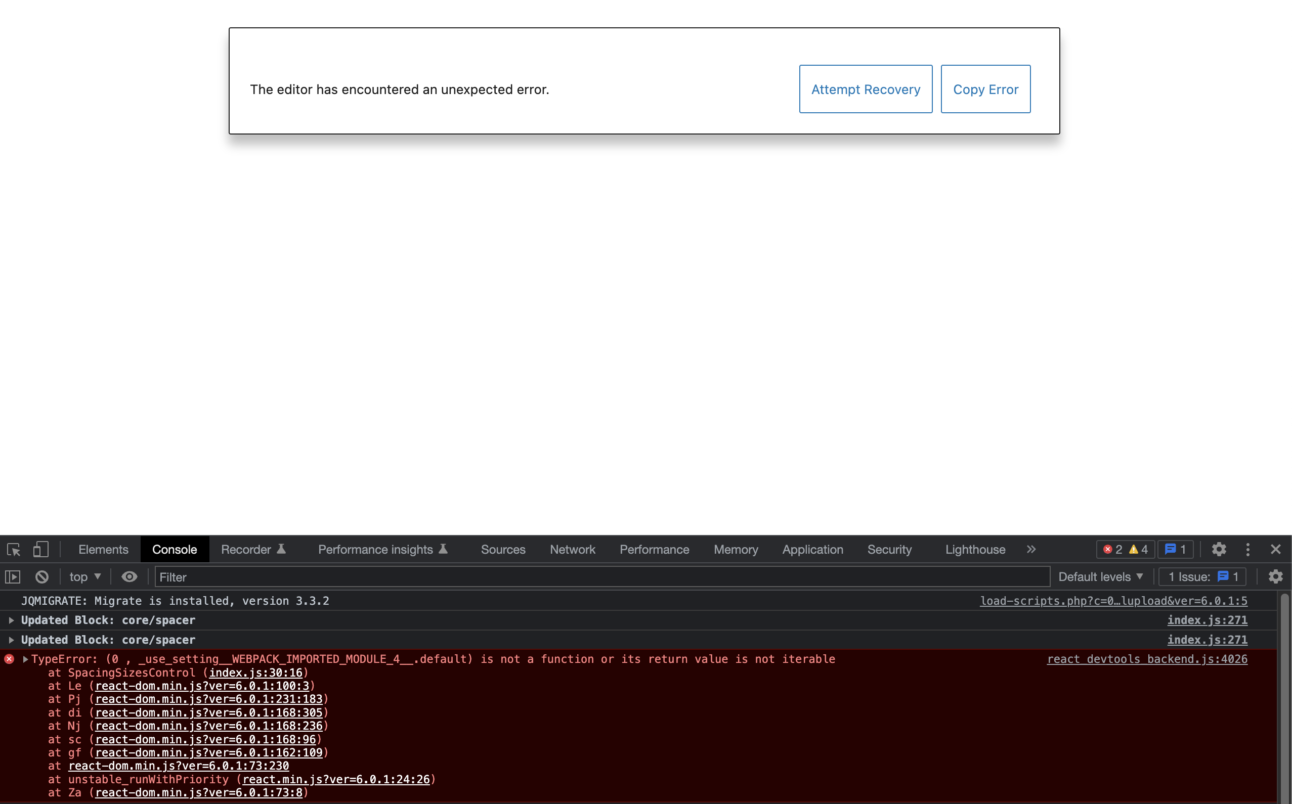 |
(I noticed this because I forgot to update my theme.json file after testing out #43105 🙂)
There was a problem hiding this comment.
Choose a reason for hiding this comment
The reason will be displayed to describe this comment to others. Learn more.
nice catch, let me think about that
…acing in global styles are applied in editor canvas
There was a problem hiding this comment.
Choose a reason for hiding this comment
The reason will be displayed to describe this comment to others. Learn more.
Thanks for all the follow-up @glendaviesnz! This is testing really well for me now, with a couple of non-blocking caveats.
✅ Using preset and custom values in the block editor is working well
✅ Using preset and custom values with constrained sides is working well
✅ Using preset and custom values in global styles is working well and the CSS variables are rendering correctly in the site editor
✅ With the dropdown list variant, the Default option is now working correctly in global styles, and displays the value set in theme.json as a custom value when it's the default
✅ Setting steps to 0 no longer crashes the editor or global styles
❓Caveats for the above — there's a slight styling issue with the BoxControl component in the post editor, and it looks like Global Styles needs the same conditional so that it'll display the BoxControl instead when no presets are available.
From my perspective, I think this PR is in a good place to merge. Tweaking the case of 0 presets being available could be tackled in a follow-up as the PR to allow steps of 0 only just merged (#43105) and there are no longer any fatals being thrown. And I think many of these tweaks will likely be easier in smaller PRs once this one lands. But feel free to fix them up here first if you'd prefer, of course!
Great work wrangling all the complexity here! 🎉
| @@ -77,6 +77,7 @@ export function DimensionsPanel( props ) { | |||
| <InspectorControls __experimentalGroup="dimensions"> | |||
| { ! isPaddingDisabled && ( | |||
| <ToolsPanelItem | |||
| className="tools-panel-item-spacing" | |||
There was a problem hiding this comment.
Choose a reason for hiding this comment
The reason will be displayed to describe this comment to others. Learn more.
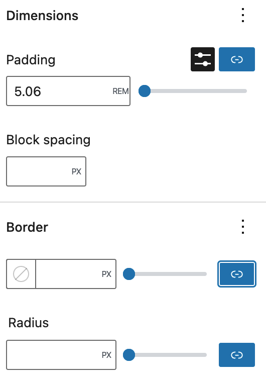
Styling nit: I think the styling changes here affect the position of the Unlink button in the BoxControl layout when the spacing presets are set to 0 steps:
| Trunk | This PR |
|---|---|
 |
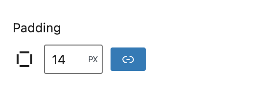 |
Since by default the spacing presets will be available, this feels like an edge case / bit of tweaking we could look into in a follow up to me.
| > | ||
| <BoxControl | ||
| <SpacingSizesControl |
There was a problem hiding this comment.
Choose a reason for hiding this comment
The reason will be displayed to describe this comment to others. Learn more.
It looks like this component needs the same logic as for the hooks/padding.js change where if there are no spacing presets we render the BoxControl instead. Otherwise it renders the RangeControl with only a single value:
Still, it's a good proof that the previous commit fixed up the fatal error that was happening, and it's technically usable as the user can switch to the custom input! 😄
The default for the toggle in the inspector should be 24x24. The fact that the link/unlink button isn't, is the errant behavior. Which is fine for one of us to look at separately — just wanted to clarify what the intended default is, so we don't optimize towards the legacy controls, which weren't as intentionally designed. |
Agreed. Took this for another run-through — its certainly coming together well! One bit I noticed is a delay in the applied padding visual (Chrome and Safari). If you take one step at a time, it's fine — but if you go through more than one before it applies the visual, the padding visual is off. CleanShot.2022-08-12.at.20.57.34.mp4 |
Thanks, @richtabor - the spacing visualiser has a number of issues on trunk currently, and the spacing presets just highlights these, I have added a note on the overview issue to follow up on this and try and get it working a bit more reliably. |
Thanks for confirming @jasmussen, will get that sorted in a follow-up PR before this makes it into a release. |
| }; | ||
|
|
||
| return ( | ||
| <fieldset role="region" className="component-spacing-sizes-control"> |
There was a problem hiding this comment.
Choose a reason for hiding this comment
The reason will be displayed to describe this comment to others. Learn more.
Any specific reason for this role="region"? It appears this conflicts with useNavigateRegions, especially in the Site Editor Will create a new issue.
There was a problem hiding this comment.
Choose a reason for hiding this comment
The reason will be displayed to describe this comment to others. Learn more.
Can't remember the reasoning, so do add a new issue thanks.
There was a problem hiding this comment.
Choose a reason for hiding this comment
The reason will be displayed to describe this comment to others. Learn more.
Thanks. Reported in #46509 together with other issues.


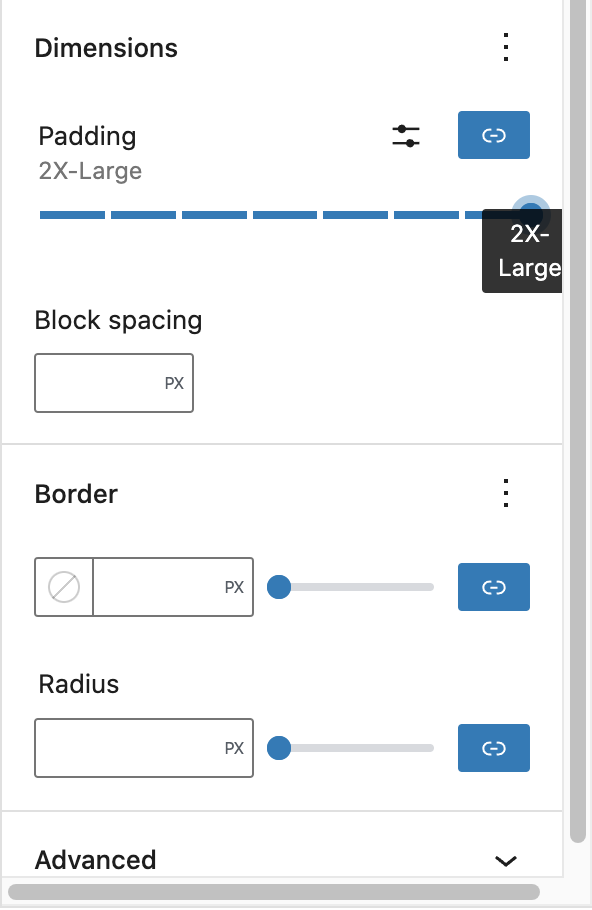
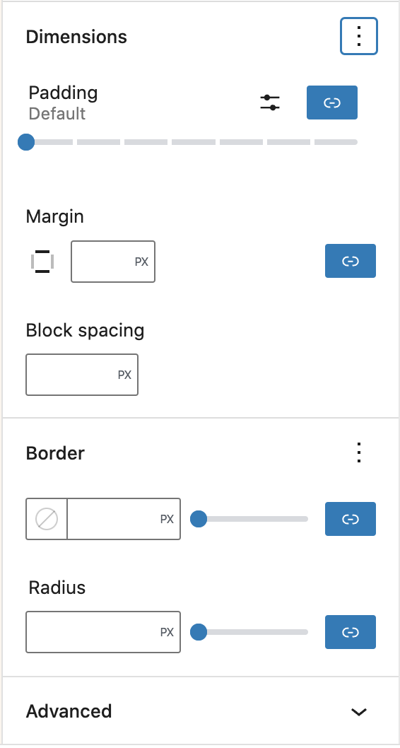

What?
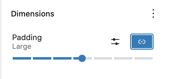
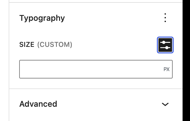
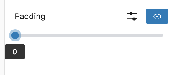
Add UI into the padding toolspanel control to allow for either a custom value to be entered or a preset spacing value to be selected
Why?
There needs to be an option for users and theme authors to specify a preset spacing size instead of having to enter a custom value every time
How?
Adds a new spacing sizes control to the editor components that can be shared between padding, margins, blockgap.
Currently this control is only applied to the padding settings.
Testing Instructions
theme.jsonincreasesettings.spacing.spacingScale.stepsto a value > 7 and check that segmented range is replaced with a select listScreenshots or screencast
presets.mp4