Skip to content
New issue

Have a question about this project? Sign up for a free GitHub account to open an issue and contact its maintainers and the community.

By clicking “Sign up for GitHub”, you agree to our terms of service and privacy statement. We’ll occasionally send you account related emails.

Already on GitHub? Sign in to your account

Borders: Add new BorderControl component #37769

Merged
merged 31 commits into from
Mar 24, 2022

Conversation

aaronrobertshaw
Copy link
Contributor

@aaronrobertshaw aaronrobertshaw commented Jan 7, 2022

Related:

Description

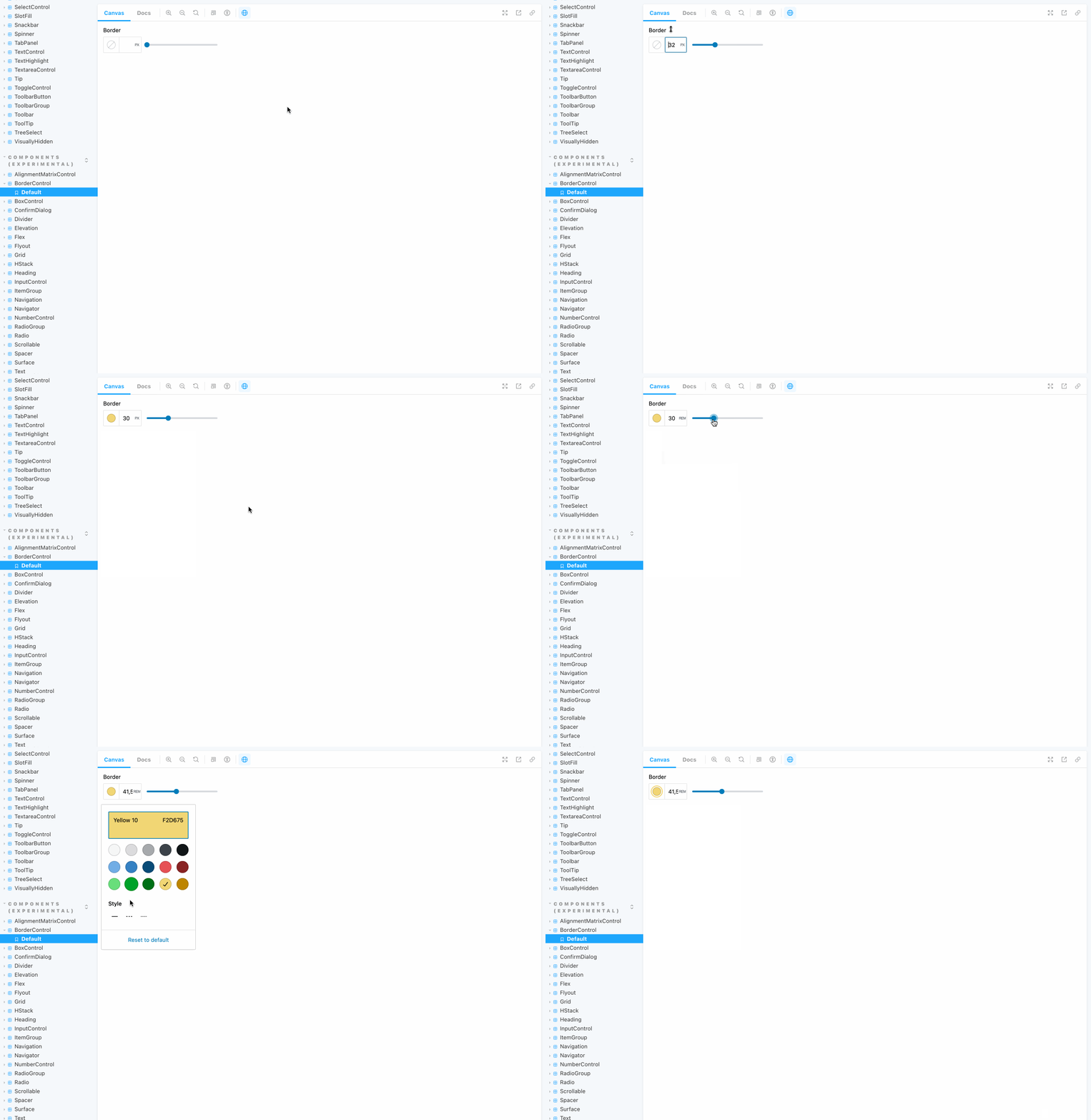
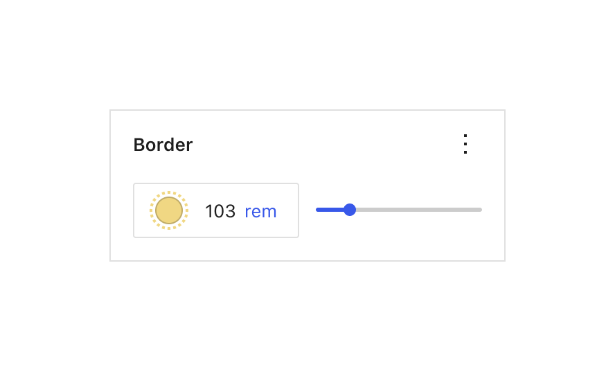
This PR adds a new BorderControl component aimed at improving the UX around configuring borders.

  • BorderControl
    • This allows the selection of a border color, style, and width.
    • Works off an object as its value e.g. { color: '#000000', style: 'solid', width: '0.5em' }
    • Can optionally display a slider for alternative means of setting border width.
    • Border style controls can be disabled
    • The color palettes used are configurable
    • The width of the input field is customizable

Note

The PR began life introducing two new components, BorderControl and BorderBoxControl. They have now been separated into separate PRs. Some of the implementation decisions in this were driven by the component's bigger picture use as part of the BorderBoxControl

How has this been tested?

Via unit tests;

  1. Run npm run test-unit packages/components/src/border-control/test/index.js

Manually:

  1. Checkout this PR branch
  2. Run npm run storybook:dev
  3. Check out the BorderControl

Screenshots

Types of changes

New feature.

Checklist:

  • My code is tested.
  • My code follows the WordPress code style.
  • My code follows the accessibility standards.
  • I've tested my changes with keyboard and screen readers.
  • My code has proper inline documentation.
  • I've included developer documentation if appropriate.
  • I've updated all React Native files affected by any refactorings/renamings in this PR (please manually search all *.native.js files for terms that need renaming or removal).
@aaronrobertshaw aaronrobertshaw added [Status] In Progress Tracking issues with work in progress [Feature] UI Components Impacts or related to the UI component system [Feature] Design Tools Tools that impact the appearance of blocks both to expand the number of tools and improve the experi labels Jan 7, 2022
@aaronrobertshaw aaronrobertshaw self-assigned this Jan 7, 2022
@github-actions
Copy link

github-actions bot commented Jan 7, 2022

Size Change: +8.79 kB (+1%)

Total Size: 1.21 MB

Filename Size Change
build/block-editor/index.min.js 146 kB +1 kB (+1%)
build/block-editor/style-rtl.css 15.1 kB +118 B (+1%)
build/block-editor/style.css 15.1 kB +114 B (+1%)
build/block-library/blocks/gallery/editor-rtl.css 961 B -4 B (0%)
build/block-library/blocks/gallery/editor.css 964 B -3 B (0%)
build/block-library/blocks/gallery/style-rtl.css 1.51 kB -101 B (-6%)
build/block-library/blocks/gallery/style.css 1.51 kB -103 B (-6%)
build/block-library/blocks/pullquote/style-rtl.css 370 B -19 B (-5%)
build/block-library/blocks/pullquote/style.css 370 B -18 B (-5%)
build/block-library/blocks/separator/editor-rtl.css 140 B +41 B (+41%) 🚨
build/block-library/blocks/separator/editor.css 140 B +41 B (+41%) 🚨
build/block-library/blocks/separator/theme-rtl.css 194 B +22 B (+13%) ⚠️
build/block-library/blocks/separator/theme.css 194 B +22 B (+13%) ⚠️
build/block-library/blocks/site-logo/editor-rtl.css 759 B +15 B (+2%)
build/block-library/blocks/site-logo/editor.css 759 B +15 B (+2%)
build/block-library/editor-rtl.css 10 kB +33 B (0%)
build/block-library/editor.css 10 kB +31 B (0%)
build/block-library/index.min.js 171 kB +2.61 kB (+2%)
build/block-library/style-rtl.css 11.2 kB -131 B (-1%)
build/block-library/style.css 11.2 kB -129 B (-1%)
build/block-library/theme-rtl.css 689 B +24 B (+4%)
build/block-library/theme.css 694 B +24 B (+4%)
build/blocks/index.min.js 46.8 kB +289 B (+1%)
build/components/index.min.js 221 kB +3.22 kB (+1%)
build/components/style-rtl.css 15.6 kB +70 B (0%)
build/components/style.css 15.6 kB +77 B (0%)
build/core-data/index.min.js 14.3 kB +136 B (+1%)
build/customize-widgets/index.min.js 11.2 kB +3 B (0%)
build/edit-navigation/index.min.js 16.1 kB -64 B (0%)
build/edit-navigation/style-rtl.css 4.04 kB +1 B (0%)
build/edit-navigation/style.css 4.05 kB +1 B (0%)
build/edit-post/index.min.js 29.8 kB +39 B (0%)
build/edit-post/style-rtl.css 7.07 kB +1 B (0%)
build/edit-post/style.css 7.07 kB +2 B (0%)
build/edit-site/index.min.js 45 kB +1.14 kB (+3%)
build/edit-site/style-rtl.css 7.58 kB +140 B (+2%)
build/edit-site/style.css 7.56 kB +137 B (+2%)
build/edit-widgets/index.min.js 16.5 kB -19 B (0%)
build/edit-widgets/style-rtl.css 4.4 kB +1 B (0%)
build/edit-widgets/style.css 4.39 kB +1 B (0%)
build/editor/index.min.js 38.4 kB +11 B (0%)
ℹ️ View Unchanged
Filename Size
build/a11y/index.min.js 993 B
build/admin-manifest/index.min.js 1.24 kB
build/annotations/index.min.js 2.77 kB
build/api-fetch/index.min.js 2.27 kB
build/autop/index.min.js 2.15 kB
build/blob/index.min.js 487 B
build/block-directory/index.min.js 6.49 kB
build/block-directory/style-rtl.css 1.01 kB
build/block-directory/style.css 1.01 kB
build/block-editor/default-editor-styles-rtl.css 378 B
build/block-editor/default-editor-styles.css 378 B
build/block-library/blocks/archives/editor-rtl.css 61 B
build/block-library/blocks/archives/editor.css 60 B
build/block-library/blocks/archives/style-rtl.css 65 B
build/block-library/blocks/archives/style.css 65 B
build/block-library/blocks/audio/editor-rtl.css 150 B
build/block-library/blocks/audio/editor.css 150 B
build/block-library/blocks/audio/style-rtl.css 111 B
build/block-library/blocks/audio/style.css 111 B
build/block-library/blocks/audio/theme-rtl.css 125 B
build/block-library/blocks/audio/theme.css 125 B
build/block-library/blocks/avatar/editor-rtl.css 59 B
build/block-library/blocks/avatar/editor.css 59 B
build/block-library/blocks/block/editor-rtl.css 161 B
build/block-library/blocks/block/editor.css 161 B
build/block-library/blocks/button/editor-rtl.css 445 B
build/block-library/blocks/button/editor.css 445 B
build/block-library/blocks/button/style-rtl.css 560 B
build/block-library/blocks/button/style.css 560 B
build/block-library/blocks/buttons/editor-rtl.css 292 B
build/block-library/blocks/buttons/editor.css 292 B
build/block-library/blocks/buttons/style-rtl.css 275 B
build/block-library/blocks/buttons/style.css 275 B
build/block-library/blocks/calendar/style-rtl.css 207 B
build/block-library/blocks/calendar/style.css 207 B
build/block-library/blocks/categories/editor-rtl.css 84 B
build/block-library/blocks/categories/editor.css 83 B
build/block-library/blocks/categories/style-rtl.css 79 B
build/block-library/blocks/categories/style.css 79 B
build/block-library/blocks/code/style-rtl.css 103 B
build/block-library/blocks/code/style.css 103 B
build/block-library/blocks/code/theme-rtl.css 124 B
build/block-library/blocks/code/theme.css 124 B
build/block-library/blocks/columns/editor-rtl.css 108 B
build/block-library/blocks/columns/editor.css 108 B
build/block-library/blocks/columns/style-rtl.css 406 B
build/block-library/blocks/columns/style.css 406 B
build/block-library/blocks/comment-author-avatar/editor-rtl.css 125 B
build/block-library/blocks/comment-author-avatar/editor.css 125 B
build/block-library/blocks/comment-template/style-rtl.css 127 B
build/block-library/blocks/comment-template/style.css 127 B
build/block-library/blocks/comments-pagination-numbers/editor-rtl.css 123 B
build/block-library/blocks/comments-pagination-numbers/editor.css 121 B
build/block-library/blocks/comments-pagination/editor-rtl.css 222 B
build/block-library/blocks/comments-pagination/editor.css 209 B
build/block-library/blocks/comments-pagination/style-rtl.css 235 B
build/block-library/blocks/comments-pagination/style.css 231 B
build/block-library/blocks/comments-query-loop/editor-rtl.css 95 B
build/block-library/blocks/comments-query-loop/editor.css 95 B
build/block-library/blocks/cover/editor-rtl.css 546 B
build/block-library/blocks/cover/editor.css 547 B
build/block-library/blocks/cover/style-rtl.css 1.56 kB
build/block-library/blocks/cover/style.css 1.56 kB
build/block-library/blocks/embed/editor-rtl.css 293 B
build/block-library/blocks/embed/editor.css 293 B
build/block-library/blocks/embed/style-rtl.css 417 B
build/block-library/blocks/embed/style.css 417 B
build/block-library/blocks/embed/theme-rtl.css 124 B
build/block-library/blocks/embed/theme.css 124 B
build/block-library/blocks/file/editor-rtl.css 300 B
build/block-library/blocks/file/editor.css 300 B
build/block-library/blocks/file/style-rtl.css 255 B
build/block-library/blocks/file/style.css 255 B
build/block-library/blocks/file/view.min.js 353 B
build/block-library/blocks/freeform/editor-rtl.css 2.44 kB
build/block-library/blocks/freeform/editor.css 2.44 kB
build/block-library/blocks/gallery/theme-rtl.css 122 B
build/block-library/blocks/gallery/theme.css 122 B
build/block-library/blocks/group/editor-rtl.css 159 B
build/block-library/blocks/group/editor.css 159 B
build/block-library/blocks/group/style-rtl.css 57 B
build/block-library/blocks/group/style.css 57 B
build/block-library/blocks/group/theme-rtl.css 78 B
build/block-library/blocks/group/theme.css 78 B
build/block-library/blocks/heading/style-rtl.css 114 B
build/block-library/blocks/heading/style.css 114 B
build/block-library/blocks/html/editor-rtl.css 332 B
build/block-library/blocks/html/editor.css 333 B
build/block-library/blocks/image/editor-rtl.css 731 B
build/block-library/blocks/image/editor.css 730 B
build/block-library/blocks/image/style-rtl.css 529 B
build/block-library/blocks/image/style.css 535 B
build/block-library/blocks/image/theme-rtl.css 124 B
build/block-library/blocks/image/theme.css 124 B
build/block-library/blocks/latest-comments/style-rtl.css 284 B
build/block-library/blocks/latest-comments/style.css 284 B
build/block-library/blocks/latest-posts/editor-rtl.css 199 B
build/block-library/blocks/latest-posts/editor.css 198 B
build/block-library/blocks/latest-posts/style-rtl.css 447 B
build/block-library/blocks/latest-posts/style.css 446 B
build/block-library/blocks/list/style-rtl.css 94 B
build/block-library/blocks/list/style.css 94 B
build/block-library/blocks/media-text/editor-rtl.css 266 B
build/block-library/blocks/media-text/editor.css 263 B
build/block-library/blocks/media-text/style-rtl.css 493 B
build/block-library/blocks/media-text/style.css 490 B
build/block-library/blocks/more/editor-rtl.css 431 B
build/block-library/blocks/more/editor.css 431 B
build/block-library/blocks/navigation-link/editor-rtl.css 708 B
build/block-library/blocks/navigation-link/editor.css 706 B
build/block-library/blocks/navigation-link/style-rtl.css 94 B
build/block-library/blocks/navigation-link/style.css 94 B
build/block-library/blocks/navigation-submenu/editor-rtl.css 299 B
build/block-library/blocks/navigation-submenu/editor.css 299 B
build/block-library/blocks/navigation-submenu/view.min.js 375 B
build/block-library/blocks/navigation/editor-rtl.css 2.03 kB
build/block-library/blocks/navigation/editor.css 2.04 kB
build/block-library/blocks/navigation/style-rtl.css 1.89 kB
build/block-library/blocks/navigation/style.css 1.88 kB
build/block-library/blocks/navigation/view.min.js 2.85 kB
build/block-library/blocks/nextpage/editor-rtl.css 395 B
build/block-library/blocks/nextpage/editor.css 395 B
build/block-library/blocks/page-list/editor-rtl.css 363 B
build/block-library/blocks/page-list/editor.css 363 B
build/block-library/blocks/page-list/style-rtl.css 175 B
build/block-library/blocks/page-list/style.css 175 B
build/block-library/blocks/paragraph/editor-rtl.css 157 B
build/block-library/blocks/paragraph/editor.css 157 B
build/block-library/blocks/paragraph/style-rtl.css 273 B
build/block-library/blocks/paragraph/style.css 273 B
build/block-library/blocks/post-author/style-rtl.css 175 B
build/block-library/blocks/post-author/style.css 176 B
build/block-library/blocks/post-comments-form/style-rtl.css 446 B
build/block-library/blocks/post-comments-form/style.css 446 B
build/block-library/blocks/post-comments/style-rtl.css 521 B
build/block-library/blocks/post-comments/style.css 521 B
build/block-library/blocks/post-excerpt/editor-rtl.css 73 B
build/block-library/blocks/post-excerpt/editor.css 73 B
build/block-library/blocks/post-excerpt/style-rtl.css 69 B
build/block-library/blocks/post-excerpt/style.css 69 B
build/block-library/blocks/post-featured-image/editor-rtl.css 721 B
build/block-library/blocks/post-featured-image/editor.css 721 B
build/block-library/blocks/post-featured-image/style-rtl.css 153 B
build/block-library/blocks/post-featured-image/style.css 153 B
build/block-library/blocks/post-template/editor-rtl.css 99 B
build/block-library/blocks/post-template/editor.css 98 B
build/block-library/blocks/post-template/style-rtl.css 323 B
build/block-library/blocks/post-template/style.css 323 B
build/block-library/blocks/post-terms/style-rtl.css 73 B
build/block-library/blocks/post-terms/style.css 73 B
build/block-library/blocks/post-title/style-rtl.css 80 B
build/block-library/blocks/post-title/style.css 80 B
build/block-library/blocks/preformatted/style-rtl.css 103 B
build/block-library/blocks/preformatted/style.css 103 B
build/block-library/blocks/pullquote/editor-rtl.css 198 B
build/block-library/blocks/pullquote/editor.css 198 B
build/block-library/blocks/pullquote/theme-rtl.css 167 B
build/block-library/blocks/pullquote/theme.css 167 B
build/block-library/blocks/query-pagination-numbers/editor-rtl.css 122 B
build/block-library/blocks/query-pagination-numbers/editor.css 121 B
build/block-library/blocks/query-pagination/editor-rtl.css 221 B
build/block-library/blocks/query-pagination/editor.css 211 B
build/block-library/blocks/query-pagination/style-rtl.css 234 B
build/block-library/blocks/query-pagination/style.css 231 B
build/block-library/blocks/query/editor-rtl.css 131 B
build/block-library/blocks/query/editor.css 132 B
build/block-library/blocks/quote/style-rtl.css 201 B
build/block-library/blocks/quote/style.css 201 B
build/block-library/blocks/quote/theme-rtl.css 223 B
build/block-library/blocks/quote/theme.css 226 B
build/block-library/blocks/read-more/style-rtl.css 132 B
build/block-library/blocks/read-more/style.css 132 B
build/block-library/blocks/rss/editor-rtl.css 202 B
build/block-library/blocks/rss/editor.css 204 B
build/block-library/blocks/rss/style-rtl.css 289 B
build/block-library/blocks/rss/style.css 288 B
build/block-library/blocks/search/editor-rtl.css 165 B
build/block-library/blocks/search/editor.css 165 B
build/block-library/blocks/search/style-rtl.css 397 B
build/block-library/blocks/search/style.css 398 B
build/block-library/blocks/search/theme-rtl.css 64 B
build/block-library/blocks/search/theme.css 64 B
build/block-library/blocks/separator/style-rtl.css 233 B
build/block-library/blocks/separator/style.css 233 B
build/block-library/blocks/shortcode/editor-rtl.css 474 B
build/block-library/blocks/shortcode/editor.css 474 B
build/block-library/blocks/site-logo/style-rtl.css 181 B
build/block-library/blocks/site-logo/style.css 181 B
build/block-library/blocks/site-tagline/editor-rtl.css 86 B
build/block-library/blocks/site-tagline/editor.css 86 B
build/block-library/blocks/site-title/editor-rtl.css 84 B
build/block-library/blocks/site-title/editor.css 84 B
build/block-library/blocks/social-link/editor-rtl.css 177 B
build/block-library/blocks/social-link/editor.css 177 B
build/block-library/blocks/social-links/editor-rtl.css 674 B
build/block-library/blocks/social-links/editor.css 673 B
build/block-library/blocks/social-links/style-rtl.css 1.37 kB
build/block-library/blocks/social-links/style.css 1.36 kB
build/block-library/blocks/spacer/editor-rtl.css 332 B
build/block-library/blocks/spacer/editor.css 332 B
build/block-library/blocks/spacer/style-rtl.css 48 B
build/block-library/blocks/spacer/style.css 48 B
build/block-library/blocks/table/editor-rtl.css 471 B
build/block-library/blocks/table/editor.css 472 B
build/block-library/blocks/table/style-rtl.css 481 B
build/block-library/blocks/table/style.css 481 B
build/block-library/blocks/table/theme-rtl.css 188 B
build/block-library/blocks/table/theme.css 188 B
build/block-library/blocks/tag-cloud/style-rtl.css 226 B
build/block-library/blocks/tag-cloud/style.css 227 B
build/block-library/blocks/template-part/editor-rtl.css 235 B
build/block-library/blocks/template-part/editor.css 235 B
build/block-library/blocks/template-part/theme-rtl.css 101 B
build/block-library/blocks/template-part/theme.css 101 B
build/block-library/blocks/text-columns/editor-rtl.css 95 B
build/block-library/blocks/text-columns/editor.css 95 B
build/block-library/blocks/text-columns/style-rtl.css 166 B
build/block-library/blocks/text-columns/style.css 166 B
build/block-library/blocks/verse/style-rtl.css 87 B
build/block-library/blocks/verse/style.css 87 B
build/block-library/blocks/video/editor-rtl.css 571 B
build/block-library/blocks/video/editor.css 572 B
build/block-library/blocks/video/style-rtl.css 173 B
build/block-library/blocks/video/style.css 173 B
build/block-library/blocks/video/theme-rtl.css 124 B
build/block-library/blocks/video/theme.css 124 B
build/block-library/common-rtl.css 934 B
build/block-library/common.css 932 B
build/block-library/reset-rtl.css 474 B
build/block-library/reset.css 474 B
build/block-serialization-default-parser/index.min.js 1.12 kB
build/block-serialization-spec-parser/index.min.js 2.83 kB
build/compose/index.min.js 11.2 kB
build/customize-widgets/style-rtl.css 1.39 kB
build/customize-widgets/style.css 1.39 kB
build/data-controls/index.min.js 663 B
build/data/index.min.js 8.19 kB
build/date/index.min.js 31.9 kB
build/deprecated/index.min.js 518 B
build/dom-ready/index.min.js 336 B
build/dom/index.min.js 4.53 kB
build/edit-post/classic-rtl.css 546 B
build/edit-post/classic.css 547 B
build/editor/style-rtl.css 3.71 kB
build/editor/style.css 3.71 kB
build/element/index.min.js 4.29 kB
build/escape-html/index.min.js 548 B
build/format-library/index.min.js 6.62 kB
build/format-library/style-rtl.css 571 B
build/format-library/style.css 571 B
build/hooks/index.min.js 1.66 kB
build/html-entities/index.min.js 454 B
build/i18n/index.min.js 3.79 kB
build/is-shallow-equal/index.min.js 535 B
build/keyboard-shortcuts/index.min.js 1.83 kB
build/keycodes/index.min.js 1.41 kB
build/list-reusable-blocks/index.min.js 1.75 kB
build/list-reusable-blocks/style-rtl.css 838 B
build/list-reusable-blocks/style.css 838 B
build/media-utils/index.min.js 2.94 kB
build/notices/index.min.js 957 B
build/nux/index.min.js 2.12 kB
build/nux/style-rtl.css 751 B
build/nux/style.css 749 B
build/plugins/index.min.js 1.98 kB
build/preferences/index.min.js 1.2 kB
build/primitives/index.min.js 949 B
build/priority-queue/index.min.js 611 B
build/react-i18n/index.min.js 704 B
build/react-refresh-entry/index.min.js 8.44 kB
build/react-refresh-runtime/index.min.js 7.31 kB
build/redux-routine/index.min.js 2.69 kB
build/reusable-blocks/index.min.js 2.24 kB
build/reusable-blocks/style-rtl.css 256 B
build/reusable-blocks/style.css 256 B
build/rich-text/index.min.js 11.1 kB
build/server-side-render/index.min.js 1.61 kB
build/shortcode/index.min.js 1.52 kB
build/token-list/index.min.js 668 B
build/url/index.min.js 1.99 kB
build/vendors/react-dom.min.js 38.5 kB
build/vendors/react.min.js 4.34 kB
build/viewport/index.min.js 1.08 kB
build/warning/index.min.js 280 B
build/widgets/index.min.js 7.21 kB
build/widgets/style-rtl.css 1.16 kB
build/widgets/style.css 1.16 kB
build/wordcount/index.min.js 1.07 kB

compressed-size-action

@aaronrobertshaw
Copy link
Contributor Author

@shaunandrews I think I have the first draft of the new border and border-box controls ready for some feedback if you have the time to take a look.

I've whittled it down to where there are only a couple of things left that would be good to get design feedback on.

These include:

  • Is the UX around "mixed" border values acceptable?
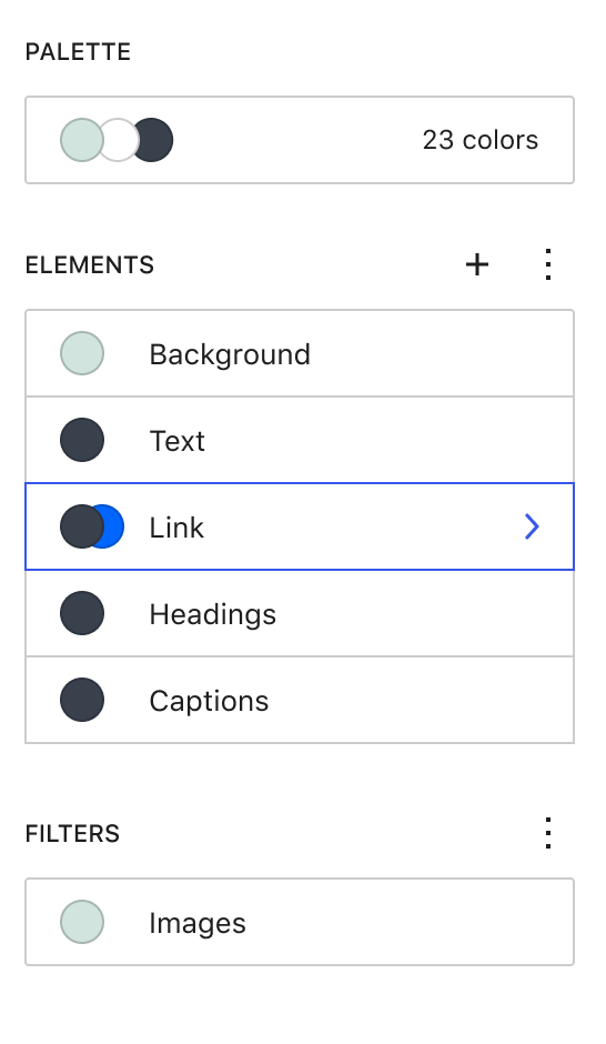
  • The color palette control has recently been updated to display multi-origin palettes (User, Theme etc). I've made this component capable of doing the same. (#37770 will demonstrate this aspect). Is this OK?
@aaronrobertshaw aaronrobertshaw force-pushed the try/combined-border-controls branch 3 times, most recently from 5d067c2 to 7be6d5d Compare February 1, 2022 03:55
@aaronrobertshaw
Copy link
Contributor Author

I've moved this PR out of the draft status. It will still have plenty of areas to improve but is ready for an initial round of feedback.

@aaronrobertshaw aaronrobertshaw marked this pull request as ready for review February 1, 2022 06:03
@aaronrobertshaw aaronrobertshaw changed the title [WIP] Borders: Add new BorderControl and BorderBoxControl components Feb 1, 2022
@ciampo ciampo requested a review from mirka February 1, 2022 08:54
@ciampo
Copy link
Contributor

ciampo commented Feb 1, 2022

Thank you @aaronrobertshaw for working on this PR, it's a great amount of work!

Before I go into a deeper review, I wanted to make a couple of higher-level considerations.

The first one is that these components look very tailored to the needs of the editor (ie. setting borders) — I wonder if other packages (like @wordpress/block-editor) are a better fit.

I know that we already have a few components in @wordpress/components that have a similar focus (e.g. DuotonePicker, FocalPointPicker, FontSizePicker, etc..), but on the other end the majority of "higher-level" control components are currently in @wordpress/block-editor.


The other main consideration is regarding the size of this PR. I read the disclaimer at the top, and I understand that this PR exists mainly for ease of testing / managing changes.

But, when reviewing these PRs in details, I'd prefer if we split them in smaller, iterative PRs.

To start, we could have a few small independent PRs:

  1. Fixing the TS errors in ColorPicker (big thanks about that, I'm curious to understand why these errors were not flagged?)
  2. Adding __unstableInputWidth to UnitControl
  3. Add the rest of the components to tsconfig.json (and add the `@ts-ignore tags)

At this point, we are going to be able to focus on BorderControl and BorderBoxControl — which, as you suggested, should also be tacked separately. BorderControl first, and BorderBoxControl as a dependent PR.

What do you think?

@aaronrobertshaw
Copy link
Contributor Author

Thanks for the initial feedback @ciampo 👍

The first one is that these components look very tailored to the needs of the editor (ie. setting borders) — I wonder if other packages (like @wordpress/block-editor) are a better fit.

I've discussed this with the team again today and the consensus was that the components package was the best home for these components.

Some of the reasoning for this includes:

  • The new components aren't dependent on anything in the block editor and could well be used in different UIs other than both the block and site editors.
  • 3rd party blocks or even core blocks might need to add these as a generic ad hoc control, importing it from the components package feels the most natural.
  • As you mentioned, there are numerous other components already in this package with a similar narrow focus and closely tied to real-world use in the block editor, e.g. Font size picker etc.
  • The BoxControl could be seen as a very similar "higher-level" component as well that resides in this package.
  • When previously adding components to the block editor (primarily the typography controls) there was discussion that they should have been added to the components package.
  • An upside of inclusion in the components package was the use of TypeScript and the components context system
  • If the decision of including these in the components package is valid either way, we can avoid unnecessary rework leaving them where they are. The components themselves would also benefit from the TS and Storybook aspects of the components package.

The other main consideration is regarding the size of this PR. I read the disclaimer at the top, and I understand that this PR exists mainly for ease of testing / managing changes.

As well as initial development.

If splitting this PR into 5 PRs as suggested occurs from the outset and we also then have the PRs exploring the use of these components for our end-goal purposes (which itself could be split) we get an unsustainable chain of PRs where excessive effort is spent switching branches to make minor edits forcing repeated rebases and increasing the likelihood of things being missed. I feel that effort is better spent refining the components and then once more stable, easily splitting the PR into reviewable chunks.

The intention is very much to get a general OK that these new components faithfully bring Shaun's design to life, their handling of mixed border values is suitable, and the general UX is improved. Then split up this large PR so it will be easy to review. Hence the disclaimer mentioned.

To start, we could have a few small independent PRs:

While the above occurs, I absolutely can begin splitting out the changes that aren't likely to change as you've suggested 👍

My plan is to have most of that done this afternoon.

Fixing the TS errors in ColorPicker (big thanks about that, I'm curious to understand why these errors were not flagged?)

My guess is no other typed components were using them and it wasn't included in the tsconfig.json.

Add the rest of the components to tsconfig.json (and add the `@ts-ignore tags)

I'm not sure this is truly "independent" but if it is satisfactory to simply note on the separate PR why these ignore checks are being added (so the components can be used in other typed components under development), then that's another easy one to split off.

It might actually need to be a part of the first suggested PR as adding the ColorPicker to the tsconfig.json will require its dependencies to be included as well. At least that was my experience while attempting to resolve the typing errors during development of these components.

What do you think?

In summary, I think we keep the new components in the components package. I will split out the basic typing changes/fixes into separate PRs now and separate the BorderControl and BorderBoxControl components pending a general thumbs up on their UX.

Thanks again for looking at this one! 🙂

Copy link
Contributor

@andrewserong andrewserong left a comment

Choose a reason for hiding this comment

The reason will be displayed to describe this comment to others. Learn more.

Fantastic work here @aaronrobertshaw! This is testing really nicely for me in Storybook 👍

I noticed a couple of tiny design things that we might want to tweak slightly. Hope you don't mind some detailed early testing notes! 😀

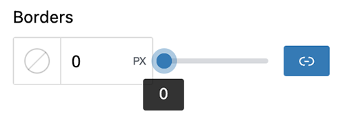
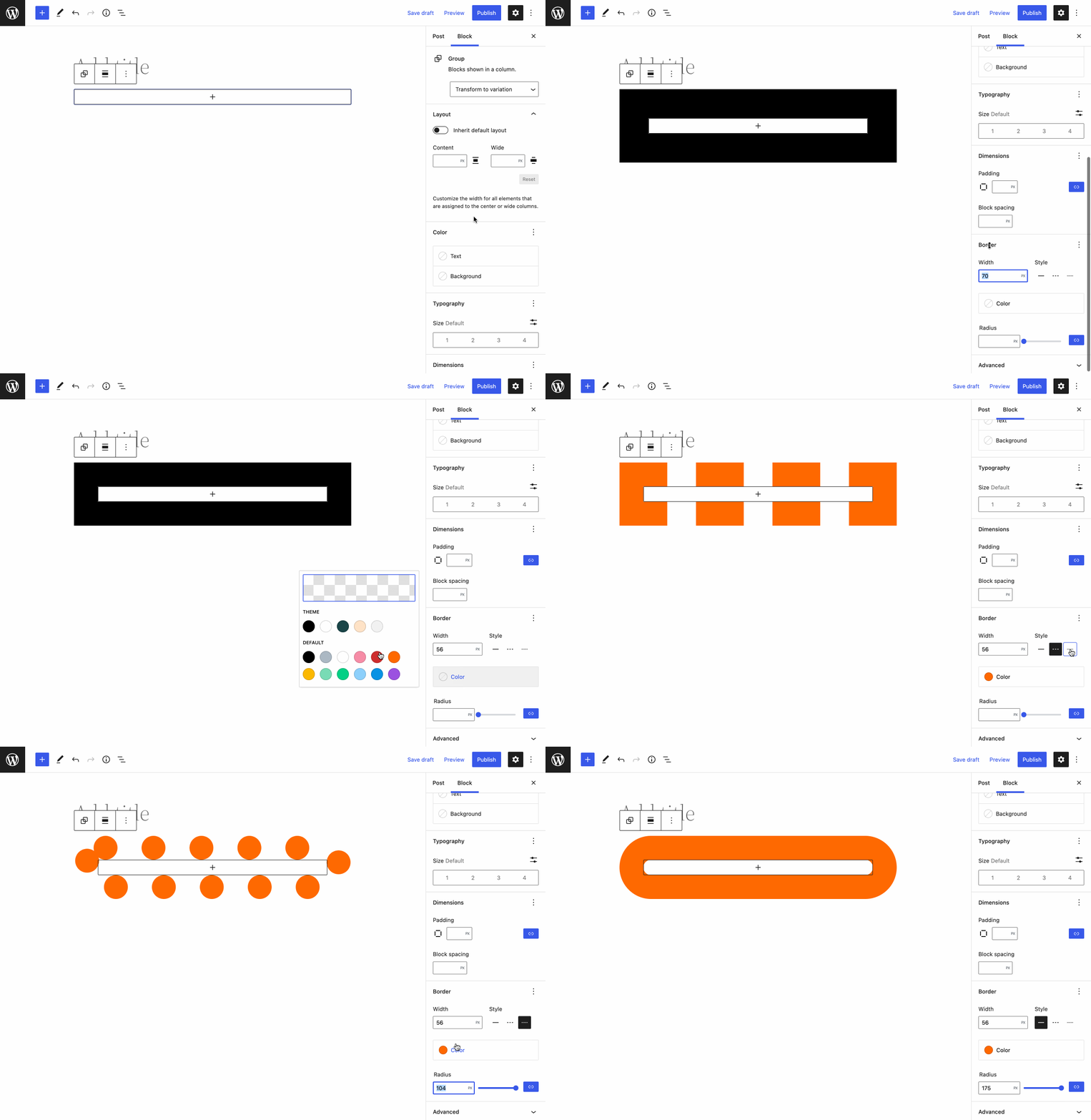
In the design in #35602, it looks like there's a little more horizontal spacing surrounding the slider to give it some breathing room. Here the focused state has the circle bump up against the border of the input control:

image

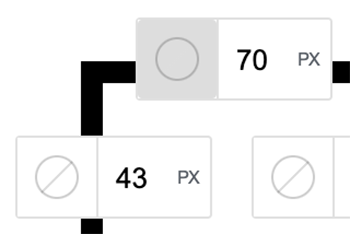
While clicking on the BorderDropdown component, if the color is currently empty the cross disappears in that active/target state. If you click quickly it effectively looks like it flickers a little when you click on it. Not sure if that's an issue? It also looks like there's a border radius on the grey colour, so it doesn't go to the full edges of the component.

image

Also in the above screenshot, with no colour selected, the border renders as a thick black border in the preview there. If someone's designing a border style where, say, they have a thick bright blue top / bottom border but want the left / right borders to be transparent, is there a more inconspicuous way that we can visually represent transparency?

Finally, in the known issues you mentioned the tooltip position and layout. It looks like the tooltips are showing immediately on clicking the BorderDropdown for me. Is that what you meant? In the below screengrab, I can see a few issues:

  • The tooltips show immediately on clicking the component
  • The tooltip position then moves to the right of the popover
  • It takes a little while for the close button icon to render in the correct position and size


In terms of the size of this PR, I'd actually be in favour of keeping much of it together in the one PR while you're iterating on it. It's really nice being able to test it all at once, and personally I don't mind the big changeset in terms of added files, given that there's a consistency to the conventions used, and many of the added or updated files are either quite small changes or readme additions.

Happy to do further testing / review if and when it helps!

@aaronrobertshaw
Copy link
Contributor Author

I've created separate PRs for the minor typing error fixes and ts-nocheck additions as promised:

As these get merged, I'll rebase this accordingly.

@aaronrobertshaw
Copy link
Contributor Author

I noticed a couple of tiny design things that we might want to tweak slightly. Hope you don't mind some detailed early testing notes! 😀

I always appreciate your detailed reviews @andrewserong. They are welcome any time 🙂

In the design in #35602, it looks like there's a little more horizontal spacing surrounding the slider to give it some breathing room. Here the focused state has the circle bump up against the border of the input control:

The difference here I believe is the focused state of the slider getting that extra ring around the slider's "dot" handle. I tried to stay true to the design however I didn't have a pixel-perfect design reference handy but that should be easily changed when we get some further design feedback.

It might also be worth noting that I put this alongside the border-radius control and made them consistent in terms of spacing between the input and the slider. If we change one to add breathing room I'd suggest we tweak the other too.

While clicking on the BorderDropdown component, if the color is currently empty the cross disappears in that active/target state. If you click quickly it effectively looks like it flickers a little when you click on it. Not sure if that's an issue?

This wasn't intended and is something I can definitely polish. Thanks!

Also in the above screenshot, with no colour selected, the border renders as a thick black border in the preview there.

This is because it should be rendering with the browser's default border color I believe, currentColor?

If someone's designing a border style where, say, they have a thick bright blue top / bottom border but want the left / right borders to be transparent, is there a more inconspicuous way that we can visually represent transparency?

If we have enableAlpha set to true for the color picker they should be able to choose a transparent color and that should be set on the border visualizer. They wouldn't see that transparent border but it wouldn't be the black color. I didn't see any easy way to clamp colors so there would always be some visible color for the control's UI purposes. I'm not sure if that is even desirable.

Finally, in the known issues you mentioned the tooltip position and layout. It looks like the tooltips are showing immediately on clicking the BorderDropdown for me. Is that what you meant?

The close button's tooltip is currently showing as the popover opens. Because the button has a flex layout the sibling span that gets included by the Tooltip then causes the icon to get squashed and small. The tooltips for the color swatches do not appear immediately but their positioning is also a problem.

In terms of the size of this PR, I'd actually be in favour of keeping much of it together in the one PR while you're iterating on it.

Sounds like a plan until this is ready for final review.

Happy to do further testing / review if and when it helps!

Thanks, they'll be plenty of testing and reviews to come 🙇

@ciampo
Copy link
Contributor

ciampo commented Feb 2, 2022

In summary, I think we keep the new components in the components package. I will split out the basic typing changes/fixes into separate PRs now and separate the BorderControl and BorderBoxControl components pending a general thumbs up on their UX.

Thanks again for looking at this one! 🙂

Thank you for looking into this, and being super available in creating smaller PRs. I will focus on reviewing those first, and will then come back to this PR for a more detailed look.

@jasmussen
Copy link
Contributor

I'm assuming you're suggesting to use the color flyout from within the current popover rather than "instead of"?

My apologies for being unclear, I'm using "flyout" as a fancy term for a popover that opens leftward instead of downward:
flyout

The designs in #35602 do share a little DNA with ItemGroup items in terms of being row-based, especially the combined border-swatch/border-width pill. So I'm simply suggesting the border controls panel opens leftwards in the same way as itemgroups do.

@aaronrobertshaw
Copy link
Contributor Author

My apologies for being unclear

I think this is more a case of me being a bit slow after some AFK. Thanks for the clarification 🙂

So I'm simply suggesting the border controls panel opens leftwards in the same way as itemgroups do.

I'm working through some refinements for both this and the BorderBoxControl so should have this sorted early next week.

@jasmussen
Copy link
Contributor

This is an extremely badly stitched together mockup cobbled together of bits and pieces, just to illustrate what I mean:

Screenshot-2022-03-18-at-09 19 20

Key here being that it'd be nice to reuse the same interface we use for colors, here.

@aaronrobertshaw
Copy link
Contributor Author

Key here being that it'd be nice to reuse the same interface we use for colors, here.

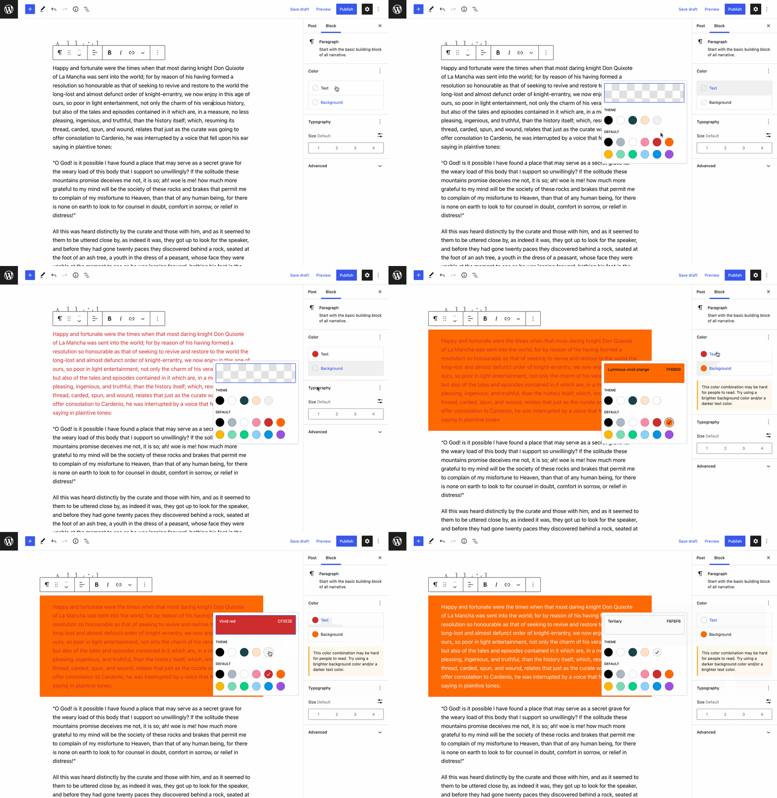
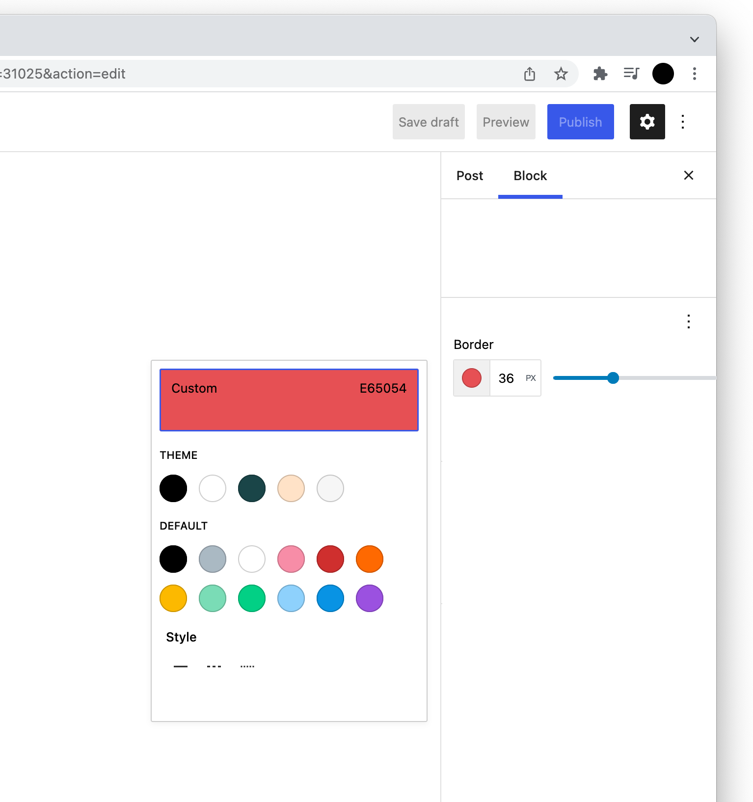
The current popover for the BorderControl uses the same ColorPalette component as the color interface's flyout. The storybook examples for the BorderControl haven't had their colours setup with multiple origins at this stage.

The demo of the BorderBoxControl and updated border support in #37770 reflects how it looks with multi-origin colors.

Am I correct that the points of difference between the above mockup and what we have currently are:

  • Positioning of the flyout
  • Removal of "Border color" heading and close button
  • Removal of the "Reset to defaults" button

Or, are these differences (other than the positioning) just part of the fact it was a quickly stitched together mockup?


Positioning of the flyout

I'll make this change once I'm clear on what other changes are needed for the flyout.

Removal of "Border color" heading and close button

I'm no designer but it feels like removing these makes the style options look even more like an afterthought, jammed into that flyout.

Any ideas on improving the delineation there between the color palette and styles?

Removal of the "Reset to defaults" button

We need this button to facilitate clearing custom colors without undoing width selections as well. Otherwise, after selecting a custom color you need to click a named color, then click it a second time to actually clear the border color.

@jasmussen
Copy link
Contributor

There are definitely limitations because of it being stitched together like this! So don't take this as a major shift. It's almost certainly fine to land this one as-is.

I'm mainly looking a bit forward, and it would be nice to unify as many of these disparate interfaces, as makes sense.

Removal of "Border color" heading and close button

Behaving the same as the color flyouts, by being placed to the left of a toggled-state ItemGroup item, the flyout would have context from its "opener". The panel itself by virtue of not having to fit within the 280px limitations of the inspector, would also afford both a wider and a taller canvas to put controls.

If you need to put the style controls at the top, that would be an option too. Yes, we definitely need better palette and color swatch management — also a separate task to this PR — right now if a theme registers too many colors, the interface becomes unwieldy.

In terms of leveraging the flyout, for context and canvas size benefits as mentioned above, #39427 details similar changes to the cover block, reducing the prominence of the focal point picker but still making it conveniently available in context of what you're doing. #39452 similarly does so for duotones.

Removal of the "Reset to defaults" button

I don't think we'd be able to do this unless we made bigger changes to the control, whether that be ToolsPanel integration, or otherwise. I didn't intentionally omit that from the cobbled-together mockup!

This passes through the __experimentalIsRenderedInSidebar prop to the border control dropdown which can then use that to determine the dropdown's position.
@aaronrobertshaw
Copy link
Contributor Author

So don't take this as a major shift. It's almost certainly fine to land this one as-is.

Given a little uncertainty around how we want the color/style dropdown to look, I've just added a prop to toggle its display for now. This is included in the Storybook example controls so it can be evaluated. Along those same lines, I've added the ability to toggle multi-origin colors as we have in the block/site editors presently.

Tooltips within the popover aren't laid out correctly and impact layout.

I'm still looking into this issue. It appears that in the storybook example, the tooltip popovers are being rendered within the dropdown's popover. That nesting might be the root cause.

@aaronrobertshaw
Copy link
Contributor Author

Now the issue with the misaligned tooltips has been resolved (535cd0d) I think this is in a position that we can merge it and make any tweaks via followups.

My only question is whether the recent addition of a prop to toggle display of the color/style dropdown header is acceptable.

Merging this will help unblock the PR creating the BorderBoxControl and another updating the border block support to use these controls and offer individual side border support. Not to mention the various issues and PRs wishing to adopt border support on core blocks more widely.

@ciampo, @mirka, and @jasmussen do you have any thoughts or objections to landing this one?

@jasmussen
Copy link
Contributor

Taking another look! Here's what we have today:
currently

That's a biggish panel for borders, with lots of atomic controls.

Here's a GIF of the new border panel:

new

I like that there's DNA shared with ItemGroup items. The ItemGroup from Global Styles is meant to look like this:

Screenshot 2022-03-23 at 08 44 19

That is, each Item is 40px tall, 8px top/bottom padding, 16px left/right padding. Since the ItemGroup in Global Styles is already a little off on those metrics in trunk, design and components teams can probably take a separate look at massaging those paddings and heights, making sure they all align. But each control as a conceptual row, is something that works very well for the ToolsPanel, and especially the plus mechanic. So even if the new Border control doesn't leverage the ToolsPanel approach, it's a good direction 👍 👍

I still think we should move towards a flyout that opens leftward, just like they do from Items. Doesn't need to block this one, but it's something we need to address at some point. It's mainly a directional change, and it comes with a few new metrics/paddings of the flyout.

Can we use 50% of the column for the border unit and 50% for the slider? Right now it gets a bit compressed with high values and long units:
Screenshot 2022-03-23 at 08 41 31

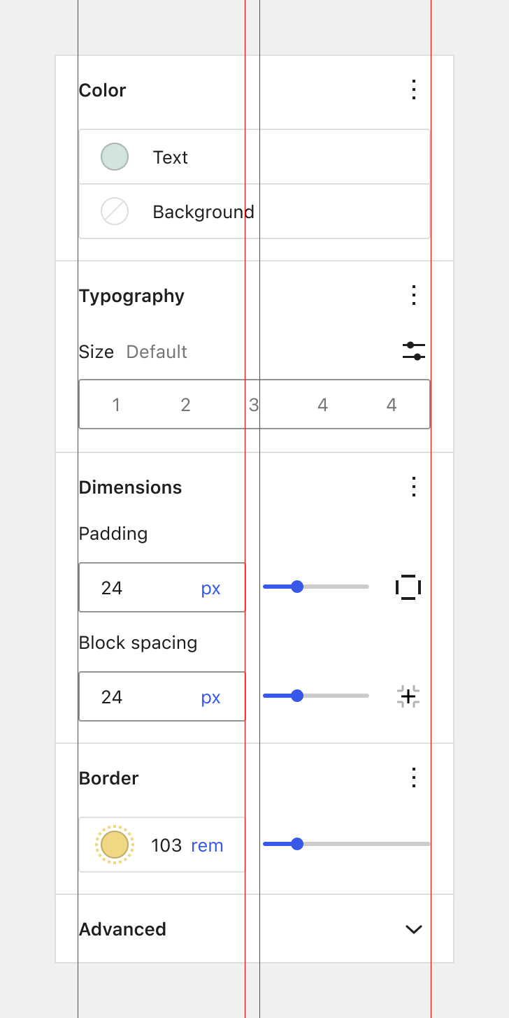
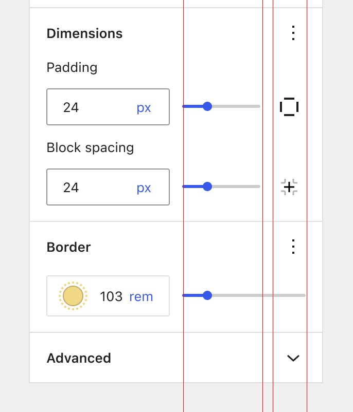
Tying it all together, you could end up with something like this:

controls

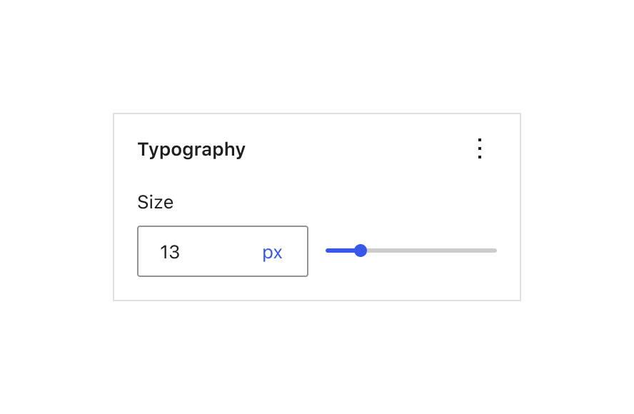
The larger footprint would afford the 16px padding left and right in the Item, it would afford the future blue 13px unit selector, even for REM units and large values, and it'd share metrics with the ItemGroup. And it would line up with other slider+input based controls:

typography

Does all that have to happen in this PR? No, but it's an idea for where we could take this in the future, so as long as the current PR doesn't paint ourselves into a corner with regards to getting there, seems fine to land!

Nice work.

@aaronrobertshaw
Copy link
Contributor Author

Thanks for the thoughtful feedback @jasmussen 👍

I still think we should move towards a flyout that opens leftward, just like they do from Items. Doesn't need to block this one, but it's something we need to address at some point.

The dropdown for this component gets given the same position as the flyouts you are referring to. Within the storybook though the component doesn't get the same treatment as it would within the context of the block editor so I don't think we should get too hung up on that at this stage.

I will address these concerns while refining #37770 and thus before it lands in the block or site editors.

Can we use 50% of the column for the border unit and 50% for the slider?

The BorderControl component has options to configure the width of the input however the consumer sees fit. So to answer your question, yes, we can use a 50% input width. If we so choose, I can make this the default width/sizing for the component in a follow-up.

Another thing to consider here is this component ( BorderControl ) won't be used in the block editor directly. It will be included as a subcomponent of the BorderBoxControl. This changes things just a little as the BorderBoxControl needs the button to link/unlink the different side borders.

Does all that have to happen in this PR? No, but it's an idea for where we could take this in the future, so as long as the current PR doesn't paint ourselves into a corner with regards to getting there, seems fine to land!

Hopefully, the answers above show we shouldn't be painted into a corner landing this. I'll wait for green lights from Marco and Lena before I pull the trigger.

@jasmussen
Copy link
Contributor

jasmussen commented Mar 23, 2022

The dropdown for this component gets given the same position as the flyouts you are referring to. Within the storybook though the component doesn't get the same treatment as it would within the context of the block editor so I don't think we should get too hung up on that at this stage.

🚀 — my bad!

component has options to configure the width of the input however the consumer sees fit. So to answer your question, yes, we can use a 50% input width. If we so choose, I can make this the default width/sizing for the component in a follow-up.

Are we sure it's a good idea to allow this width? I would expect the whole component, including the slider, to be always the full width of its container and scale as best it can using built-in min/max values inside. It doesn't seem like there's a tremendous value in allowing arbitrary widths of the inner pieces of the component.

Right now we have a great deal of vertical misalignment going on in panels:
Screenshot 2022-03-23 at 09 31 54

Even though #27331 is closed now, that's one of the primary efforts that was meant to be addressed. Components should size themselves smartly according to what was shown and hidden, so that things would line up across. Quick and dirty doodle:
alternative

This changes things just a little as the BorderBoxControl needs the button to link/unlink the different side borders.

As shown in the block-spacing/padding mockups above, this can still work by letting the link/unlink button be part of the 50% space occupied by the slider:
Screenshot 2022-03-23 at 09 41 22

That's all to say: if we can rely on intrinsic behaviors for each of these ingredients, hopefully it can put is in a much better place. What do you think?

Copy link
Member

@mirka mirka left a comment

Choose a reason for hiding this comment

The reason will be displayed to describe this comment to others. Learn more.

No blockers on my end, I think we can iterate after merging 🚀 Great work!

@aaronrobertshaw
Copy link
Contributor Author

Thanks for the extra thoughts and explanations @jasmussen 👍

Are we sure it's a good idea to allow this width?

Given we are creating a package of components that could be used to build any UI, I'd say the flexibility is desirable.

I wonder if we are focussing too much on how the component will be used, shown or configured in our editors at the moment. This PR and the BorderBoxControl one create these new components as part of the components package only. So long as they can be set up to address the vertical alignment concerns you raised once we include them in our editor sidebars, I think we are in a good place.

I would expect the whole component, including the slider, to be always the full width of its container and scale as best it can using built-in min/max values inside. It doesn't seem like there's a tremendous value in allowing arbitrary widths of the inner pieces of the component.

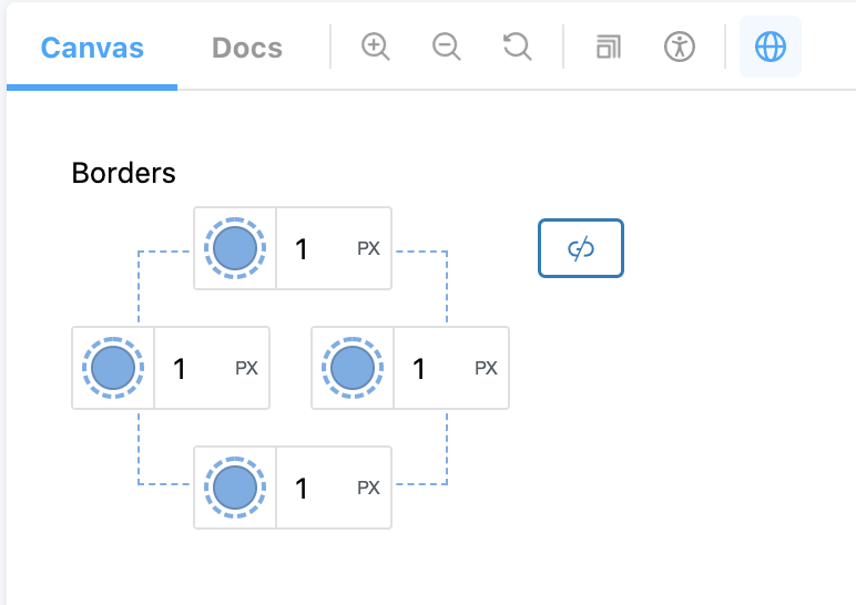
The BorderBoxControl I linked to in the PR description and other replies, uses this BorderControl component in a way that isn't the full width of its container (and minus the slider). See the split (unlinked) border controls:

Screen Shot 2022-03-24 at 9 20 30 am

As shown in the block-spacing/padding mockups above, this can still work by letting the link/unlink button be part of the 50% space occupied by the slider:

At present the BorderBoxControl in its "linked" view is made up of a BorderControl and a button sibling. This will make the 50% input slightly trickier to configure by default. Again though, this is something we can sort out in the context of our editors.

I'm happy to work on refining the default widths/sizing in a follow-up.

@glendaviesnz
Copy link
Contributor

I'm happy to work on refining the default widths/sizing in a follow-up.

Given the existing size and length running of this PR I think merging it based on the approval and then adding some follow-ups for the width/sizing issues is a good approach.

@aaronrobertshaw
Copy link
Contributor Author

Given the existing size and length running of this PR I think merging it based on the approval and then adding some follow-ups for the width/sizing issues is a good approach.

Thanks for the sanity check. I'll get this merged. 🚢

I think we can use the PR updating the border block support to focus the discussion around sizing and vertical alignments and inform it via that real-world use case.

Sign up for free to join this conversation on GitHub. Already have an account? Sign in to comment
Labels
[Feature] Design Tools Tools that impact the appearance of blocks both to expand the number of tools and improve the experi [Feature] UI Components Impacts or related to the UI component system Needs Design Feedback Needs general design feedback. [Status] In Progress Tracking issues with work in progress
7 participants