Skip to content
New issue

Have a question about this project? Sign up for a free GitHub account to open an issue and contact its maintainers and the community.

By clicking “Sign up for GitHub”, you agree to our terms of service and privacy statement. We’ll occasionally send you account related emails.

Already on GitHub? Sign in to your account

Revisit the bundled block patterns #29973

Merged
merged 44 commits into from
Apr 19, 2021

Conversation

MaggieCabrera
Copy link
Contributor

Description

This PR adds the block patterns discussed in #28921

How has this been tested?

These have been tested using Empty Theme

Screenshots

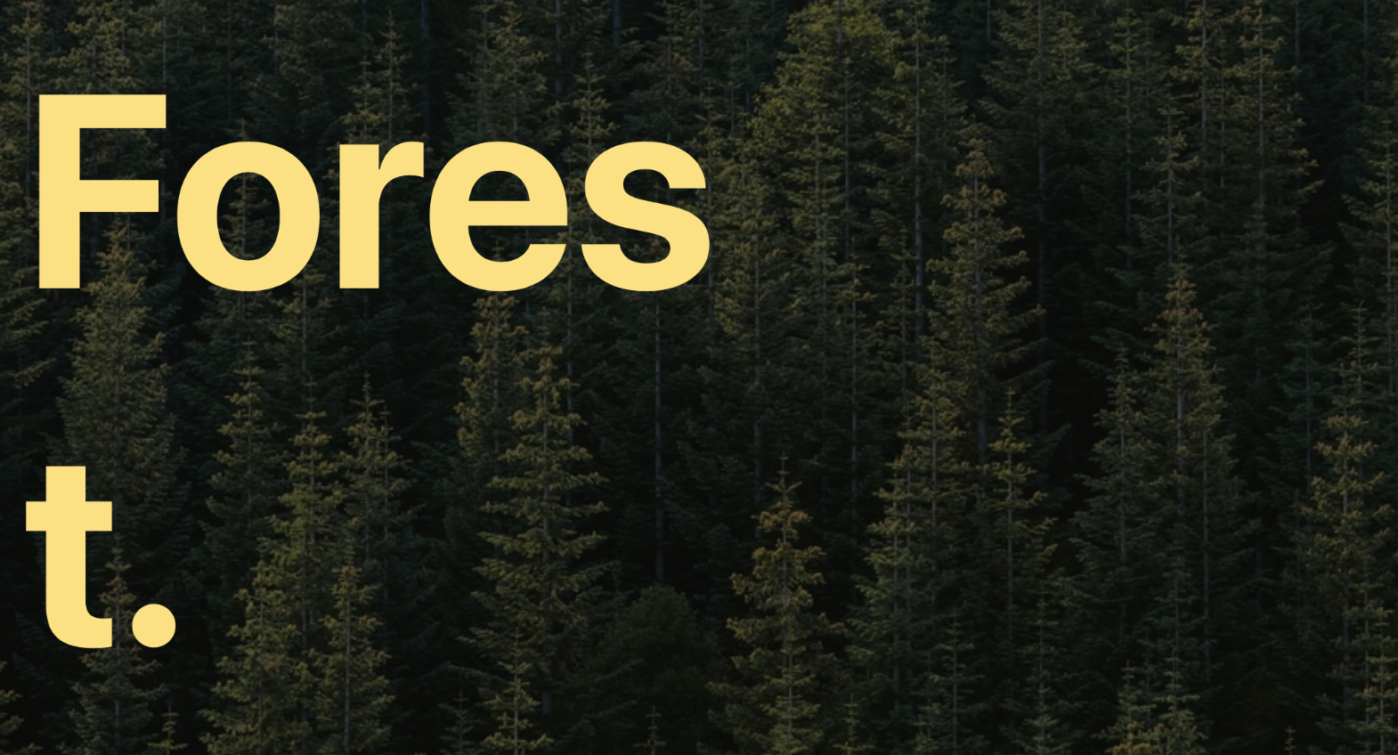
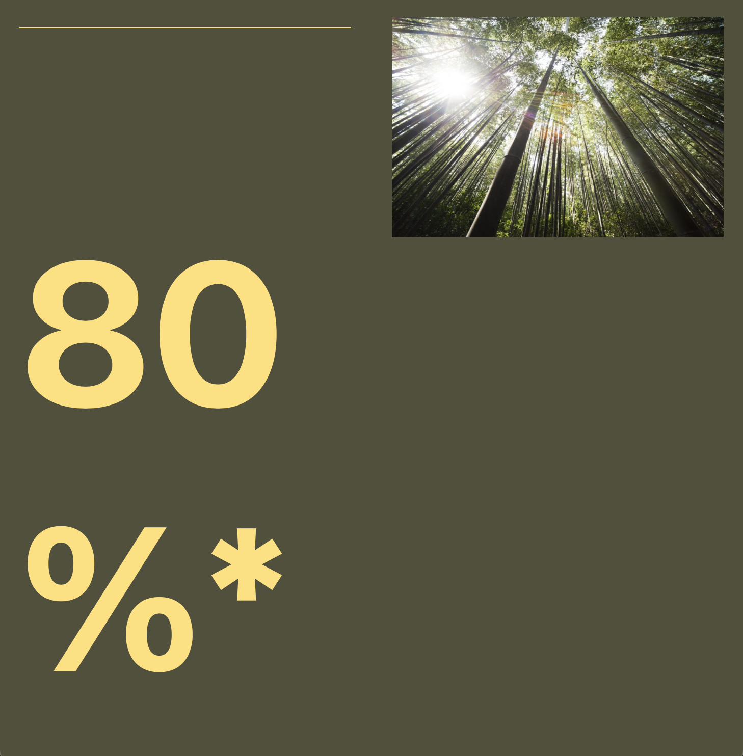
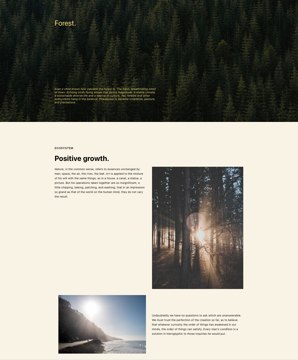
Nature

FireShot Capture 005 - Edit Post ‹ freethemes-dev-site — WordPress - freethemes local

Art

FireShot Capture 008 - Edit Post ‹ freethemes-dev-site — WordPress - freethemes local

Architecture

FireShot Capture 011 - Add New Post ‹ freethemes-dev-site — WordPress - freethemes local

Types of changes

New feature

Checklist:

  • My code is tested.
  • My code follows the WordPress code style.
  • My code follows the accessibility standards.
  • I've tested my changes with keyboard and screen readers.
  • My code has proper inline documentation.
  • I've included developer documentation if appropriate.
  • I've updated all React Native files affected by any refactorings/renamings in this PR.
@scruffian scruffian added [Feature] Patterns A collection of blocks that can be synced (previously reusable blocks) or unsynced [Feature] Pattern Directory The Pattern Directory, a place to find patterns and removed [Feature] Pattern Directory The Pattern Directory, a place to find patterns labels Mar 18, 2021
);
}

register_block_pattern_category( 'nature', array( 'label' => _x( 'Nature', 'Block pattern category' ) ) );
Copy link
Member

Choose a reason for hiding this comment

The reason will be displayed to describe this comment to others. Learn more.

I think the categories should be a bit more functional: text, columns, galleries, hero / cover, etc. Can we revise them?

Copy link
Contributor

Choose a reason for hiding this comment

The reason will be displayed to describe this comment to others. Learn more.

Agreed — I've left some category recommendations below.

@kjellr
Copy link
Contributor

kjellr commented Mar 18, 2021

I'm sharing some feedback (and suggested categories) for each of the patterns below. I need to do another round of testing these on mobile to see how they scale down on mobile, so stay tuned for that.

I also noticed that this new set doesn't include any replacements for the "Buttons" patterns that are currently bundled with core. I think it makes sense to keep those around, so either myself, @beafialho, or @melchoyce will share a couple updated button-only patterns in this thread later today.


Media + text Two Images side by side
Screen Shot 2021-03-18 at 9 05 38 AM Screen Shot 2021-03-18 at 9 08 54 AM
Let's rename to "Media & text in a full height container" (Category: Headers) Let's just make the "I" in "Images" lowercase. (Category: Gallery)

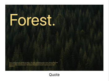
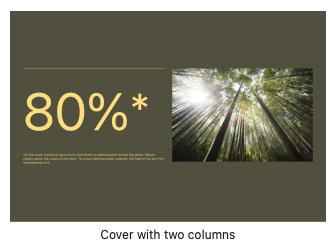
Quote Cover with two columns
Screen Shot 2021-03-18 at 9 12 32 AM Screen Shot 2021-03-18 at 9 10 16 AM
Let's rename to "Large header with left-aligned text". (Category: Headers) Let's rename to "Large header with two columns". (Category: Headers)

Three columns with images and text Quote with portrait
Screen Shot 2021-03-18 at 9 14 14 AM Screen Shot 2021-03-18 at 9 14 17 AM
(Category: Gallery) Let's rename to just "Quote", so it replaces the existing default Quote pattern. (Category: Text)

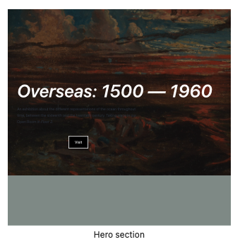
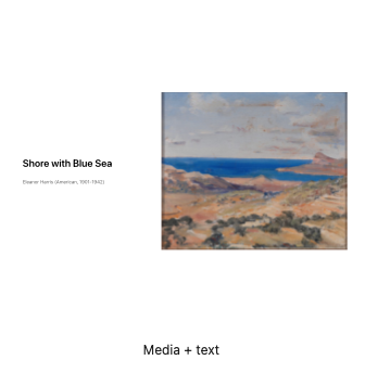
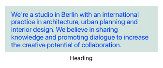
Hero section Media + text
Screen Shot 2021-03-18 at 9 18 12 AM Screen Shot 2021-03-18 at 9 18 31 AM
Rename to "Large header with text and a button. I think the text needs a white color assigned. (Category: Headers) Rename to "Media & text with image on the right", and remove the wrapping cover block. (Category: Headers)

Two columns text and title Three columns list
Screen Shot 2021-03-18 at 9 21 25 AM Screen Shot 2021-03-18 at 9 21 37 AM
Rename to "Two columns of text with offset heading"(Category: Text) Rename to "Three columns of text".(Category: Text)

Two columns text and title After
Screen Shot 2021-03-18 at 9 22 11 AM Screen Shot 2021-03-18 at 9 26 42 AM
Rename to "Two columns of text" to replace the existing default pattern with this title. (Category: Text) I think we should remove the blue text color here, and let it inherit the theme's default. (Category: Text)

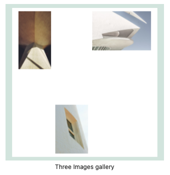
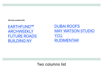
Three Images Gallery Two Columns list
Screen Shot 2021-03-18 at 9 28 47 AM Screen Shot 2021-03-18 at 9 28 52 AM
Rename to "Three columns with offset images", remove white background color for the columns block — this can just inherit the theme's default background. (Category: Gallery) Rename to "Two columns of text". Remove white background color and text/link colors — these can just inherit the theme's defaults. (Category: Text)

Three Images Gallery
Screen Shot 2021-03-18 at 9 32 51 AM
Rename to "Media and text with image on the right". Let's also rebuild this to use a Media & Text block instead of the two columns it uses now. (Category: Headers)
@kjellr
Copy link
Contributor

kjellr commented Mar 18, 2021

also noticed that this new set doesn't include any replacements for the "Buttons" patterns that are currently bundled with core. I think it makes sense to keep those around, so either myself, @beafialho, or @melchoyce will share a couple updated button-only patterns in this thread later today.

Here's an additional buttons-only pattern from @beafialho that we can include.

Title: Two Buttons
Category: Buttons

@kjellr
Copy link
Contributor

kjellr commented Mar 18, 2021

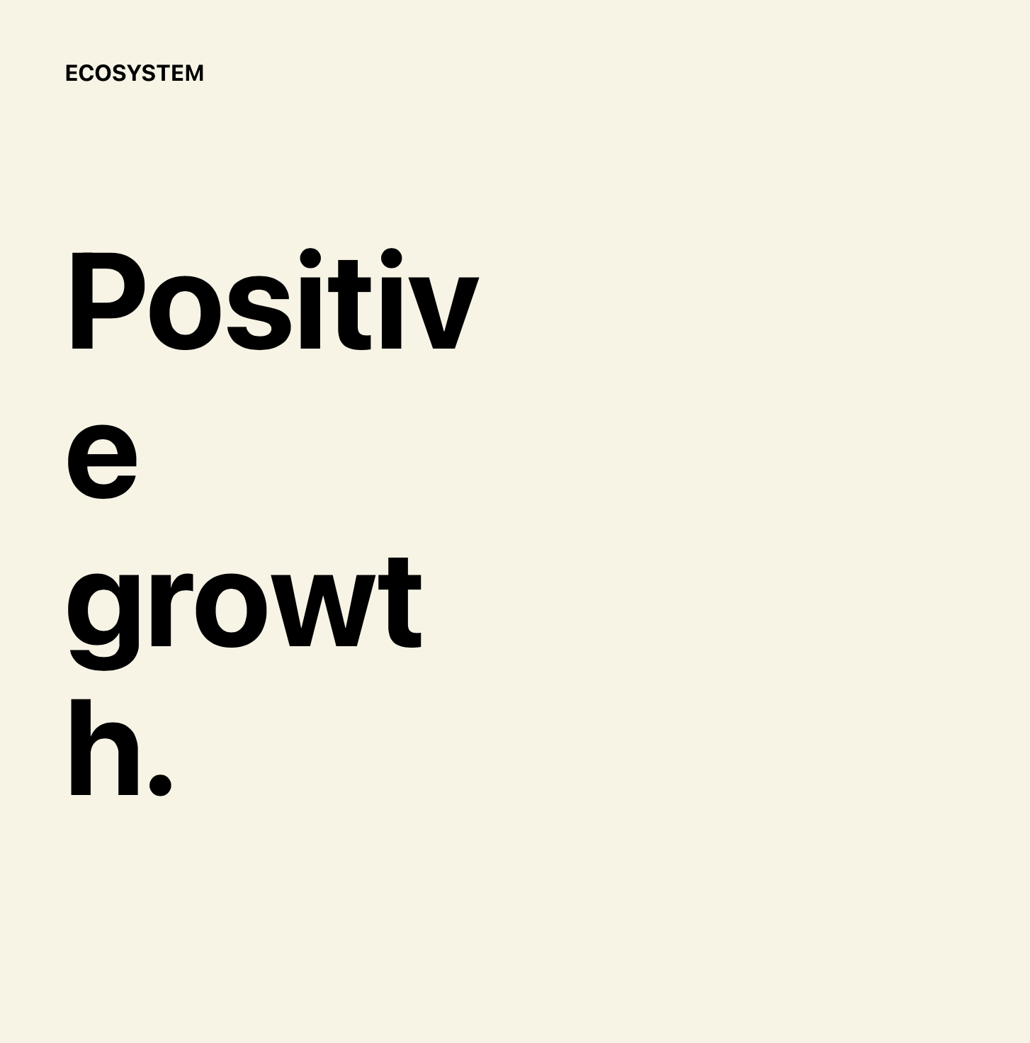
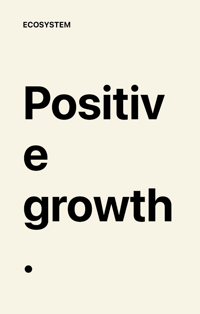
I checked the responsive behavior of these, and there are a ton of issues with the ones that use larger text. For themes that don't have wide content widths (Like Twenty Fifteen for example), this is a problem all the time, not just on smaller screens.

I don't think we'll be able to get those working as designed unless we have a fluid font-size option available, as per #23323 or #24480.

We could technically make the font size smaller for these, but it's going to negatively effect the design. 😞 I'm interested in other designers' thoughts on this.

Screenshots

Screen Shot 2021-03-18 at 2 32 28 PM

Screen Shot 2021-03-18 at 2 32 36 PM

Screen Shot 2021-03-18 at 2 35 02 PM

Screen Shot 2021-03-18 at 2 35 17 PM

Screen Shot 2021-03-18 at 2 35 31 PM

Screen Shot 2021-03-18 at 2 35 50 PM

Screen Shot 2021-03-18 at 2 36 21 PM

@mtias
Copy link
Member

mtias commented Mar 18, 2021

Let's try to add variable font-size and see if that works. I'm interested in a solution that makes things work well by default without a lot of tweaks at every breakpoint.

@kjellr
Copy link
Contributor

kjellr commented Mar 18, 2021

If Gutenberg added the option of using vw units for custom font sizes, we'd be able to get these working pretty smoothly out of the box.

@MaggieCabrera
Copy link
Contributor Author

Aren't custom units something a theme opts in? I'm not aware of the context of the decision to not add them globally for every theme. If we add them for font sizes, should we do that in the same way? In that case, that won't be universal and not all themes will be able to benefit from them.

@kjellr
Copy link
Contributor

kjellr commented Mar 19, 2021

Aren't custom units something a theme opts in?

I think that got implemented globally... I know that for example, the Custom Units control in the cover block height field works even if the theme hasn't opted in.

But even if that's not the case, I'd expect that if we used custom units in a block pattern, they'd work even if the theme didn't specifically opt in. That's the way it works with line height: If a pattern uses custom line height, it respects that setting even if the theme hasn't opted in.

@mtias
Copy link
Member

mtias commented Mar 19, 2021

But even if that's not the case, I'd expect that if we used custom units in a block pattern, they'd work even if the theme didn't specifically opt in. That's the way it works with line height: If a pattern uses custom line height, it respects that setting even if the theme hasn't opted in.

Agreed. Also cc @nosolosw as it seems related to the supports decoupling.

@oandregal
Copy link
Member

👋 took a look at this, and it seems to be that there are two things here:

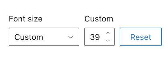
  • That the patterns can use vw units instead of px in inlined font sizes: this can be done already. In the video I did it manually but patterns should also work. In the font size UI control, it is be set to "custom" and a blank value.
210322-1848-font-size-vw-units.mp4
@MaggieCabrera
Copy link
Contributor Author

* The second issue is allowing more units in the UI font size control. I seem to remember that Jorge and/or @ItsJonQ looked at this at some point as per #25137 and [#23323 (comment)](https://github.com/WordPress/gutenberg/issues/23323#issuecomment-702283277) ― Q, pinging in case it rings any bell or can lend a hand.

I've been investigating this myself but I'm afraid I am missing a lot of context on how components work (I was trying to implement the UnitSelect component inside Font Size control but that didn't seem to be the way to go about it). I'm very interested in this and I'd love to pair with anyone that wants to have a look at this.

@kjellr
Copy link
Contributor

kjellr commented Mar 22, 2021

That the patterns can use vw units instead of px in inlined font sizes: this can be done already.

I guess I just never expected that to work. 😂 Thanks for the tip. I'll give this PR a quick refresh later today/tomorrow to try and get that working.

@mtias
Copy link
Member

mtias commented Mar 22, 2021

Cool, let's get the patterns updated to use them just so that we can merge them then :)

@kjellr
Copy link
Contributor

kjellr commented Mar 22, 2021

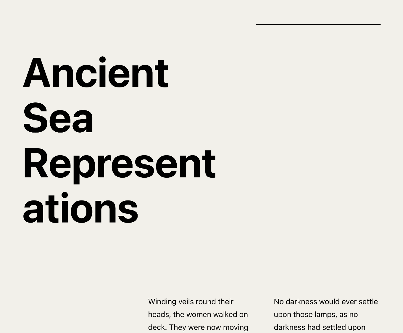
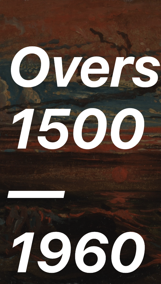
I've adjusted the font sizes on the larger-text patterns so that they all use vw units now. I've tested in Twenty Twenty-One and Twenty Twenty, and it looks pretty good. It would be a nicer if we were able to use something like clamp() or min() here, but this is still workable.

Desktop Mobile
Screen Shot 2021-03-22 at 15 45 01 Screen Shot 2021-03-22 at 15 45 35

(I fixed that line break in the "Overseas..." pattern right after I took the screenshot)

@melchoyce if you have a moment, do you think you can help test this and see if those text sizes are working ok in other themes as well?

Once these changes and the new button pattern are included in this PR, I think it'll be in pretty good shape.

@MaggieCabrera
Copy link
Contributor Author

I just updated with the renames and the missing buttons block pattern:

  • After renaming quote-portrait to quote, I only see the previous one (since it loads from core directly). To have the new one show I believe we need to wait until we make the PR to core, where we can actually delete the old version that has the same name. The PR to core is opened here (Revisit the bundled block patterns wordpress-develop#1103) and I'll update it once this PR is approved with all the changes. For testing purposes I renamed it quote-2 so you can see it in the editor.
  • Two columns of text and the two buttons one have the same issue the quote has since it's also replacing a core block. I renamed them for the sake of testing as well.
@ItsJonQ
Copy link

ItsJonQ commented Mar 23, 2021

The second issue is allowing more units in the UI font size control.
@nosolosw Haiii!! Yes, there's a limitation in the FontSize control right now. We do have the components/mechanics to allow for unit support. The current issue is a combination of (UI) design, and accommodating the current interactions.

In other words, the control has to look and work differently.

(Poke at this example to get a sense for the current design)

Screen Shot 2021-03-23 at 9 17 18 AM


Design: Limited Space (Reset Button)

The presence of the "Reset" button makes it very difficult to include a unit control (due to spacing constraints).
We already experience some layout issues for i18n - for languages with longer labels.

IMO, the "Reset" mechanic as a whole needs to be updated - something touched upon in the updated Sidebar/controls post.

P.S. Limited input space is an issue in Gutenberg's current controls, resulting in values getting (visually) cut off. It's gotten better over time though! The FontSize control is the most noticeable one (for me).

Interaction: Changing values

This one is a minor one. The current number value is a input[type="number"] element that instantly updates on change. Unit inputs need to have this "buffer" state allowing you to type in values like 23vw:

2
23
23v
23vh
// Press Enter

That way, the value can be unit parsed (or CSS parsed for things like var()).

At the moment, there are quite a few E2E tests that rely on the current interaction.
They will break once we make the swap.

This was something we encountered during the initial integration attempts.
We can fix them of course! Just wanted to provide some background info :)


Moving forward

IMO, to successfully add unit support to the UI control, we need to address the UI + interaction concerns above ☝️


Hope this context was helpful!

@mtias
Copy link
Member

mtias commented Mar 23, 2021

Yes, to expose these in the UI we need to redo the typography panel with the new design direction, accounting for all the interrelations of the typographic settings

@kjellr
Copy link
Contributor

kjellr commented Mar 23, 2021

I'll get started on a core issue like this one so that we can try getting the images uploaded to the WordPress.org CDN. Once those are up, we can swap out the links here (and in WordPress/wordpress-develop#1103) with those final ones.

In the meantime, a few small notes:

  1. I noticed that some of these patterns included links to the test site. I adjusted those in 2879e0c.
  2. None of these used the old "Columns" category but I think it makes sense to preserve that. I've re-arranged some category labels in 1101483 to account for that.
  3. We'll need alt text for many of these images. @melchoyce would you mind identifying which ones, and writing up some copy for us?

Thanks!

@melchoyce
Copy link
Contributor

Just tested with all the Twenties. I added each pattern into a post, to see how the patterns would hold up when potentially next to a sidebar.

Short answer: not well. Font sizing is an issue for these themes on desktop:

image
image
image

These issues appear in Twenty Eleven, Twelve, Thirteen, Fourteen, Fifteen, Sixteen, and Seventeen.

Here's a gallery of all the Twenties: https://cloudup.com/cnLGtBQKuqc

@kjellr
Copy link
Contributor

kjellr commented Mar 23, 2021

For some of those, something like max(8vw, 100%) would help. EDIT: Nevermind, that is wrong.

But it also looks like, three columns of text just don't work in general for some themes. The very-short line lengths are problematic even for the smaller text here:

112175249-7efd0600-8bcd-11eb-9b78-e031ddedac2f

I'm not totally sure how to solve for that sort of thing. In general, patterns aren't always going to work nicely for all themes. But maybe we need to be more conservative about that for the default patterns?

@kjellr
Copy link
Contributor

kjellr commented Mar 23, 2021

I'm not very happy with this, but I think our safest option forward is a mix of:

  • Scaling down font sizes. Rather than using the vw that we added, we might need to max-out at like 48px or something.
  • Simplifying some of the complex three column patterns.

Here's a proof-of-concept for that approach:

Twenty Twenty:

Editor Front
Screen Shot 2021-03-23 at 1 36 52 PM Screen Shot 2021-03-23 at 1 37 04 PM

Twenty Sixteen:
(The images overflowing the columns looks like an unrelated theme bug, so we should ignore that for our considerations here)

Editor Front
Screen Shot 2021-03-23 at 1 36 20 PM Screen Shot 2021-03-23 at 1 36 05 PM

How do others feel about that compromise?

@melchoyce
Copy link
Contributor

I think that's a decent compromise.

I'll write up alt tags for the ones missing 👍

@melchoyce
Copy link
Contributor

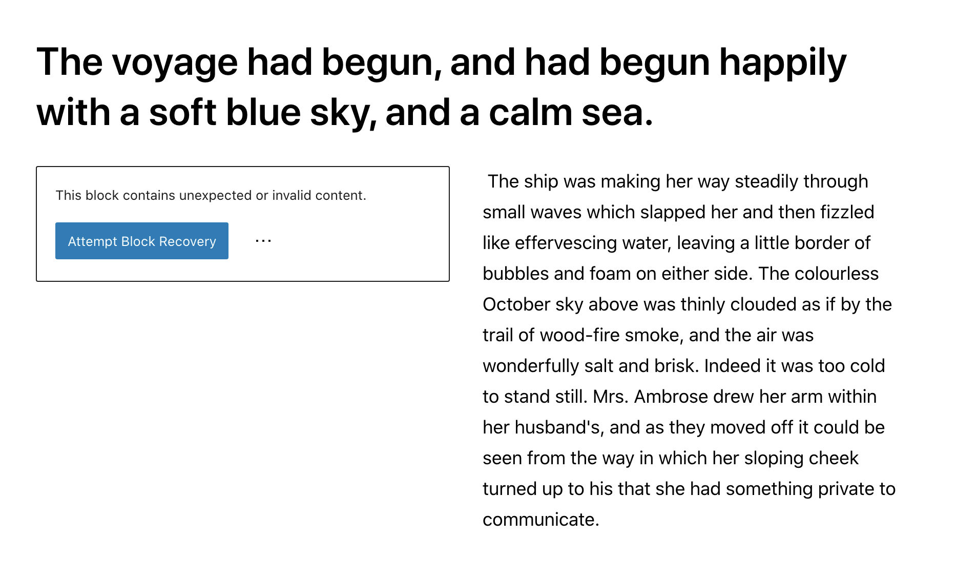
I keep getting a validation issue for this block when I reload:

image

Recovery creates an empty paragraph block.

@melchoyce
Copy link
Contributor

melchoyce commented Mar 23, 2021

Image Alt
sand-rock-texture-dry-brown-soil-726223-pxhere com_-1024x681 Close-up of dried, cracked earth.
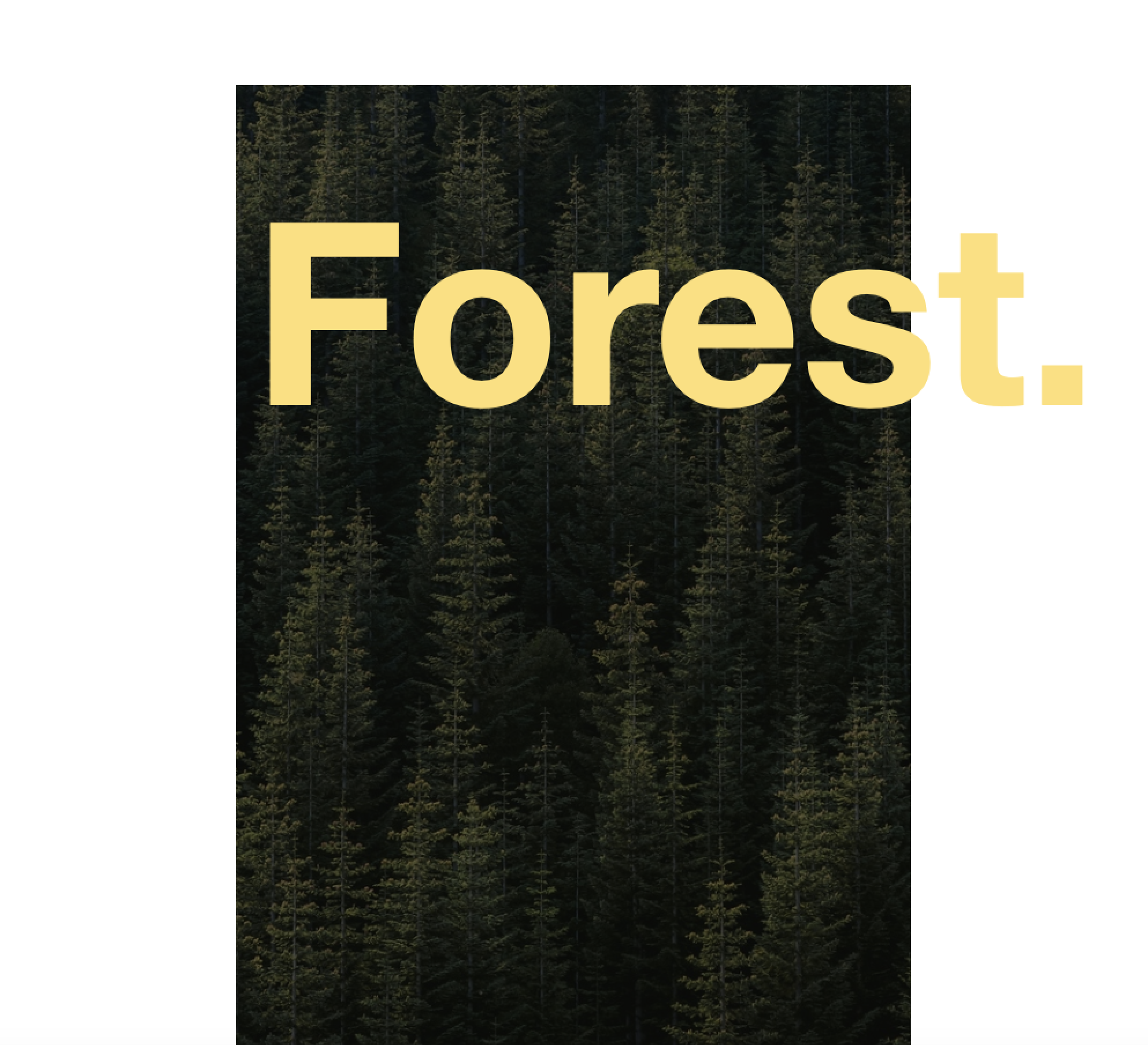
tree-nature-forest-light-plant-sunshine-1100731-pxhere com_-1024x681 Forest of bamboo trees, seen from the ground up. The sun shines through the canopy.
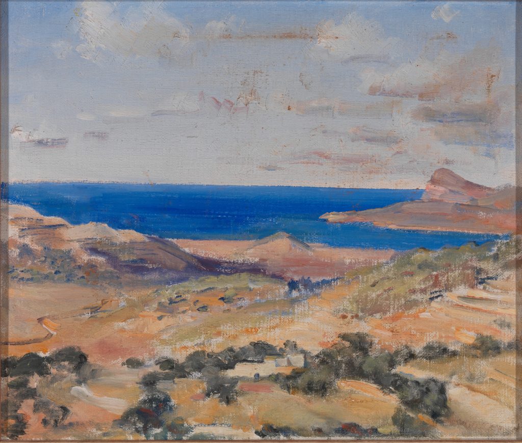
508741ldsdl-1024x870 A green and brown rural landscape leading into a bright blue ocean and slightly cloudy sky, done in oil paints.
StockSnap_ZD6WAL4LGT-edited The sun setting through a dense forest of trees.
StockSnap_56RKHNDUQ2-edited-scaled Wind turbines standing on a grassy plain, against a blue sky.
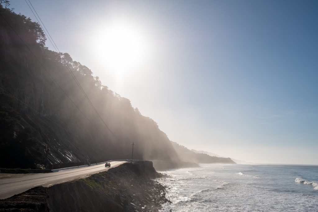
StockSnap_H17J2YTARL-1024x683 The sun shining over a ridge leading down into the shore. In the distance, a car drives down a road.
StockSnap_IM8T5HVXU0-edited-1024x1024-1 An aerial view of waves crashing against a shore.
StockSnap_66J4T150FP-edited-1024x1024-1 An aerial view of a field. A road runs through the upper right corner.
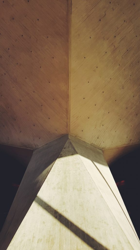
wing-light-architecture-structure-wood-white-714046-pxhere com_-576x1024 Close-up, abstract view of geometric architecture.
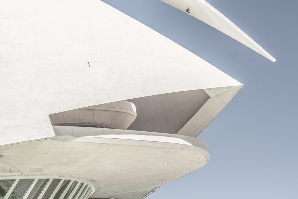
wing-architecture-structure-building-ceiling-geometric-99094-pxhere com_-1024x683 Close-up of the corner of a white, geometric building with both sharp points and round corners.
wing-architecture-structure-wood-white-house-997338-pxhere com_-683x1024 Close-up, angled view of a window on a white building.
StockSnap_HQR8BJFZID-1 A side profile of a woman in a russet-colored turtleneck and white bag. She looks up with her eyes closed.
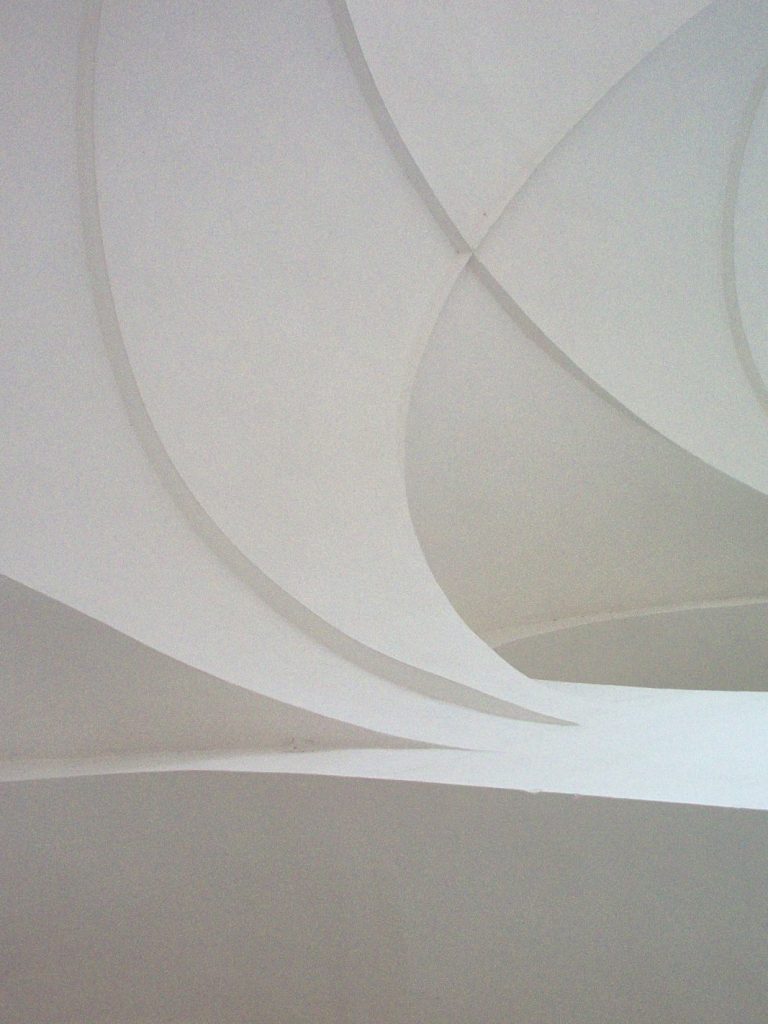
StockSnap_C7E4WYWEHZ-edited-768x1024 Close-up, abstract view of architecture.
tree-forest-grass-wilderness-plant-wood-153393-pxhere com_ A dense forest of tall, straight trees as seen from slightly above.
504382ldsdl-scaled "Sunset at Sea after a Storm" by Francis Danby, 1793–1861.
Copy link
Contributor

@kjellr kjellr left a comment

Choose a reason for hiding this comment

The reason will be displayed to describe this comment to others. Learn more.

This is looking great. Tests are passing, so let's get this in and get a broader set of users testing them! 🎉

Sign up for free to join this conversation on GitHub. Already have an account? Sign in to comment
Labels
[Feature] Patterns A collection of blocks that can be synced (previously reusable blocks) or unsynced
8 participants