Expanding and simplifying layout #42385
Comments
|
Big +1 from me on the idea of abstracting layout as a concept versus dedicated blocks like row/columns/group. I'm curious about the relationship with semantic blocks that require layout... things like navigation, social links, gallery. My assumption is that they would just 'support' How do you see fixed columns working on nested containers? I appreciate most of the examples here are to demonstrate full capabilities, but it could be good to ideate on the smart defaults and determine the minimum number of controls to expose by default so that we might avoid an overwhelming initial experience. Nice work. This is very comprehensive :) |
 martinkrcho
added
[Type] Enhancement
martinkrcho
added
[Type] Enhancement
|
Fascinating exploration, thanks for sharing the great interactive demo, too!
For a bit of context surrounding the Group, Row, and Stack blocks — they're all the one Group block, but use the block variations API to be exposed as different conceptual blocks in the editor, based on their layout settings. At the moment the Group block appears to be the canonical container block in the editor, and it gets registered as such when the editor boots up. So, (at least in API terms), we already have a Layout concept that's abstracted away from the block type itself, where different features of Layout can be opted-into at the With that in mind, it sounds like there are a few different parts to this proposal: 1) The changes to controls and which ones appear in the Layout panel, 2) the introduction of a Grid layout type, that is different to the existing flow and flex layout types, and 3) the ability to resize children of the Grid layout type to determine a particular grid layout? To achieve this, if there was an additional Grid layout type, it could then be exposed in the editor as a Grid variation of the Group block, too. That way, users could switch a Group block from a default flow layout to Grid or back, either via the existing Variations toggles, a new UI for switching between Layout types, or by adjusting Layout settings? When it comes to the existing conceptual blocks like Group and Row, some of the benefits of keeping some semantic difference in block naming within the editor (even if behind-the-scenes they're still a Group block) include:
I really like the idea of the child blocks being able to set their width or column span — one of the things that'd be very cool, is if it could also be supported in the Gallery block, so that users could set a grid of images, and then select particular images to span multiple columns, to have a customisable mosaic kind of layout.
For these kinds of layout options, did you have in mind that the layout controls are defining a flexbox layout or CSS grid approach? |
|
Thanks for sharing these thoughts! One thing we need to account for is responsive behaviour. In the current Columns block, that manifests as a “Stack on mobile” setting, but also in the ability to set fixed widths in px units, and unset width altogether so that a column can take up the remaining space. This allows us, for example, to build classic fixed sidebar/responsive content area layouts.
I’m curious about how the 12-col underlying grid would work in a mixed fixed/variable column width context. Is the grid always 12-col regardless of screen size? Do fixed px width columns ignore it? |
|
This is a very cool demonstration! I love the sandbox to allow for testing of the features!
This is what I'm immediately curious about as well. Right now, Gutenberg doesn't really have a lot of options for controlling how things will shift when the screen size shrinks. In any case where I want something even remotely complex (like 3 column shifting to 2/1 instead of 1/1/1) I usually swap to a |
 tellthemachines
added
the
[Feature] Layout
tellthemachines
added
the
[Feature] Layout
|
I've spent more time thinking this through and have iterated on the above to get to the point below.
Consistent layout and dimension settings for all container blocks (e.g. Group or even Query) and child blocks. We infer whether a block is flex, grid or auto based on its settings, and in some cases its children's settings. We also infer the "inner block width" toggle based on child width setting and hide the complex wide/content width setting unless it's needed. |

|
I always appreciate how deep you immerse yourself in the UI/UX challenges, Saxon. Nice work. I am having a bit of a hard time extracting the Layout pieces on their own from the component and inspector changes you made. I understand why the compression of said componentry might have played a role in your decisions, but it can still make it a little trickier to compare with what's shipping, since the visual delta is bigger. Two riffs on your mockup, just to see if I understand this right:
|


|
@jasmussen that looks about right. There is an experimental branch in motion here which we will use to play with some of these changes. |
|
Nice, I took the branch for a spin and left some comments there. |
|
I explored a little on this front too, mostly figuring a way to fuse what we have today with a bit more simplicity - but also flexibility. CleanShot.2023-05-10.at.10.50.33.mp4Align/Justify MatrixLike @jameskoster explored in #49448, I think we could potentially condense a bit, while adding more flexibility, with a matrix control like what Figma uses. Justify (Distribute) SelectA way to set values for how the blocks are distributed within the layout. I.e. Space between, around and evenly. We only support between at the moment, but using a select lets us flex this without making the UI more complicated. I'm not 100% on the label—could be "Distribution" or "Distribute" or "Space" (though we do have Block Spacing elsewhere). Nested widthA way to condense the current layout content controls that exist within the Group block.
|
|
There's also room for adding an "Items" select, for setting the items in the layout to align-items: stretch, or other. 
|
|
And I explored using a checkmark/minus (reset) for Wrap as well. Perhaps a "wrap" icon would work better than a checkmark? 
|
|
Using a matrix control to conflate a subset of alignment and justification options, with a separate control for the remaining options (space-between and stretch) raises a few questions:
|
I'd expect matrix only on row, stack, perhaps grid variations. I think we can start with layout on those blocks - then once that's settled figure how content constraining can work better within that context.
If so, then no I don't think it would be. But there is something to be said for how simple using the matrix in the cover block is. Yes, it's quite a simpler model, but I think it's worth exploring.
We should have similar controls in both areas (if we're to have both). Same as how the site logo block has evolved, where there's a control in the toolbar to replace media, very similar interaction in the inspector. I don't know that it'd work to have a cover block matrix in the toolbar, but different select controls in the inspector. Maybe if matrix was in both, but it could be too much.
I would think the matrix selection would adapt based on the justify and alignment values, as well as row/stack variants. If set to stretch, then you'd have three taller areas to select – instead of nine individual areas. I'm still not sold on the matrix, but it's worth exploring a bit more — it does work great for the cover block, we need to see if we can expand it (and if its still simple/easy). Here's a rough visual: 
Matrix wouldn't be necessary, but I also don't think we'd need justify/align-items with grid. -- Love the thinking. 🖤 One bit I'd like to keep top of mind is that we don't need to implement the CSS spec directly into UI. Just the most valuable, most impactful, controls to allow for diverse layout results. Layout has to be simple and intuitive. |
|
Great thoughts all around. Stepping back for a bit, all the arguments shown here are very valid, and worth making progress on. A friend described layout as it exists a bit as inserting a USB key, in that it takes two tries to get it right, due to the complexity of the controls 😅 That, I think, is why it's so important that if we refresh these controls and foundations, that we end up somewhere very intuitive. The prototype has been a great test bed, but it's also surfaced some challenges with our componentry and existing patterns. Things like using the existing gap verbiage and controls, finding a less emphatic way to toggle wrapping or not, and perhaps embracing the existing row/stack icons instead of the arrows, at least for the first iteration and so long as we still have different container blocks. The matrix control is an interesting take on making it more spatially intuitive, though definitely flex-between and wrapping can be hard to illustrate there, perhaps that's okay? |
They'll likely be needed when grid children are not all the same size. Here's a codepen with examples for both justification and alignment to illustrate what I mean.
Will this this work for other blocks with flex layout, such as Buttons or Navigation? I guess we could make the row/stack icons mean horizontal/vertical across the board, but is the idea to add the same switching controls as Group has to all blocks with configurable orientation? That will require some rewiring because currently those controls are tied to block variations. |
Right, valid point to bring up. But the fact that we have both the transforms at the top, and now additional icons that do the same inside the layout panel, regardless of the solution, still suggest we need an iteration here. Whether that's removing the icons at the top, and go with more generic layout icons, or even removing the direction control from the layout. Perhaps there's even a third option? |
|
Providing an update here with some further iterations @richtabor and I have been exploring. There are two options, both of which add the following:
Option 1: Merge Group with Stack
Option 2: Keep Group
Moving variation selection in to layers panel
|


I'm concerned that changing the layout tools without testing on all blocks with layout will lead us down the wrong path. Controls should be the same across different block types, so we need to make sure they work for all different block types. |
|
I agree with you @tellthemachines . An alternative for option 2 is to move the block variation selection (group, row, stack, grid) into the layers panel so that it's accessible to all blocks (I think @richtabor was playing with this idea). Perhaps this is a better starting point as its consistent with option 1 just without the content width control. We can then decide to remove group variation in favour of a content width property or keep it there.
|

|
Great progress. The use of the generic block icons feels like a big step forward, and in general moving them out from the top "descriptive" area works well here. I wonder if that translates well to other places where we are showing those transforms? Maybe not, but perhaps this suggests those other places may not be the right approach after all (example: #46195). The "Wrap" yes/no is too prominent for taking up a whole row like that. It was added because it allowed some responsive nuance that was useful, but it still seems like we can have a default and then a much more hidden option to toggle it. Perhaps it can live inside an ellipsis menu? It's pretty important we be intentional about our terms, and "Block Spacing" instead of "Gap" was chosen as a more obvious alternative to "Gap". I know this is something @mtias feels strongly about too. I realize the length of that term makes it hard to fit in the space, but to that end the slider doesn't feel as successful to me in the stacked version regardless, and we may end up with translations becoming an issue here regardless, where a worst case German translation could be "Zwischenraum". Finally it may be worth keeping padding and margin separate from the layout panel at least for the first iterations. I see the argument to unify them with a layout panel, but if we're going to move them from Dimensions to Layout, maybe it has to happen across all such panels at once? |
|
I like moving the variation selection to the layout panel. It's easy to see this working for all container blocks. IE allow Buttons to be arranged in a grid. The Gap control looks a little strange, I don't think there's a vertical configuration of input + range elsewhere. Are there other options? |
|
I don't like moving variations to the layout panel very much because it breaks the hierarchy and consistency they aim to provide—changing the layout is also changing the block variation, which is represented in the block icon and is relevant outside of the appearance sub panel. Variations render at a higher level, given they can also be accessed directly in the block inserter and block transformations. Moving them into an attribute palette breaks that mental model which I think is pretty important. |
There's only one block (Group) that uses variations to switch between orientations, whereas there are multiple blocks that depend on the layout tools for that. For blocks such as Buttons and Social Icons it feels like overkill to make orientation switch a block variation, and we also need to consider third party blocks already using layout: removing the orientation switch in the layout panel will break back compatibility for those. Tbh I'm not fully convinced that it makes sense for different layouts of Group to be variations; it seems to indicate we have different types of containers, when what we actually have is the one container with different ways of organising its contents. |
Yea, though the notion that you can start with the intent to add a row, or a stack, of blocks is beneficial — i.e. via the inserter. |
Hmm yeah that must have been the reason to make Row and Stack variations in the first place. I guess regarding the orientation controls, we have two options:
The second option has the downside of introducing inconsistency in the layout tools, but that could be mitigated by using the same icons for horizontal/vertical/grid orientation as we use for the Group variations, so the controls would look similar even if they are in a different place. |
|
Minor feedback: Can we switch width & height? Since we read the layout from top to bottom and left to right, let's got with horizontal first and vertical second - as for padding, margin and image aspect ratio (just seen it's inconsistent between image and featured image) Other questions and notes:
|
|
@tellthemachines it's ok to reflect orientation as a layout attribute, what I mean is it should not imply relocating the variation functions into layout as well. Variations are higher level for group(s) block. We use them for transforms; in multi-select; in list view; we expose them in the inserter. They offer a direct mental model to things you can express with layout without understanding the intricacies of layout properties. I consider this an important user-focused design principle. Other blocks leveraging the layout tools (buttons, social icons, navigation) are fine to just rely on orientation since the mental model and context is a bit different there. |
@mtias Could you clarify what you mean here in terms of what sort of experience you expect? It sounds like you're fine with option #2 @tellthemachines mentioned above. The fact that we currently have an orientation control that changes the group variation also breaks hierarchy in a way (from a users perspective).
I don't think our mental model as developers would match that of end users. I doubt majority of users even know what a block variation is. If we were to go with this approach I'd expect variation icons and orientation/direction icons to be the same. |
Just explorations; many more bits to iron out. :) |
|
@SaxonF the main experience I expect is to preserve the mental model afforded by blocks more than the mental model of properties. I think the latter is the developer and systematic thinking in us more than what users would intuitively understand. So I want us to balance improving design tools with the value of blocks as the primary user-facing abstraction. In a nutshell, I rather normal users learn one thing—blocks—than a whole set of layout tools. Another example: the Cover block can be seen as just a group block with a given set of properties. However, a user would have a much easier time discovering a Cover in the inserter than figuring out a Group can do all the things they need it to do to replicate a cover. It doesn't matter if we end up with Cover being just a variation of Group, what matters is users recognize and interact with it through all our major interfaces (inserter, transforms, list view). The block encapsulates an intention and communicates it much more rapidly than properties. Block variations were designed to allow us to have both things—a consistent set of malleable properties that allows us to reduce duplication and consolidate tools without letting go of the more direct aspect of the block mental model. I don't mind layout orientation existing as a property, what I mind is burying blocks within it and eliminating the higher level concept of quick variations from the inserter. So in terms of the proposals above I'm actually fine with orientation existing in layout tools with the arrows and for group blocks to also see that reflected in the variations. Which I guess is what we have now.
I don't think it does. We have blocks where a given combination of attributes would match a variation and the variation become enabled. Variations can be seen as a shortcut for a combination of attributes but it's not a requirement that a user understands this. If anything, I think changing layout orientation and seeing my Stack became a Row helps me understand things better. |
|
An update here is that we have a second prototype branch here. I'd recommend trying it by attempting to reproduce common pattern layouts etc. If you're used to the existing layout controls it takes a bit to adjust but I personally find it a little easier to understand conceptually and the addition of predictable height/width controls goes a long way. This obviously wont make it for 6.4 but I'm hoping to put together a few tests to send out to different groups of people to collect feedback and iterate before 6.5. |
|
Howdy! It was recommended I share a recent scenario where I ran into some difficulties helping a user with a layout request: A user wanted to have a “Welcome to our team” Cover block banner show Full width above their footer on their About Us page, while maintaining the rest of their page content at Wide width. (The Content block in their Page template was already set to be Wide width.) With lots of help, I almost nailed the request: I ended up with a Full width banner, but narrow, instead of wide, width content. We settled on suggesting the user try the Content block's Layout > Content width setting to let them set their ideal content width manually. Even though I have a much better grasp thanks to help from colleagues and my experimentation, it felt like a lot of effort for a simple request: place a full width banner beneath wide width content. Understanding where to apply the "Inner blocks use content width" setting is also tough, especially with several layers of nesting. That said, I do appreciate the power of FSE! |
What problem does this address?
When making a decision around how to implement a particular layout, multiple blocks need to be considered. There is group, columns, layout grid, row and stack, not to mention more specific blocks like cover and gallery. The tools within those blocks also limit what's possible, particularly when looking at inner block sizes and alignment
What is your proposed solution?
This proposal consists of a few changes revolving around creating a single container block that can handle both fluid and grid based layouts, as well as extending layout/size controls.
A single container block
As a user, I can currently implement a two column layout using either the Columns, Layout Grid or Row blocks. They each behave slightly different but they also overlap slightly in what you can accomplish. It's worth exploring whether we can accomplish all behaviours using a single intuitive block.
POC
I have built a little proof of concept that I would recommend playing with https://s75qk3.csb.app
You can also see a quick demo below:
layout-demo.mp4
The block
What would this look like in the block inspector?
The container block would have the following global layout settings:
All child blocks of a container block have size properties accessible to them, starting with width but also including padding and margin.
An important point to note is that there should be a global token called size/layout/width which is an array or object of width values.
wideandcontent (default)would be two options, but you should be able to create as many as you like.Layout and size controls will change depending on the direction of the container block.
Horizontal
Container
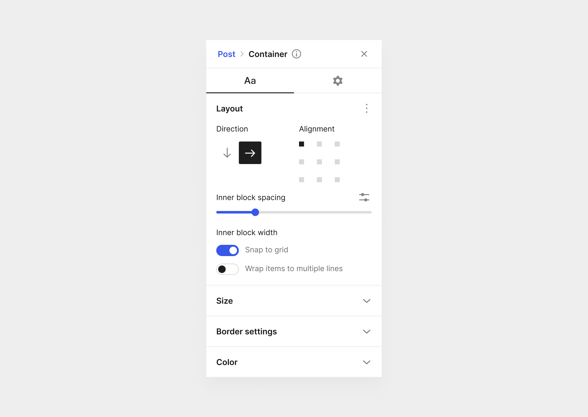
Containers set to horizontal direction also have an
inner block widthsetting which contains asnap to gridtoggle andwrap itemstoggle. The snap to grid toggle performs the same function as seen in the POC above.Child
Vertical
Container
When a container block is set to vertical orientation it behaves like the existing group block by default. The only change here is that we are removing the existing (and somewhat confusing)
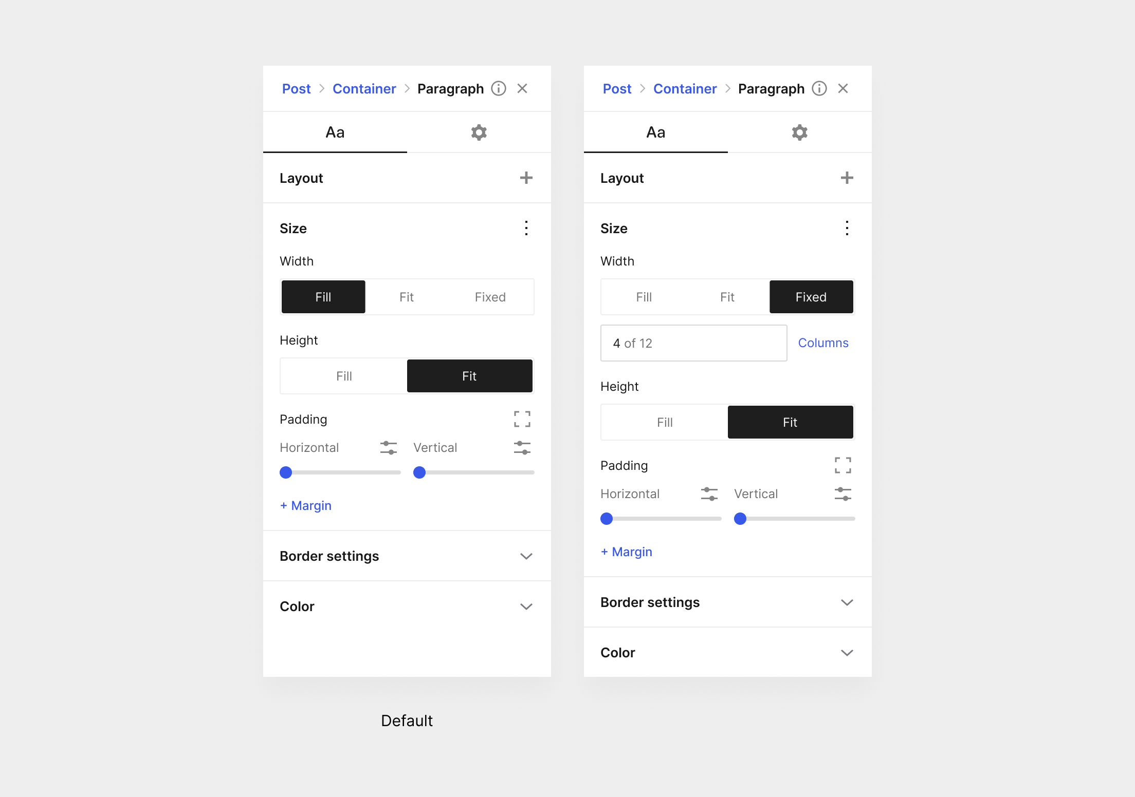
Inner blocks use full widthsetting and relying on smart defaults. If a container block is wider than the content width/layout size, then inner block widths should be set to the content width, if its smaller than they should be set to "fill". The size controls should be accessible to all inner blocks however.Alternatively, we can introduce an
default inner block widthsetting which uses the same interactions as the width setting of any other block. The only thing you can't accomplish with this interaction is setting the "wide" size of child blocks but I'd argue this should be set on the child anyway.Child
A child within a vertical direction container block has its width set to fill by default, unless the container block is wider than the content width. It also has its horizontal padding set to the global padding setting. If a user wanted an image to span the full width of the container, they just need to remove the padding (or could be margin).
The width setting has an extra
fulloption which is essentially 100vw.These settings should be able to be applied on any container block, including blocks like PostContent. This gives the theme builder more flexibility when designing unique templates.
For added flexibility we should also consider adopting a negative margin property that also uses global spacing values.
The text was updated successfully, but these errors were encountered: