-
Notifications
You must be signed in to change notification settings - Fork 4.1k
New issue
Have a question about this project? Sign up for a free GitHub account to open an issue and contact its maintainers and the community.
By clicking “Sign up for GitHub”, you agree to our terms of service and privacy statement. We’ll occasionally send you account related emails.
Already on GitHub? Sign in to your account
Split block tools between "settings" and "appearance" #40204
Comments
This comment was marked as outdated.
This comment was marked as outdated.
|
This looks like a great starting point to me, but there's something about the nested tabs that feel a bit awkward. Maybe it's just because the settings/appearance tabs seem 'heavier' than the post/block ones, and that's throwing the hierarchy off a bit? Some more 'out there' ideas that are probably terrible, but I share just in case they inspire anything better: Settings onlyCould we say the inspector only handles settings, and put access to the appearance panels in the toolbar? This would reduce reliance on the Inspector which could be good, but the appearance panels would need to be movable which complicates things. DrilldownsRemove the post/block tabs and utilise the drilldown pattern from global styles. We might do the same thing in the block inspector – emphasise appearance options and put settings in a drilldown. Figma prototype here. Split document / block settings into different UI regionsIn the site editor, template details are accessed in the top bar, we might do the same thing in the post editor freeing up the Inspector to concentrate solely on blocks. |
|
In my opinion, it has always felt inconsistent and confusing that all plugin sidebars are separate in the top toolbar, but the document settings and block inspector share a sidebar. So I'm all for splitting the document and block sidebars, though I'm not sure where to place the former. Perhaps just have two buttons instead of the current single cog next to the Publish button? Or maybe the middle of the top toolbar is the place to put it after all (as seen in the prior comment's mockup); my main concern with that design is how it is not clear that the post title in the toolbar is the point to access the settings. I know there's been some accessibility concerns about various buttons lacking descriptive labels. Back to the main point of this issue, I totally agree that we should split design options from more block-specific settings. Divi Builder does this, and it really helps with organizing the very large number of options in its modules. |
On balance I think this could be the way to go. There's a lot of context in #27093, but in short:
Plus it means we can eliminate the awkward nested tab situation that could arise when we close this issue. Also related: #39082 |
|
Tabs feel like the right pattern here but agree nesting looks weird. What about converting post/block tabs into breadcrumbs to better show the parent->child relationship, with "post" being the top level "block". Could also play with typography treatment and input stroke colour to try and reduce competing elements. |
|
At a glance the breadcrumb pattern looks great, but I worry about the scalability. In the template editing context you'll mostly be seeing I do appreciate how much lighter the interface appears when you reduce the stroke on active tabs, and use icons instead of full labels. |
|
For folks subscribed to this ticket, I added a mockup to the main issue with a baseline tab interface that we can build. Whether that needs to evolve into a segmented control or otherwise, this can be explored separately. |
|
Thanks for adding the mockup. I'd like to take this one on, as it touches on some areas I've had a little experience in Gutenberg. Namely, block supports and our |
|
I think this might take a few iterations to get right, so we should consider enabling it as a feature flag until we square all the dependencies (UI, block API, extensibility, etc). |
|
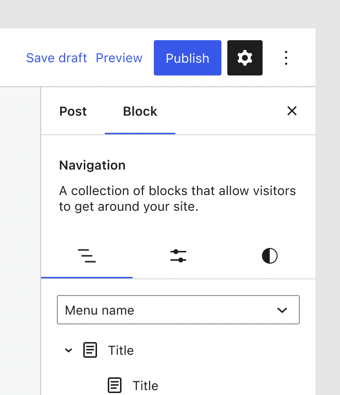
@jameskoster @SaxonF can we try a design that includes the three tabs (list, settings, styles) but uses the icons? |
|
Purely using our existing components: There's some tension between the block icon and the tabs, which would be solved by simply removing it. The icon to use for settings is also a bit contentious. The one above is used for "custom" elsewhere so doesn't feel like a perfect fit. The cog feels more natural, but obviously we use that to toggle the Inspector itself so it might be a bit awkward. |
|
Perhaps nitpick territory — should the sidebar icon be flipped horizontally? |
|
Yup, we should probably have both versions of the icon so the button can flip based on locale (rtl/ltr). There may be other applications where we need the inverse as well such as #28745. |
|
Can someone point me in the direction of the panel icon via a figma link or supply the SVG etc so I might add it to the icons package? |
|
Sure, here's drawer-right: drawer-left: |
|
Remember to remove the |
|
Proof of concept PR is up in #45005. |
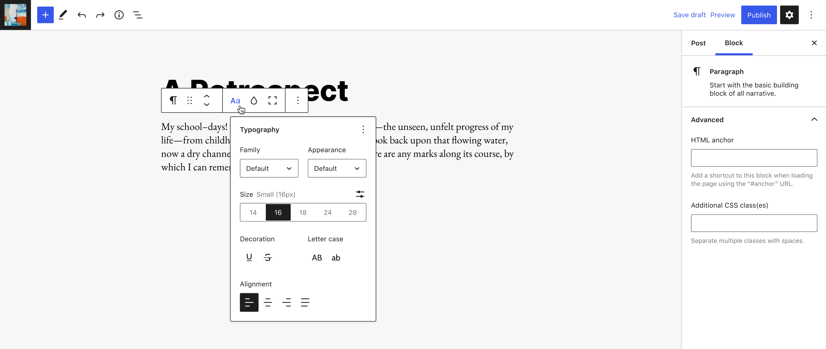

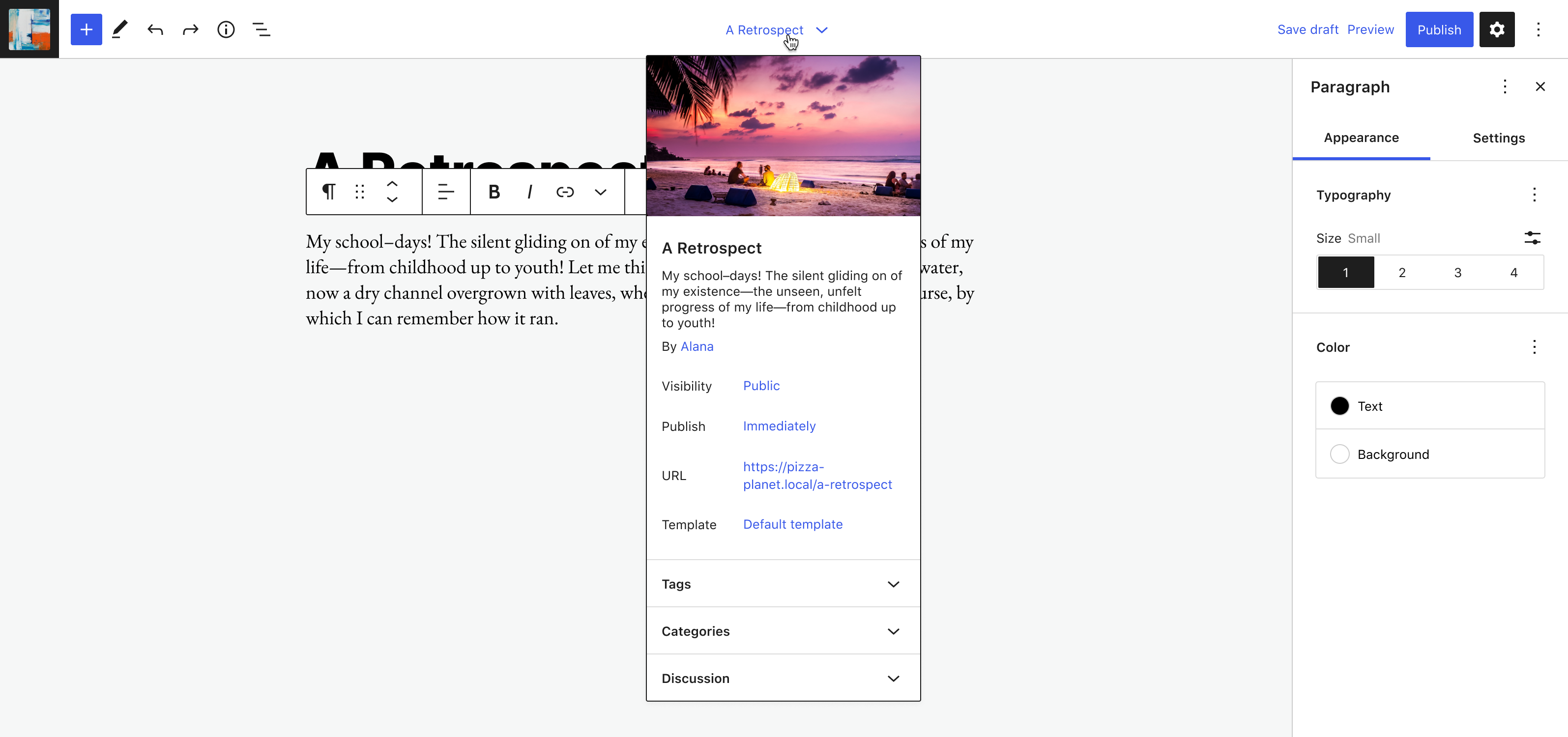

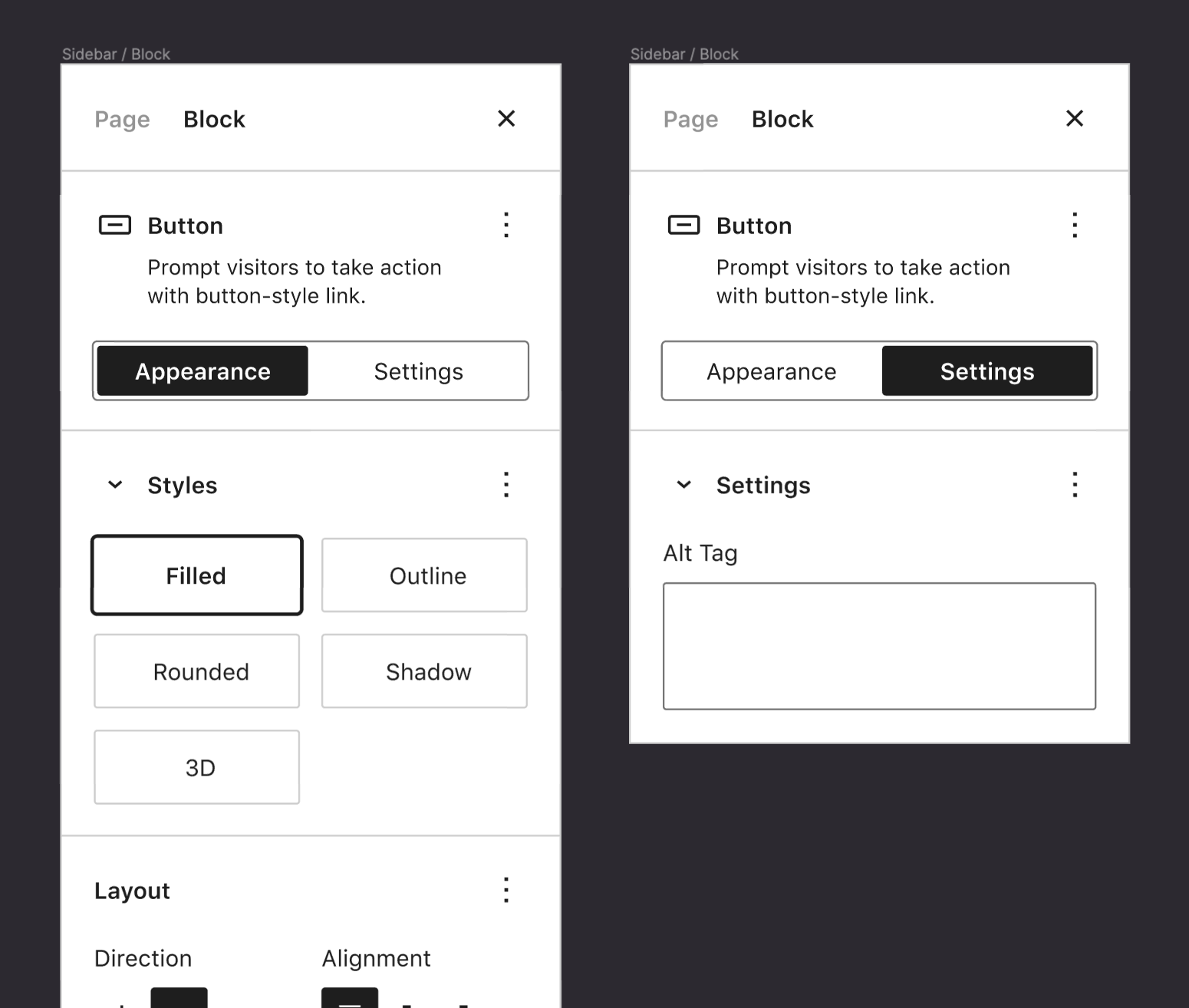
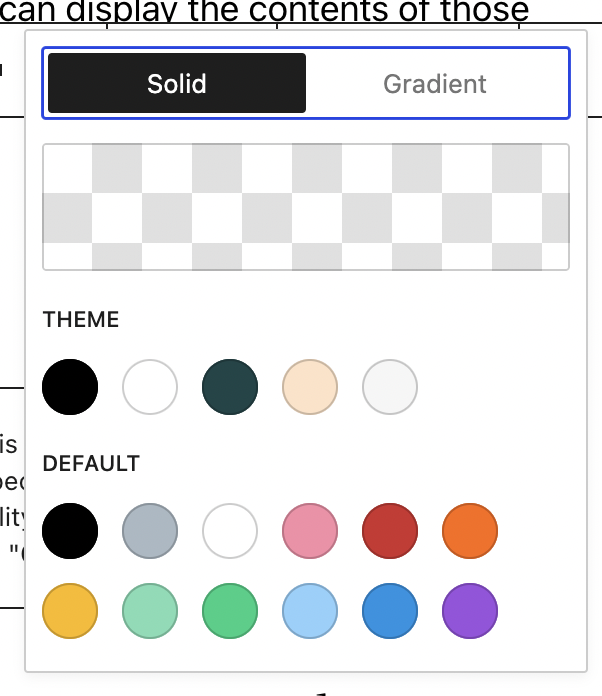
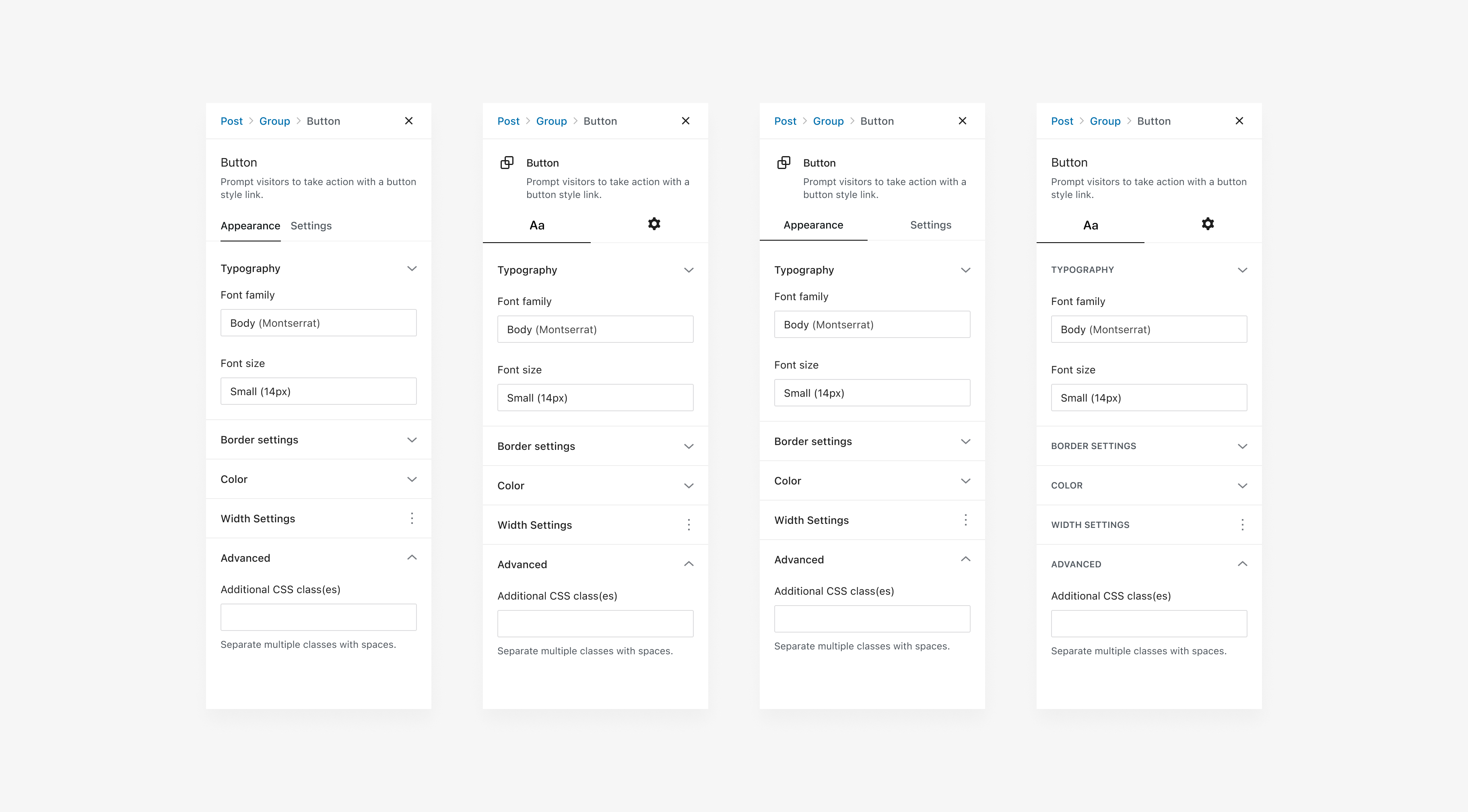
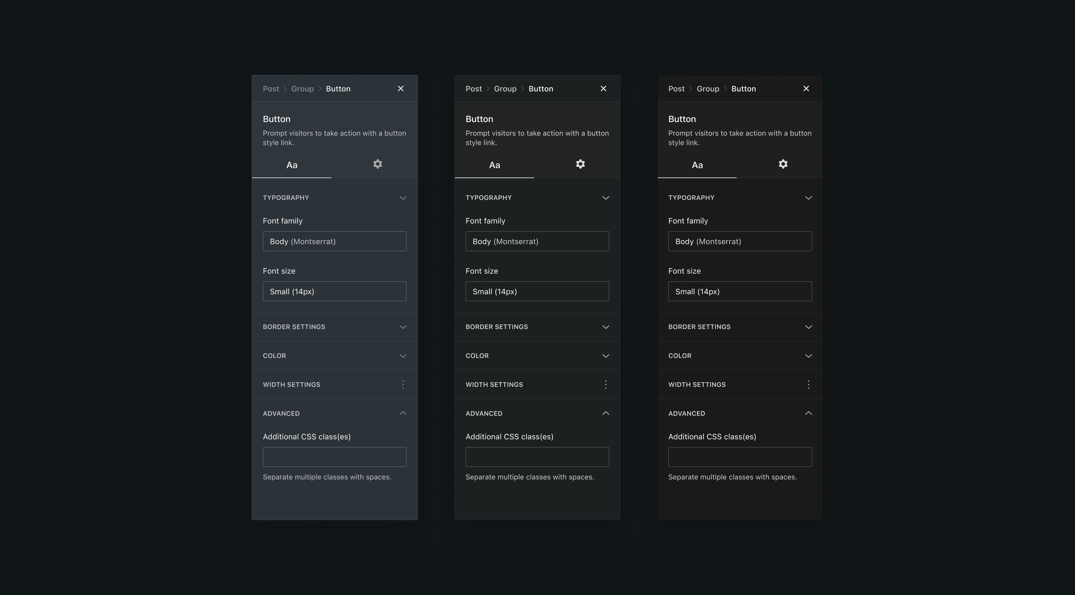
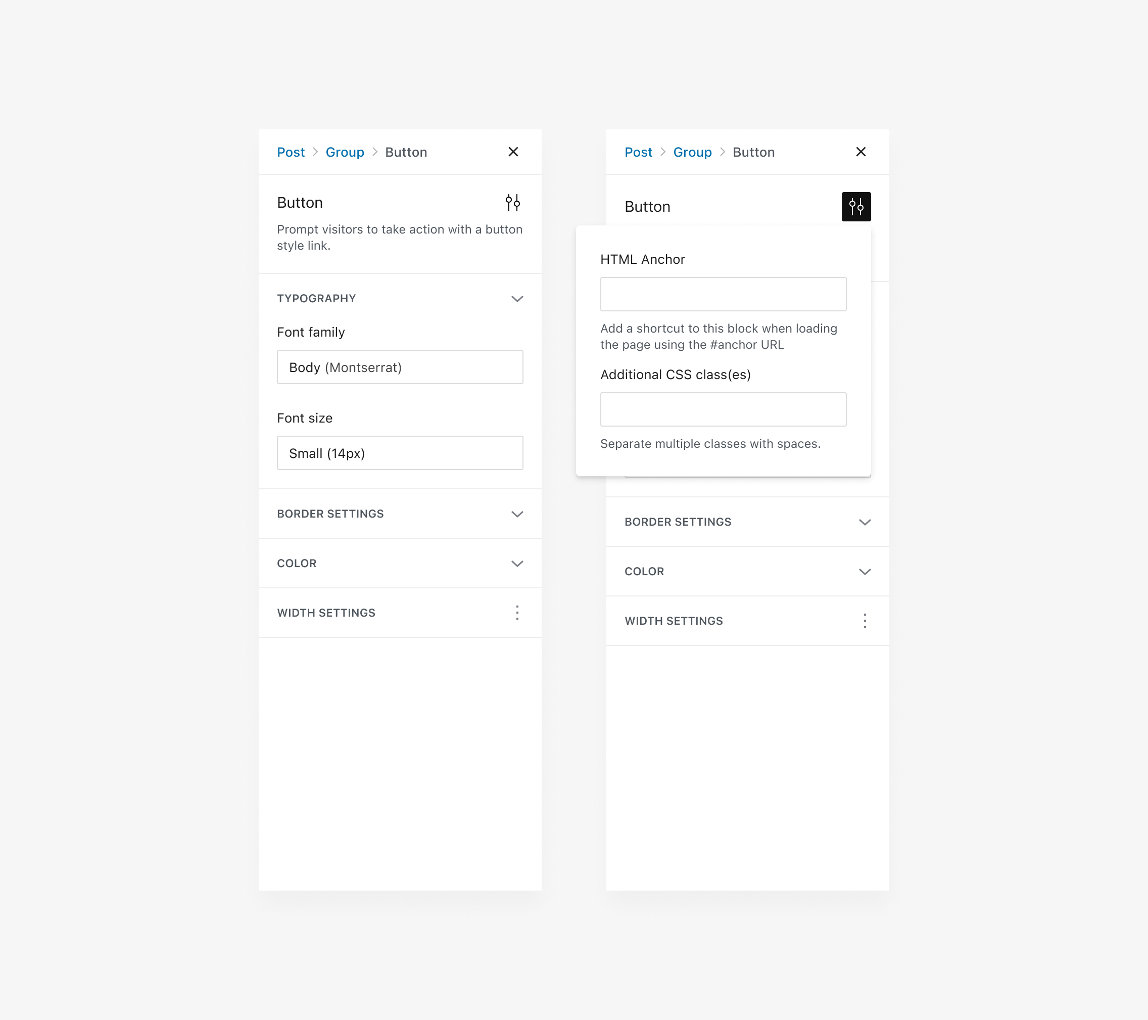



We've discussed this as far back as 5.0, but it was not yet the right time to explore. Now that we have tools more clearly delineated, it's a good time to start looking at how we can split the block inspector between settings and appearance — appearance would generally be all the common block tools registered through supports, and setting would generally be block specific tools. The earliest mockups we had used a tabbed interface for this. There are some other considerations to discuss, including attribute types and UI slots for registering controls. We should assume by default
<InspectorControls>are of role "settings".Mockup:
See also: #42257, which could benefit from this.
The text was updated successfully, but these errors were encountered: