-
Notifications
You must be signed in to change notification settings - Fork 4.1k
New issue
Have a question about this project? Sign up for a free GitHub account to open an issue and contact its maintainers and the community.
By clicking “Sign up for GitHub”, you agree to our terms of service and privacy statement. We’ll occasionally send you account related emails.
Already on GitHub? Sign in to your account
Custom Image sizes are not responsive in the editor #38381
Comments
|
Good ticket, thank you. It looks like #38399 fixes this one at least on the frontend: I'm currently investigating what it will take to also fix it in the editor. |
|
It looks like this issue will be harder to fix in the editor, because the There's some commentary on what looks like a past exploration in the code for the Image block: So it seems like at worst this can only be fixed in the editor with a little bit of a refactor. But given that #38399 fixes it on the frontend, we might want to see if we can land that one, and repurpose this ticket to detail the bug in the editor. What do you think? Meanwhile, I'll tinker a bit with the max-width and a percentage value, see whether I can get it working. Edit: yeah there doesn't seem to be a trivial fix to this one, per the commentary above. |
|
With the merger of #38399, I took the liberty of updating this issue to reflect that the issue is now editor-only. |
|
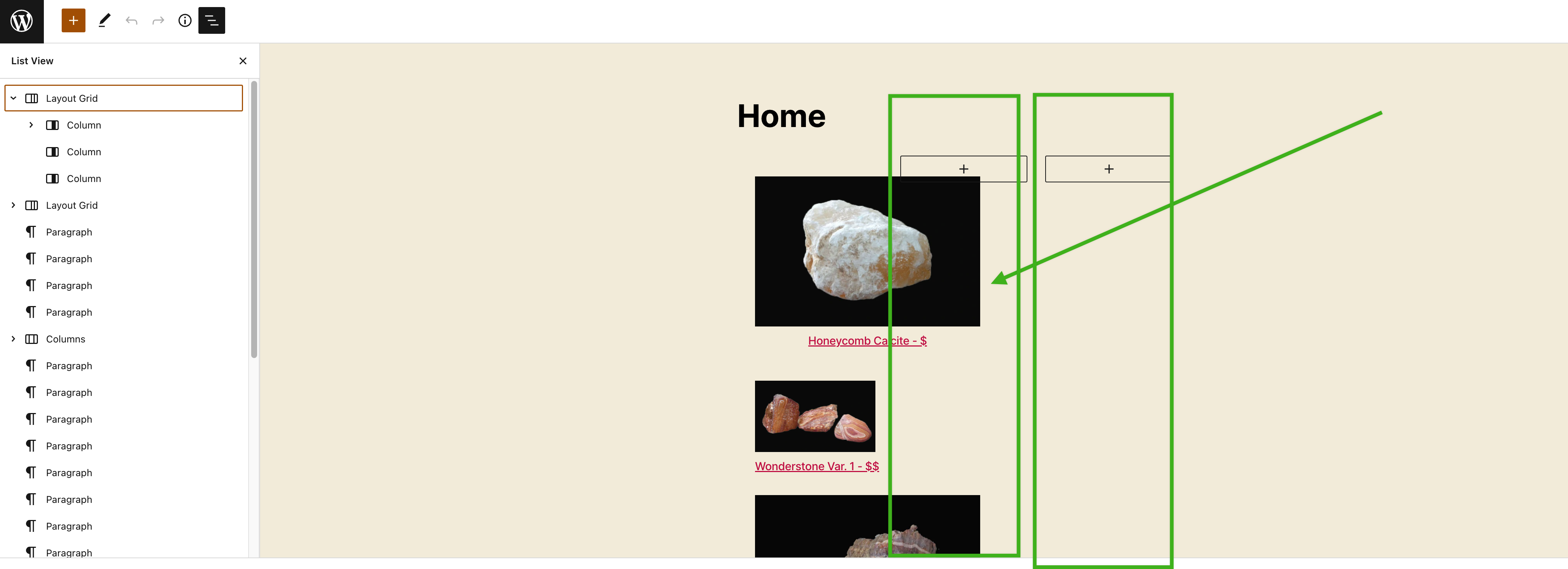
Jumping in here to pass along some feedback that was found as part of the FSE Outreach Program's All Things Media exploration since this is very much related to this ticket:
Of note, this only happens in the Post Editor but that might be due to some breakage in the site editor (#38557). 154404537-85c4ec68-37b7-4ade-945b-712f04dce90f.mov |
|
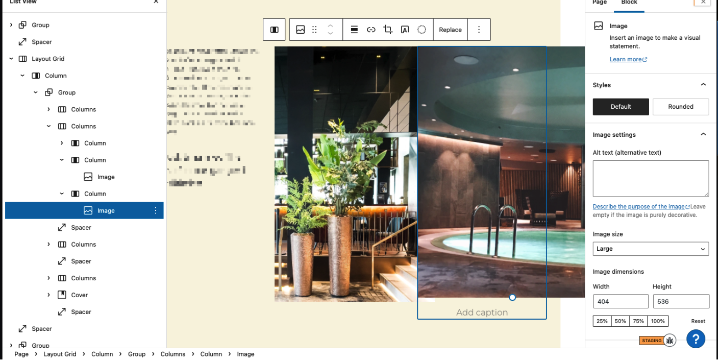
There's still going on here, but I think it could be also very specific to some cases. This is what I saw on a user's site with a Layout Grid & Columns structure. The issue also remained once I took the images out of the Layout Grid: I can confirm this remained a problem on self-hosted. Is it worth opening another report on this @jasmussen ? |
|
@Robertght or @rickmgithub can you provide some example content that I can test? Using the latest plugin version testing against TwentyTwenty and TwentytTwentyTwo it's working as it should for me: |
|
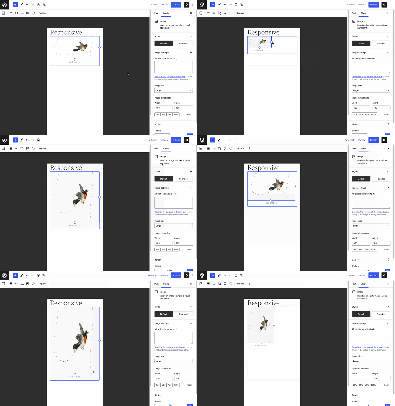
As an update, I did find a way to reproduce it after all. If you just insert an image, without resizing it manually, it works like noted above. As soon as you resize the image manually, however, the image gets an explicit size and stops being responsive: That issue is editor only: on the frontend the responsive catch-all rules still work and the image doesn't break out of its container. However it is technically difficult to address, as outlined in this comment. |
|
Thank you @jasmussen ! I referenced the above as it appears this issue creates a very misleading experience, especially when used with Columns and the Layout Grid block. If these are separate issues, I can open a new one instead. |
|
It's all the same issue, if an image has been resized manually, it loses the responsive guard rail in the editor view. I agree it'd be really good to fix, though! |
|
It's possible to fix this fairly easy but it would affect what outcomes are possible with the resizeable box component if we did not change the unit system for the resizer from absolute (px) to relative units (%). Currently, when width/height are changed they are changed proportionally. If I make To get a simple fix (at a cost I'll get to later) assuming we are working with static/relative images we can override setting height and just force it to be always This is easily achievable with something like this without touching any of the JS code for resizer. .wp-block-image .components-resizable-box__container {
height: auto !important;
max-width: 100% !important;
}Problem this introduces - and any other implementation around that has a couple of drawbacks.
We are now limiting them to 100% but most of the time the fixed dimensions make sense only within the screen space user fixed the width/height of the image. I'm thinking if the width/height set there shouldn't be relative and based on % of the container rather than on absolute value which won't scale and possible cause breaking of a grid whenever non desktop screen size (or browser window) is used where column in which image got resized suddenly get smaller than the fixed width. With the responsiveness of block themes this is guaranteed to be the case anytime this feature is used. If we replaced absolute units with relative units this should always work alright and make the images more responsive similar to how using the fixed % breakpoint sizes works. Even creating overflowing images could work fine on mobile to create subtle grid breaking layouts. if we had agreement on direction I'd be happy to pick it up. |
|
@tomasztunik Thank you for looking! I did explore a CSS-only fix like what you've suggested above, though when I tried it didn't work as resiliently as your fix and resulted in garbled images. Nevertheless, I think the downside you outline isn't worth it. While the responsive max-width + auto height is currently applied on the frontend, it is applied with low specificity so themes can easily override it. Specificity and behavior in the editor should ideally match that of the frontend, and adding More importantly, though, #38990 outlines how a pattern developer will be able to set specific dimensions on an image and apply masking ( |
|
Ha! Using maxWidth is definitely going to make it simpler :) Though it would still prevent creating grid breaking designs which oftentimes are valid and desired so I'm not sure if it's an ideal solution. I'm thinking though as I mentioned the units now are absolute (px) and I think this is a bigger issue. If someone designs the page on a smaller or larger screen/window and then previews it on different screen size or changes the container to be full width/wide the fixed nature of the unit wouldn't cause the content to properly scale to retain proportions and designs harmony. I'm not sure if this issue is the right place to discuss this change but I think a lot of that overflowing images, and images not fitting in on mobile etc. comes from the fact that once the user touches the manual resize of the image it stops being responsive despite the block that hosts it and all other elements of the page around it are. |
Indeed, do we choose between basic responsive guard-rails out of the box, or do we leave that to themes to handle? I have a feeling that when we're able to tackle #38990, the object-fit toggle that is output when manually typing in non-intrinsic aspect-ratio dimensions might afford us a space to change how that responsiveness works. That refactor seems like it might provide an avenue for such boundary breaking sizes. In the mean time, I think it would be useful to apply a max-width equal to the container size as described here, mainly because that is already the case on the frontend.
This would only ever be the case if they set explicit dimensions on an image, right? If you insert an image by default, it will naturally be size limited by its container. The px vs. % conversation is definitely valid, but in my mind it is an addon conversation that can happen regardless of where we end on this one. What do you think? |
|
I experimented with relative Relative units weren't used initially because @tomasztunik, feel free to spin up new PR so we can test your fix as well. |
|
@jasmussen - yes, by default image fills the width of the container and if % breakpoints (25, 50, 75, 100%) are used the images are responsive. It's only when the user puts in values by hand or when they drag the resizable box the image stops being responsive and the problem occurs. I agree, with how the frontend now has max-width: 100% it makes sense to make it consistent. I can try spinning up a |
👍 👍 — another reason to keep that separate is that relative units aren't always obvious in their behavior, and it depends what they are relative to. Is this image 50% of the width of the column it's in? Or is it 50% width of the viewport. |
|
@Mamaduka I had a look at the PR with maxWidth being based on the layout's wide width and thinking if this would produce expected results from the user's perspective. For images put as children of columns and nested deeper in the layouts most of the time it wouldn't be true and would still produce the glitchy states that were shared in the report. I think using 100% of the container width might be better here to make it reflect frontend behaviour. Assuming the user would design the page at max width it would give him a full range of possible sizes within a given container. Such a small thing but so many edge cases... I don't even want to get into how it should behave with absolute values when moved around to a different column or when columns get resized... :) |
|
Just noting that this came up with the Avatar block (another image related block) in the comments query loop when you manually resize (as noted above): This was noted during group testing for the fourteenth call for testing for the FSE Outreach Program. To me, this is the same problem so noting it here but happy to open a new issue if that seems more advantageous. |
|
related to this issue lets continue here |


In the editor, by default, image blocks are 100% the width of their container, regardless of their actual dimensions. As soon as the user adds a custom width to their image however, that responsive guardrail is gone, and the image will flow off-screen.
responsive-image.mp4
The max-width guardrail works on the frontend. The editor discrepancy appears to be related to the in-canvas resize handles (see also).
Tested with a clean install of WordPress 5.9.
First reported over in the Twenty Twenty-Two support forums.
The text was updated successfully, but these errors were encountered: