Improve UX of image crop/edit tools #23721
Comments
|
Great review, Rich! I like that you've explored a way to keep the crop icon in position and toggle the new features in one compact area. It appears that the UI for this is undergoing continual changes right now. My recent pull shows a slightly different UI.
That being said, I jumped in with another exploration on the toggle riffing on your work.
To address your numbered points:
|


|
I think the image tools could take a cue from the proposed Link UI updates in #23375 and "take over" the entire block toolbar.
|

|
My animation is off, but here's a go at the editing controls taking over the entire toolbar.
|

I like that even better! Especially if we decide that plugins can add their own image editing capabilities to the mix (such as image filters, exposure editing, contrast, saturation even). Leaves more room for the actually useful items within context. I wonder if the "Done" language should be consistent as well. "Apply" is interesting, because as we know, the image edits are not technically applied, but to a user seeing the changes as they edit, they have been. |
|
Is there any reason we wouldn't want to use the label "Edit" instead of the crop icon?
|

I can see how using a text label would be tempting, but I think the icon provides a visual anchor between the default Image block toolbar a potential "image editing" toolbar. |
My thought here is that a crop icon takes you to a tool that lets you crop, rotate, zoom, etc. I admit I'm partial to the "edit" text label, but if we keep an icon is there one that might better convey an array of editing options? |
|
There is agreement on the toggle functionality of the edit tool to open up a group of edit tools. I worked through some iterations trying to understand which items, if any, should remain visible in the block's toolbar when the edit image tools are toggled.
A is the toggled state from this comment. I'd love some feedback around which of these is the right path to go down. Much of this can be edited in a PR, but it would be good to have a strong beginning. |

|
In regards to icons I've checked in with a few people and got this feedback.
|

|
Option D makes the most sense to me, and is consistent with the proposed Link UI. I'd suggest removing the vertical line between the rotate icon and "Apply" as well; Its not doing too much. -- The crop icon seems fine to me, as most of this editing is actually cropping, but I can see how it could be confusing. I think combining the crop and rotate icons is a good solution. I don't mind the magnifying glass too much, but maybe we could add a + to help differentiate it from search. Something like this:
|

|
Option D makes sense to me as well. We're focusing the current contextual actions with the invoked editing tools. Makes sense to me. |
|
"Search" icon on the left. A "Zoom" icon on the right.
|

|
I think we can move forward with a PR for option D. Once this is working, we can refine icons in the PR if needed. |
|
@ajlende Alex I believe this would be an issue for you to take a closer look at. |
|
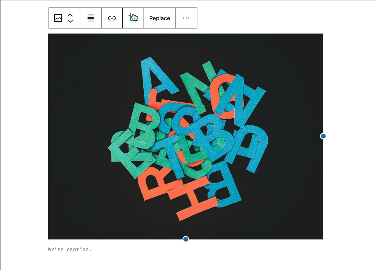
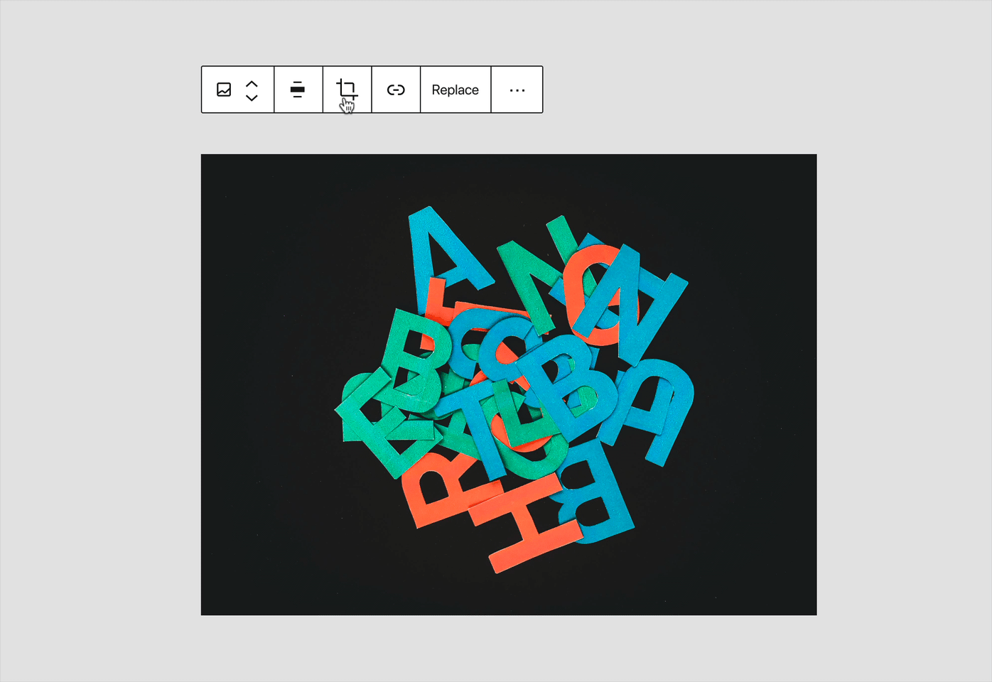
Btw I tried cropping a few days ago the bottom area of an image. I could not figure out how to do so. It would be great to improve this aspect of the image tools. |
In the current state of the image block, Edit would be more appropriate. To @paaljoachim's point above, and also seen in this thread: https://wordpress.com/forums/topic/i-need-help-with-cropping-an-image-in-my-blog-post-using-the-block-editor/, the Crop icon is very misleading because there isn't a true crop function on the image block. The gridlines and crosshair cursor imply that you should be able to click and drag on the image to select the area to crop, but in reality you have to go into Aspect Ratio for any kind of select tool. Compare to the Crop function in Media > Edit which acts how one would expect (click, drag, crop, boom!) Until the image block has that same kind of complete crop function, using the crop icon or variation of it should be avoided because it's quite confusing/misleading. Not to mention having the same icon in 2 places (Media screen and Image block) representing different functionality is also a bit confusing.😬🙃 |
|
Passing along some feedback that came in through the FSE Outreach Program's All Things Media exploration that relates to the specific experience around rotating:
|
Is your feature request related to a problem? Please describe.
The current flow of image edit tools within the Image block are great, though the experience using the controls could be improved to better indicate the available tools, as well as clean up the interactions.
Current flow:
Notice how the "Insert Link" and "Crop" icon (the one pressed to trigger this edit flow) both disappear when the "Crop" icon is toggled. I almost think we should view the "Crop" icon as a toggle, instead of a "click it, it's gone" action step.
It's also unclear what new set of relative image editing tools are available, now that we're editing the image.
Describe the solution you'd like:
We switch the placement of the "Insert Link" and "Crop" icons, so that when the "Crop" icon is clicked and the "Insert Link" icon disappears (which again, is proper), the "Crop" toggle does not move from its current position.
The "Crop" icon is switched to a toggle functionality, much like a number of other patterns used throughout the editor (i.e. the new + inserter at the top left, the settings sidebar toggle).
Consider making the new icons/editing tools a "drawer" that slides out to reveal the additional tooling for editing the images. The styling in my prototype here resembles the new "dragging" indicator style, and makes it clear that these have been added to the toolbar for cropping/editing the image.
Update the "Aspect ratio" icon to be a bit more clear.
Bonus points: Move the "Zoom" RangeControl to live within the bounds of the editing experience, to not bounce/interfere with content below the currently manipulated image.
More bonus points: Currently we require pressing the "Apply" button to save any edits, but if you accidentally click outside of the block - any edits are reverted without any indication of what occurred. Perhaps we should consider auto-applying the image edits when the block is deselected. Potential flow would be to open the edit tools, configure however, then move on to the next. If that's the case, maybe we don't need the "Apply" button (though we'd need to test that UX).
Figma:
https://www.figma.com/file/xsxvEDmfi5ijzQrBQwVegN/Image-Crop-Flow?node-id=0%3A1
Figma Prototype: https://www.figma.com/proto/xsxvEDmfi5ijzQrBQwVegN/Image-Edit-Idea?node-id=1%3A29&viewport=415%2C794%2C1&scaling=scale-down&hide-ui=1
The text was updated successfully, but these errors were encountered: