#55434 closed task (blessed) (fixed)
About Page for 6.0 Release
| Reported by: |
|
Owned by: |
|
|---|---|---|---|
| Milestone: | 6.0 | Priority: | high |
| Severity: | normal | Version: | |
| Component: | Help/About | Keywords: | has-patch commit dev-reviewed |
| Focuses: | ui, docs, administration, ui-copy | Cc: |
Description (last modified by )
This ticket includes the discussion, planning, bug scrubs, design, work and other records leading to the development and completion of the WordPress 6.0 release About page. Many teams are involved in this.
Attachments (8)
Change History (72)
#2
 @
@
2 years ago
- Keywords needs-message-strategy added; message-strategy needs-design needs-copy-review needs-docs needs-screenshots removed
- Milestone changed from Awaiting Review to 6.0
- Type changed from enhancement to task (blessed)
#3
 @
@
2 years ago
- Focuses administration added
- Keywords needs-design added
- Priority changed from normal to high

This ticket was mentioned in Slack in #core by nalininonstopnewsuk. View the logs.
2 years ago

This ticket was mentioned in Slack in #core by abhanonstopnews. View the logs.
2 years ago

This ticket was mentioned in Slack in #design by chaion07. View the logs.
2 years ago

This ticket was mentioned in Slack in #design by chaion07. View the logs.
2 years ago
#10
 @
@
2 years ago
I've created an initial collaborative document as a starting point using Google Docs. If for some reason you have trouble accessing it, please just "request access" or leave a comment here and we'll address that.
https://docs.google.com/document/d/15ES6jMSp2JfpYKEcq1Z3oRWLwrBsfOd1sEbtHizozmU/edit?usp=sharing

This ticket was mentioned in Slack in #core by critterverse. View the logs.
2 years ago
#12
 @
@
2 years ago
Hi all. Based on @critterverse points, I started working on different ideas for the header artwork to define the page style. Here are the two ones I like most.
Version 1 (left)
This one has the 6.0 text as overlapped figures to reference the jazzy styles found in album covers without adding more decorative elements, and the font is based on the News redesign (EB Garamond). I like how bold and straightforward is and the decorative components like the 6’s top area and the single dot between the numbers.
Version 2 (right)
In this case, I blended two styles. I used the brush stroke from News redesign to create a rectangle area below the number, and I took the 6.0 from the grid appearance of the demo video (2:45 sec. https://make.wordpress.org/core/2022/04/07/6-0-product-walk-through-recap/)
Feedback
Please let me know which direction you like more and the possible tweaks you envision.

This ticket was mentioned in Slack in #design by fcoveram. View the logs.
2 years ago
#14
 @
@
2 years ago
Thanks for sharing both design ideas. I do not have a strong preference - either one seems fine to me.
#15
follow-up:
↓ 18
 @
@
2 years ago
These look awesome, thanks for sharing @fcoveram! We took a quick look during the Design Team Show & Tell call today. A few notes that came up:
Folks seem to prefer the version on the left:
- We are big fans of the colors used and the overall composition
- This version feels more open/inviting
- The gray background helps ground the numbers and create an interesting masking effect
- Visually, the headers could work well without the subhead
The version on the right also looks great, but perhaps feels too boxy and the number lockup used there feels like it might work better when animated/used in video.
Would love to see how the direction on the left could be expanded to the other page section headers and to the Dashboard welcome banner! 😁

This ticket was mentioned in Slack in #core by abhanonstopnews. View the logs.
2 years ago
#17
 @
@
2 years ago
Chiming in that the option on the left / Version 1 also resonates more with me in the jazz/improvisational style. Either way, nice work and thanks for the help!
#18
in reply to:
↑ 15
 @
@
2 years ago
Glad that you all liked one version. I will start exploring alternatives for the other sections.
#19
 @
@
2 years ago
Hi folks! What's the status of the About page copy? We need to have this committed by next Tuesday for RC1, so if the copy is ready (or at least 90% there) I can put up a patch.
#20
 @
@
2 years ago
I'd like to get the copy in final draft form by Thursday end of day (April 28th). I'm out on Friday and others can continue to work on refining the copy... but by Monday, May 2nd, I think it should be good to go. As I write this, I think we're at the 95% point.
#22
 @
@
2 years ago
Hi all! I have been designing the images to show the features and the page based on this document (content up to April 28th, 11:30 GTM-4) and this guide (https://make.wordpress.org/design/handbook/workflows/wordpress-core-about-page/) shared by @estelaris. Here you can see a prototype version (https://www.figma.com/proto/ZizhN0ztdgGYYuatX2w85s/About-Page-6.0?page-id=681%3A3763&node-id=751%3A11397&viewport=328%2C48%2C1&scaling=min-zoom&starting-point-node-id=740%3A12400), and below the mockup and some comments related to the whole design.
All images are static images except the one in “Switch up styles!” where I tried a GIF displaying the style variations of the Twenty Twenty Two theme. Open the prototype to see it live.
Content order
The content document has the “More design tools” section between the Integrated patterns and the List view descriptions. I am not aware of why this decision, but once the descriptions are reinforced with images, it sounds more logical moving this section to the end of the feature descriptions. Let me know what you think of this shift.
Content length
There are two features with bullet content, “Let your writing flow” and “Different templates for different things”. At first glance, it looks clear to describe the characteristics per point, but once on the page, it is difficult to handle it since the text lengths tend to vary and the sentences look irregular.
In the case of “Let your writing flow,” I tried different layouts, and a section made of two columns is the cleanest way to balance the empty space between the paragraph, image, and bullets. Nonetheless, I would prefer to describe the feature in multiple paragraphs since the page follows a section-per-feature logic.
For the “Different templates for different things” section, I added one thumbnail image per point showing the tool, but you can notice that the third one does not have the full text by the text length reason mentioned above.
I hope you like this proposal. Please let me know your thoughts

This ticket was mentioned in Slack in #design by fcoveram. View the logs.
2 years ago
#24
follow-up:
↓ 25
 @
@
2 years ago
The original intent on ordering the features listed was to start with the content-creating/writing "stuff" and then move into layout and controls. I loosely attempted to group them together by area of focus... but it is all related... there is no recipe here set in stone, so I think this is an agreeable approach.
#25
in reply to:
↑ 24
 @
@
2 years ago
Replying to dansoschin:
The original intent on ordering the features listed was to start with the content-creating/writing "stuff" and then move into layout and controls. I loosely attempted to group them together by area of focus... but it is all related... there is no recipe here set in stone, so I think this is an agreeable approach.
That makes sense. I tend to think that all tools are for designing, and since the bullet list points to different functionalities, I displayed them with related icons.
#26
 @
@
2 years ago
I like the design but I am concerned about the developers section. Not adding a headline to the last section makes it feel like this update is only about design. Previous pages have it well defined by calling it "For developers" before the field guides, dev notes and other features.
#27
 @
@
2 years ago
From how I read it, I don't think there is a "for developers" section in the page this release. The "Learn more about WordPress 6.0" headline is also the section header for the last three columns too.
@fcoveram I like the design :) Could you export those images? I can copy out the header & icons since those will be SVGs, but I have trouble exporting images from Figma.
Are the other section headers in the Artwork ideas page finished? I see they're missing the subtitles, so those will need to be added back in, but I can grab the graphics from there for now.
#28
 @
@
2 years ago
The copy is now frozen. It is available here: https://docs.google.com/document/d/15ES6jMSp2JfpYKEcq1Z3oRWLwrBsfOd1sEbtHizozmU/edit?usp=sharing
#29
 @
@
2 years ago
As @ryelle said, there is no "For developers" section in the content. Something that we might raise in the doc itself.
The headings "Welcome to WordPress 6.0", "More design tools," and "Learn More About WordPress 6.0" have H2 styles to create three separated sections, but that is open to change indeed.
I also submitted the graphic assets to the 6.0 folder (https://drive.google.com/drive/folders/1wgNLq-m9x1UfVIda4QIo4PeJ2GFDjx0r?usp=sharing) and currently working on the dashboard banner variations. I will come up with a proposal this week.

This ticket was mentioned in PR #2659 on WordPress/wordpress-develop by ryelle.
2 years ago
#30
- Keywords has-patch added
Add the header styles to all About-section pages, and add the content from the About page doc. Some responsive styles have been added — the page titles use a scaling font size so it fits in the header space without overlapping the image — but if there are other issues we can iterate during RC.
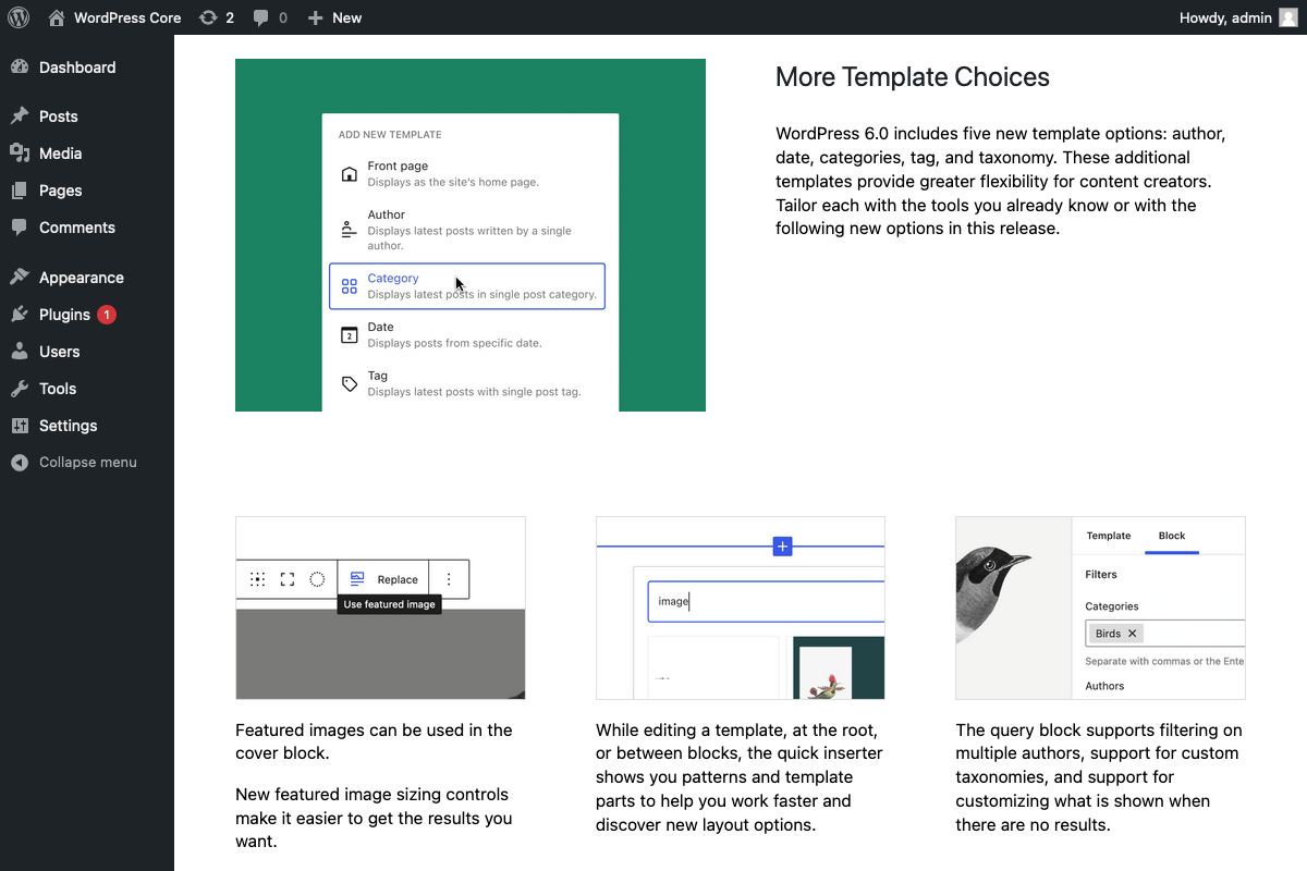
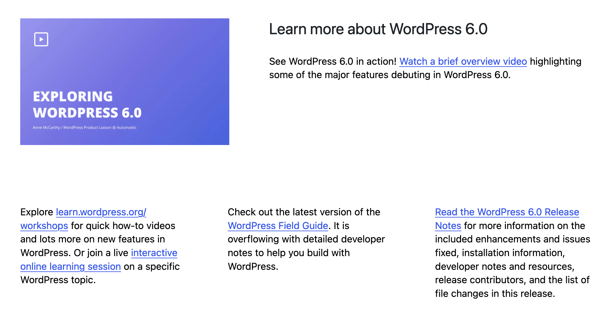
Screenshot of the full about page:

The content changed a little from when it was put into the design, but it mostly all still fit. The biggest change from the design is the "More Template Choices" section, which I switched to a single narrow column so that the "with the following new options […]" text would clearly flow into the next section.
This is what it would look like with the original design:
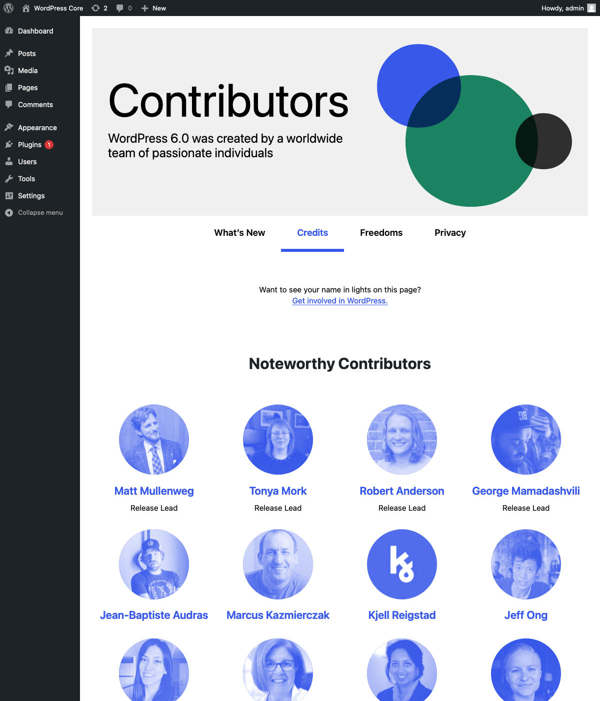
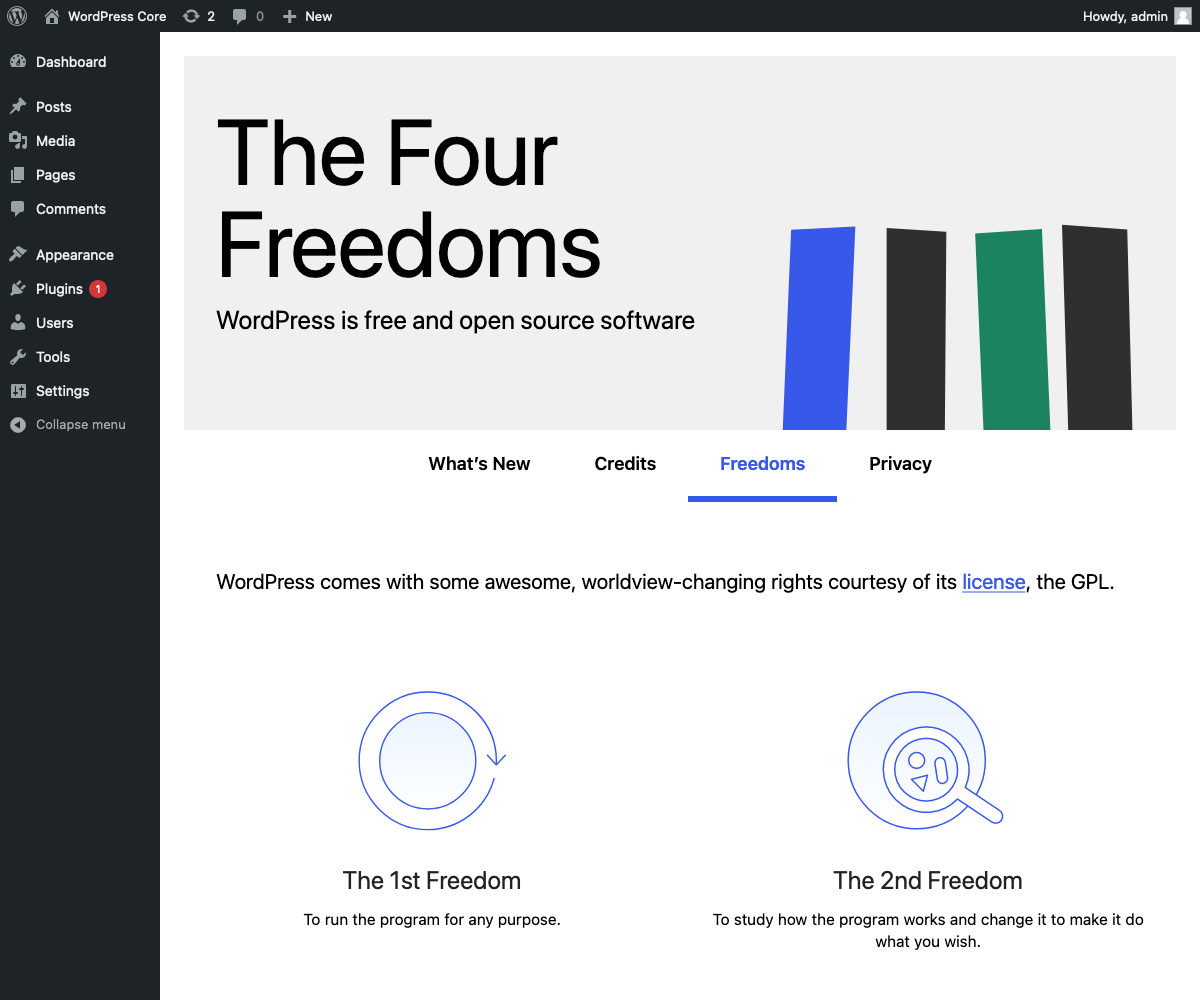
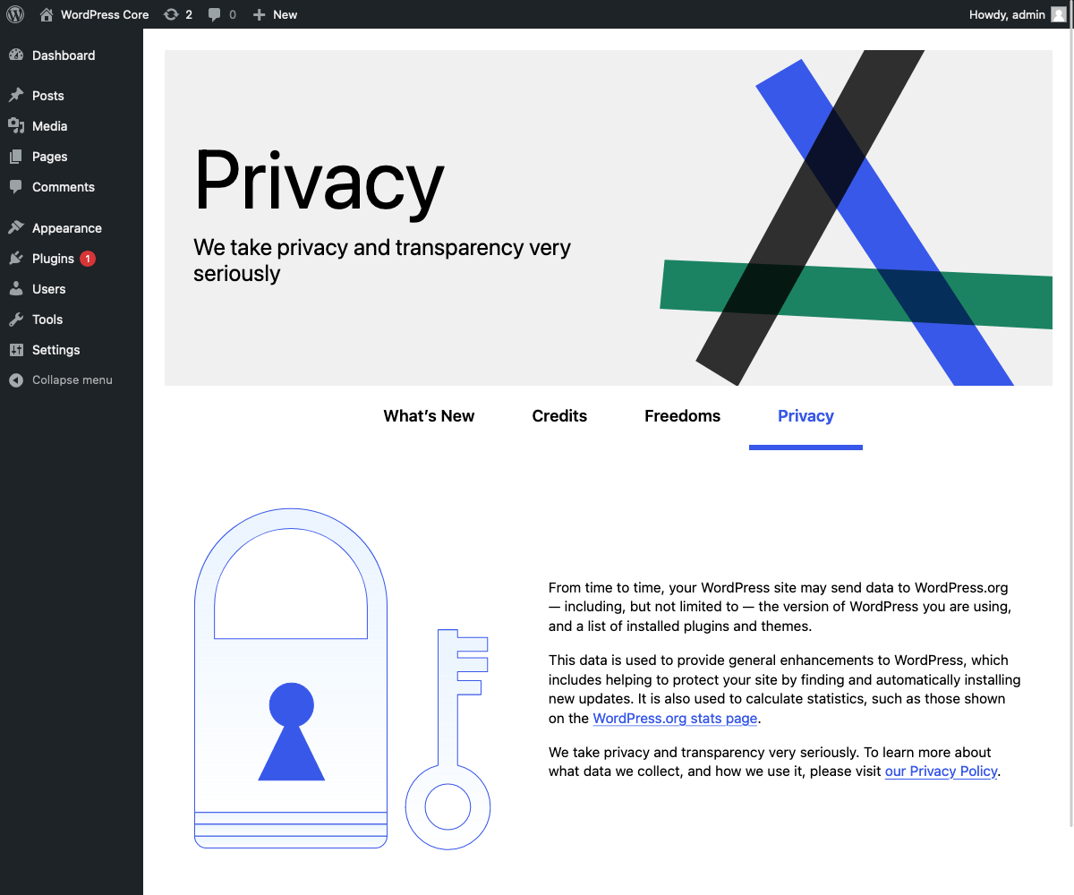
Other About section pages have the headers updated:
Trac ticket: https://core.trac.wordpress.org/ticket/55434
#31
 @
@
2 years ago
I've pushed up the code in a PR, and you can see screenshots above. I would appreciate a copy review, since the copy was finalized after my initial export (I think I got it all, but more eyes are better) cc @dansoschin
@fcoveram Any feedback on the design implementation is welcome too :)
#32
 @
@
2 years ago
@ryelle, I did a side-by-side comparison using the Google Doc linked above and your screenshot. I found only two minor items:
- The text in the screenshot for the field guide (all the way toward the bottom) differs from the Google doc.
- The section on the field guide (last paragraph in doc) had a typo that got copied into the screenshot you shared, "issues fixes" should be "issues fixed". I've fixed that in the Google doc, just for the sake of fixing that. :)
Thank you!
#35
 @
@
2 years ago
- Keywords needs-message-strategy needs-design removed
This is the props list I have so far, grabbed from this ticket & the google doc history. Am I missing anyone?
fcoveram, estelaris, JeffPaul, critterverse, chanthaboune, dansoschin, webcommsat, annezazu, marybaum, cbringmann, eidolonnight, laurlittle

SergeyBiryukov commented on PR #2659:
2 years ago
#36
The PR looks great to me 👍

This ticket was mentioned in Slack in #core by costdev. View the logs.
2 years ago

This ticket was mentioned in PR #2673 on WordPress/wordpress-develop by audrasjb.
2 years ago
#41
- Keywords has-patch added
Trac ticket: https://core.trac.wordpress.org/ticket/55434
#42
 @
@
2 years ago
Since some locale translated the Field Guide into their language, the above PR adds the Field Guide link as a translatable string :)

This ticket was mentioned in Slack in #core by abhanonstopnews. View the logs.
2 years ago
#46
follow-up:
↓ 52
 @
@
2 years ago
Updated the field guide link in [53354]. It needs to be ported to the 6.0 branch, which the docs say is "best done by different committer."
With that, the only links we need are the video link (which won't be ready until closer to release) and the link for "Read the WordPress 6.0 Release Notes." @dansoschin What post should that link to?
The images still need to be uploaded to the w.org CDN - I can do that before RC2 if everything looks good.
#47
 @
@
2 years ago
@ryelle - I was hoping to include a link to the 6.0 version of this doc/page:
https://wordpress.org/support/wordpress-version/version-5-9/
#48
 @
@
2 years ago
I love how clean it looks. There are a few comments regarding text styles and layout.
The spacing above and below the intro title and description, "Welcome to WordPress 6.0", seems big and pushes down the following content. I would apply a 64px space above after the tabs and below before the first feature item.
The description below “Welcome to WordPress 6.0” title is slightly small and bold due to font weight and line-height. In the mockup the text styles are font-size 23px, line-height 160%, and font-weight 300. Also, I would center the alignment to match the heading above.
The title in each feature looks too light compared to the design proposal. The mockup has Heading 3 bold style for all these texts where the font-size is 26px , line-height 37px , and font-weight 700 (Bold).
Body text looks a little bit small and semi-bold. The style in mockup is font-size 18px line-height 28px, and font-weight 300 (Regular).
The bullets in the first feature section look a little bit tight. I would increase the margin-bottom double, 12px.
It seems that “More Template Choices” is implemented as two sections instead of one. The initial idea was to have a feature section divided into two rows with a smaller spacing, 48px. The first row for the image and feature description, and the second row for the three columns with the feature details. The design handbook (https://make.wordpress.org/design/handbook/workflows/wordpress-core-about-page/) does not allow this layout, so I wonder how possible it is to develop this.
I just noticed the new bullet in the section mentioned. Do we have a tentative deadline for freezing the content? I still like the idea of sub-feature images in three columns, but four columns might require a new layout or eliminate the images and mirror the first feature section, “Enhanced Writing Experience.”
I consider the “Additional Design Tools” a different section, as the features group and the “learn more” at the end. For that reason, I would apply the same spacing to divide these three sections. I tried 128px in the browser inspector and it looks good.
In the same area mentioned above, I would center the texts below icons to match the title and description legibility.
The same layout of two rows applies in the “Learn more about WordPress 6.0” section. The spacing between rows looks slightly large. I would apply a 64px spacing in between.
Please let me know what you think of my points and how feasible the implementation is.

This ticket was mentioned in PR #2681 on WordPress/wordpress-develop by ryelle.
2 years ago
#49
Trac ticket: https://core.trac.wordpress.org/ticket/55434
#50
 @
@
2 years ago
Body text looks a little bit small and semi-bold. The style in mockup is font-size 18px line-height 28px, and font-weight 300 (Regular).
I've updated the font size, but left the body text at the current font-weight (regular) since 300 is light, and light body text can be hard to read.
It seems that “More Template Choices” is implemented as two sections instead of one.
Yeah, I mentioned that in the PR, I switched it to a single narrow column so that the "with the following new options […]" text would clearly flow into the next section.
Do we have a tentative deadline for freezing the content?
Content is frozen now, the deadline for string changes was this past tuesday (RC1). If the current layout works, I would rather stick with it — we don't really have the time to keep iterating. I decreased some of the spacing in the two sections you mentioned, so hopefully that helps.
I've made the other font and spacing changes, but I didn't change the text alignments. The subheading and "additional design tools" paragraphs are all longer, and centering long text makes it harder to read the content.
@fcoveram you can either try the new PR or just review the screenshot above :)
#52
in reply to:
↑ 46
 @
@
2 years ago
- Keywords dev-reviewed commit removed
Replying to ryelle:
Updated the field guide link in [53354]. It needs to be ported to the 6.0 branch, which the docs say is "best done by different committer."
Backporting done!
#53
 @
@
2 years ago
I updated the artwork for the internal tabs and here is a screenshot of how the header area looks.
Link to download the SVG files (

2 years ago
#54
Updated headers for the other About sections:


#55
follow-up:
↓ 58
 @
@
2 years ago
- Keywords commit dev-feedback added
It's a little buried, but the most recent PR (2681) updates the font styles, spacing (see 50), and About section header images.

2 years ago
#56
Updated the image source to use the s.w.org CDN 👍🏻
SVG images reasonably well compressed (SVGOMG could save 50 bytes of each but I suspect that was rounding numbers down)
They've all been through SVGOMG already - the biggest change was removing focusable, which is technically not necessary but I'm adding it to these SVGs to keep it consistent with the change to the "6.0" SVG in #2683.

This ticket was mentioned in Slack in #core by ryelle. View the logs.
2 years ago
#58
in reply to:
↑ 55
 @
@
2 years ago
- Keywords dev-reviewed added; dev-feedback removed
Replying to ryelle:
It's a little buried, but the most recent PR (2681) updates the font styles, spacing (see 50), and About section header images.
Looks good to commit and backport.
#60
 @
@
2 years ago
- Resolution fixed deleted
- Status changed from closed to reopened
Reopening for backport



Hi all, I asked for volunteers to help with the About page in the Design channel recently and @fcoveram reached out to say he'd love to help with the design for this release 😀
Also wanted to follow up on this question that @ryelle asked on Slack the other day:
My sense is that we should try to reuse the same layout since the Dashboard banner will also need similar updates. I think the most streamlined approach would be to focus on updating these items:
I opened a new ticket to discuss the Dashboard updates in #55532.