-
Notifications
You must be signed in to change notification settings - Fork 4.1k
New issue
Have a question about this project? Sign up for a free GitHub account to open an issue and contact its maintainers and the community.
By clicking “Sign up for GitHub”, you agree to our terms of service and privacy statement. We’ll occasionally send you account related emails.
Already on GitHub? Sign in to your account
Allow borders on image, group, cover blocks #21540
Comments
|
+1 👍 |
|
It's probably obvious, but a border-radius control with this would be a welcome addition to many blocks to create rounded cornered elements with group, cover, image, etc. |
|
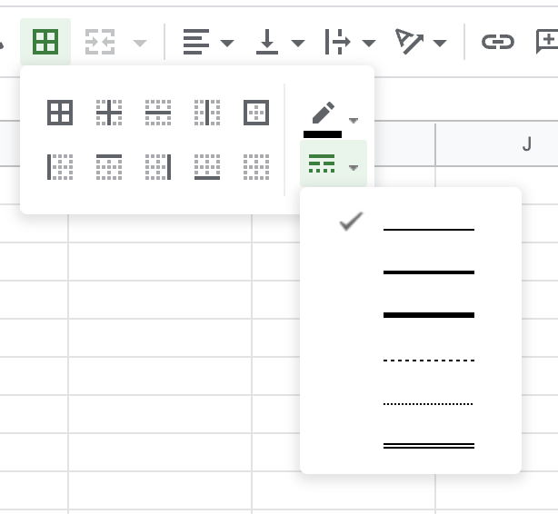
So we need controls for:
|
|
Now that #25791 has been merged to add radius as a block support, adding others controls just involves amending to what's been done there right? @aaronrobertshaw are there any plans for the rest of these features? I'm trying my hand at integrating that block support into a block or two to see how it works out. |
|
I successfully added the __experimentalBorder.radius to the core/code block and the editor behaved as expected per #25791 . And setting border.customRadius flag in a theme would disable this as expected. However I was unable to leverage a Theme's theme.json to produce changes in the style as other block supports appear to provide. Is this behavior I should open a ticket to track? |
The border radius feature was added within a new "border" set of block supports specifically so we could easily add new border related supports such as style or width. In the next week I'd planned to revisit the border block support and see what we could add right now 🙂 It is likely we'll hit some delays though settling on the best UI for all the controls. Some blocks may opt into some features and not others, another block could be different again. So allowing for them to be used independently is one thing, it's another when all the controls @carolinan outlined are present at once. Do we look to combine the options within the UI like this example: The recent addition of font weight and style to the typography block support tools is an example of where some controls got "merged" within the UI but could still operate when either was disabled. I'd be interested in your thoughts @jasmussen regarding the UI? It might also be worth considering if the choice of border color should actually be handled by the colours block supports. That's the direction I'd lean towards at the moment. |
|
Border properties like suggested is quite a big can of worms to open. It's a can we'll want to open at some point, probably, but it's a non-trivial challenge. Borders should be able to inherit their colors, or have specific colors. It should be themable and user overridable. You should probably be able to define dash types in a technical sense, but also have some sensible defaults to choose from. Do box shadows fall in under borders? Outlines? Should you be able to create gradient borders or use background graphics? It's a vast spectrum and we have to choose where to land on it. The biggest blocker I see is that our sidebar system is not yet ready to scale to accommodate such complexity yet. I think we have to walk the path of global styles and the component system outlined in #27331 a little bit, before we seriously tackle all the border properties. And even then, it needs to be tackled carefully with some solid designs first. In the mean time, I'd suggest employing style variations for borders, such as how Twenty Twenty One does it. |
@pbking this behaviour is expected and I believe consistent with other block supports that provide custom values on a per block basis e.g. custom line heights. There has also been a desire to avoid adding new presets to the theme.json which would possibly provide the functionality you describe. I take it you are referring to the presets for colors, font sizes etc? |
|
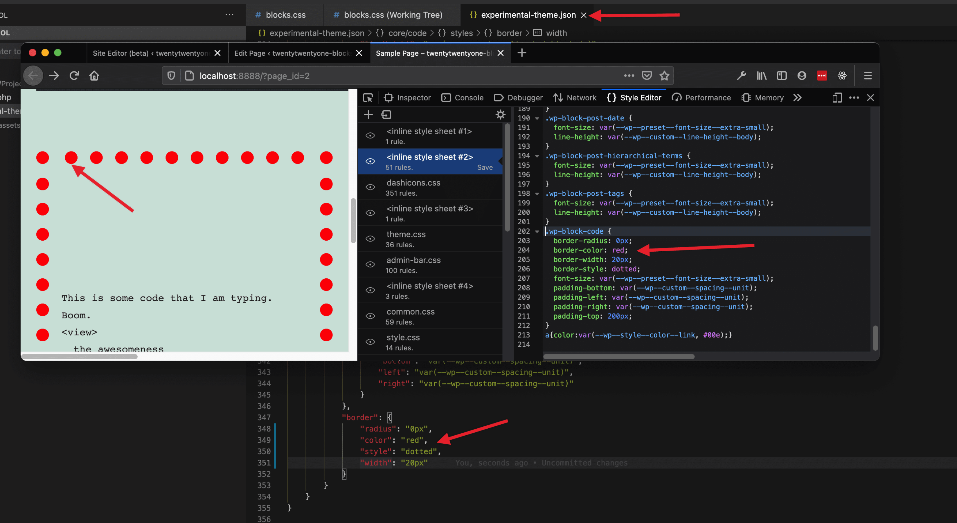
@aaronrobertshaw I believe that what I was looking for was a tiny change to the theme.json schema like this. Including border.radius in the schema allowed for the CSS to be generated as I expected in order to support styling the code block (and ultimately other blocks) per WordPress/theme-experiments#113 However when doing that I noticed that simply by adding all FOUR border-related attributes (like so) I was able to define style values in my theme.json to control the border's radius, size, color and style (even though there is no UI control in the site editor for three of those). From a theme building standpoint that's pretty darn handy! Do you think that we would need to wait to add the style scheme support for those border properties until we have the block-level editing ability? Or do you think we could bring that change (or something like it) in closer to now allowing themes to get a jump on define boarder values. |
Thanks, for the clarification, I believe that might have been an oversight of mine while rebasing the border radius support PR after the theme json processor was extracted. I'll put together a new PR to correct that and tidy up a few other lines of code.
This one I'm not sure about. @nosolosw or @jasmussen do you have any thoughts on this? |
|
A new PR is up that adds the already existing border radius support to the theme.json styles schema #27791. I'd still be interested to hear others' thoughts on the viability of allowing additional border styles prior to them having controls at the block level. |
|
@aaronrobertshaw Is there anything we should followup with here? |
|
Thanks resurfacing this one @paaljoachim. We've just merged some additional border block support for color, style and width. It hasn't evolved yet to include specifying which sides to display the border on but I don't think that should stop us using this support for the group, image and cover blocks. I'll put together a couple of PRs later today. |
|
A couple of refinements detailed in these two: |
|
Associated issue: |
|
A couple of draft PRs have been created to add border support to image (#31366) and cover (#31370) blocks. The group block only needs for the theme to enable custom border properties by opting in via the theme.json. "settings": {
"defaults": {
"border": {
"customColor": true,
"customRadius": true,
"customStyle": true,
"customWidth": true
}
}
} |
|
border radius for images are considered here? |
|
Hi @avagp, border-radius support is already opted into by default for the image block. However, to be able to leverage this, the border-radius UI must be enabled via your theme's I also have a PR in the works that will enable border color, style and width for the image block. You can follow those enhancements in #31366. Hopefully that helps 🙂 |
|
This came up as a request for the eleventh call for testing for the FSE Outreach Program:
Updated to include a desire for this in the All Things Media exploration too:
Passing along so folks are aware this is still being asked for :) |
|
👍 from me! I'm actually pretty surprised this isn't part of the editor yet. Dualtone for image block seems a really weird thing to prioritise over borders. |
|
With #41153 landing, cover, image, and group blocks now support borders. |
|
Thank you Aaron! |
|
Thanks! In which Gutenberg plugin version will this be available? |
|


Consider this example:
Having the ability to add borders (with custom color selection) would allow for more compelling layouts and patterns in Gutenberg.
The text was updated successfully, but these errors were encountered: