Most settings in theme.json let you configure properties at the global level. This means that they apply to all blocks that support them. But WordPress also lets you control this at the block level.
That’s what the settings.block property is for—you can configure everything from typography, to colors, to spacing, and more for individual blocks.
Before moving forward with this page of the handbook, it is important to familiarize yourself with at least some of the existing theme.json settings. This way, you can apply them on a per-block basis.
How block settings work
In the previous pages of the theme.json settings documentation, you learned how to configure specific properties at the global level. Essentially, this means that they are applied to all blocks that support the specific property/feature.
You would have configured many of these properties in your theme.json (shortened for example—you can review all available properties via the main settings documentation):
{
	"version": 2,
	"settings": {
		"border": {},
		"color": {},
		"custom": {},
		"spacing": {},
		"typography": {}
	}
}
But there are times when you need to add settings at the individual block level, and anything set for the block will overrule its global setting. So let’s explore an example that shows block-specific settings overwriting the global settings.
For this example, you will create a custom color palette, which you can learn about in the color settings documentation. This will be applied globally and used for every block’s color picker. Then, you will create a custom color palette for the Cover block that’s only shown for the Cover block.
First, add your global color palette in theme.json with two colors named base and contrast:
{
	"version": 2,
	"settings": {
		"color": {
			"palette": [
				{
					"color": "#0284c7",
					"name": "Base",
					"slug": "base"
				},
				{
					"color": "#ffffff",
					"name": "Contrast",
					"slug": "contrast"
				}
			]
		}
	}
}
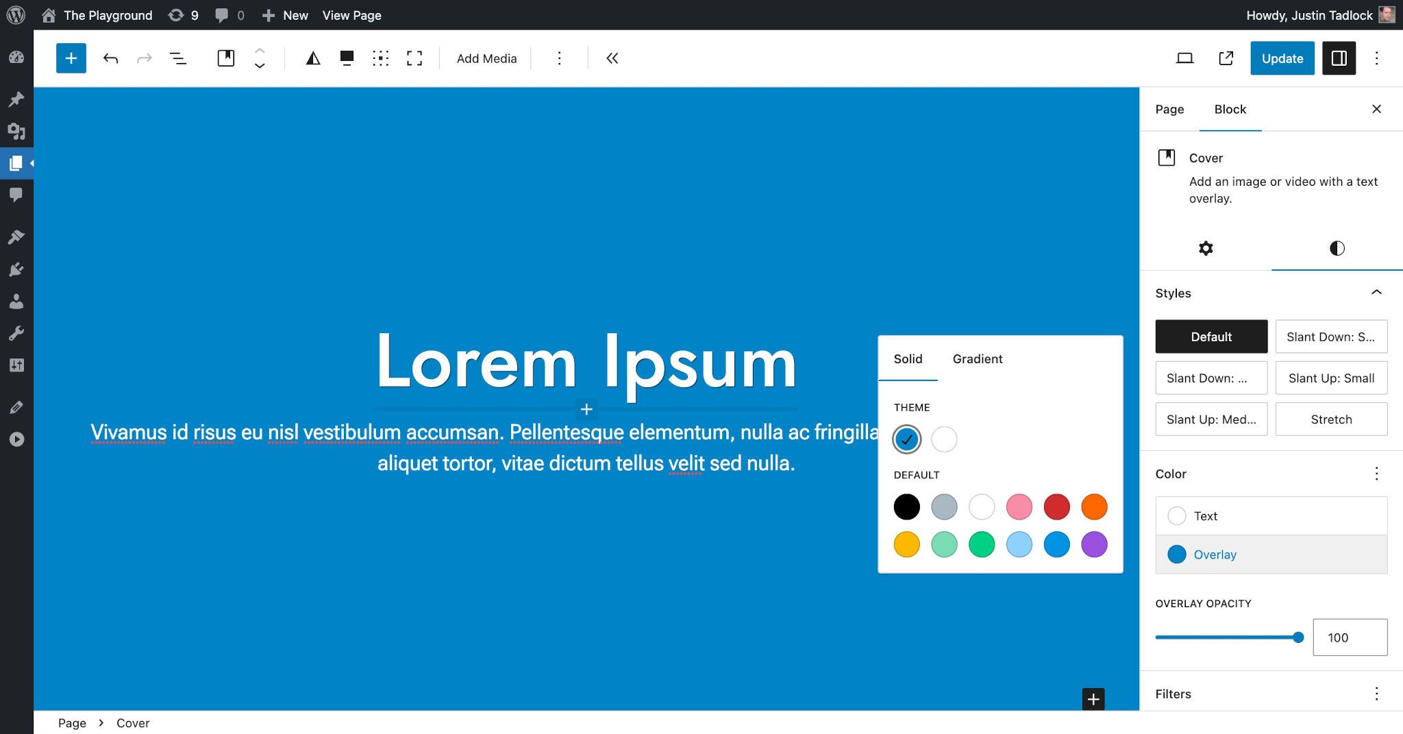
Now add a Cover block and some nested text in the WordPress editor, saving the Text and Overlay colors for the block to your two custom colors:

As you can see, the Cover block currently uses the global color palette that you configured in your theme.json file.
Suppose that you wanted the Cover block to use an orange color palette. You can configure that by targeting settings.blocks[core/cover].color.palette in your theme.json file and passing an array of custom colors.
Add this new section to your existing theme.json so that it looks like this:
{
	"version": 2,
	"settings": {
		"color": {
			"palette": [
				{
					"color": "#0284c7",
					"name": "Base",
					"slug": "base"
				},
				{
					"color": "#ffffff",
					"name": "Contrast",
					"slug": "contrast"
				}
			]
		}
		"blocks": {
			"core/cover": {
				"color": {
					"palette": [
						{
							"color": "#ea580c",
							"name": "Base",
							"slug": "base"
						},
						{
							"color": "#fff7ed",
							"name": "Contrast",
							"slug": "contrast"
						}
					]
				}
			}
		}
	}
}
As shown in the theme.json example, you use the same organizational structure for block settings as you do for global settings (i.e., settings.color at the global level but settings.blocks[core/cover].color at the block level).
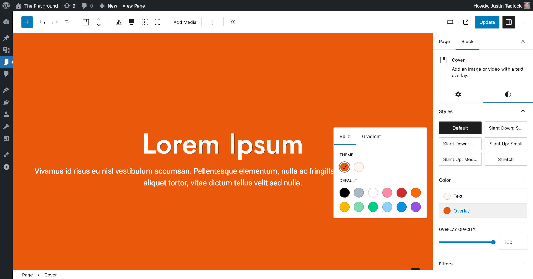
If you refresh your browser window, your Cover block should now show the new colors:

If you check other blocks, they will still use the global color palette. Only the Cover block will use this custom orange palette.
Per-block color palettes are just the tip of the iceberg. You can configure any theme.json for any block (assuming the block supports it). This gives you an incredible amount of control over how your theme works.
When targeting a block’s settings, you must know both its namespace and slug. Above, you learned that the Cover block has the namespace (core) and slug (cover), creating the namespace/slug combination of core/cover. All core WordPress blocks have the core namespace, and you can find this information for any block (including from third-party plugins) in its block.json file.
Default block settings
Believe it or not, WordPress actually configures a couple of default block settings in theme.json. Generally, this would be left to themes, but these settings are primarily enabled for backward compatibility with features from older versions of WordPress.
WordPress enables a few settings for the Button and Pullquote blocks by default. Here is what this looks like in the default theme.json:
{
	"version": 2,
	"settings": {
		"blocks": {
			"core/button": {
				"border": {
					"radius": true
				}
			},
			"core/pullquote": {
				"border": {
					"color": true,
					"radius": true,
					"style": true,
					"width": true
				}
			}
		}
	}
}
You can overwrite these block-specific settings in your theme.json file just as you learned to do in the previous section of this documentation.
If you are wondering why some of your global settings do not seem to apply to certain blocks, particularly Button and Pullquote, it is likely because they are being set at the block level. You will need to override these in settings.blocks in your theme.json if you want a different behavior.