
You probably already know how to use media-specific CSS to provide a suitable layout for the printed page.
But how great would it be to be able to go further and provide a better print alternative through the use of specific high-resolution images specifically for print? Awesome? Here’s how.
HTML image sizing#section2
HTML and CSS allow us to force images to display in a different size than their native dimensions. I recently began wondering whether higher resolution devices like printers might be able to use the pixels omitted by the relatively low resolutions intended for screen viewing.
So I began an experiment to compare the way resized images look on screen to their appearance in print.
I made the following images:
| 10×10 pixel anti-aliased GIF | 50×50 pixel anti-aliased GIF | 100×100 pixel anti-aliased GIF |
|---|---|---|
 |
 |
 |
Then I added these three images to an HTML page and used the img tag to force all three images display 10×10 pixels.
<img alt="" height="10" width="10" />This left three circles that, while the same size, all looked slightly different:
| 10×10 pixel GIF displayed at 10×10 pixels (file size 85 bytes) |
50×50 pixel GIF displayed at 10×10 pixels (file size 323 bytes) |
100×100 pixel GIF displayed at 10×10 pixels (file size 706 bytes) |
|---|---|---|
|
 |
 |
The first circle looks a little nicer than the other two due to anti-aliasing. The other two images are anti-aliased, but because of the browser’s rather brutal pixel-culling when scaling, they look jagged.
The file sizes vary between the three images (85b to 706b). For simple GIFs like these, the real difference is negligible, but it is important to note that in larger JPEGs and PNGs the difference can be significant.
I printed the HTML page that contained the three images and discovered that the print results were actually the opposite of the screen results. The first circle appeared to be of the lowest quality, while the second and third circles looked better.
| 10×10 pixel GIF (file size 85 bytes) |
50×50 pixel GIF (file size 323 bytes) |
100×100 pixel GIF (file size 706 bytes) |
|---|---|---|
 |
 |
 |
This is happening because the image sizes are being forced down while their resolution (dpi) is being forced up. The first image is made up of 100 pixels (102), whereas the second crams in 2500 pixels (502), and the last a whopping 10,000 pixels (1002) into the same space. Printers can utilize these extra pixels to produce a higher quality image because print resolution typically ranges from 300dpi up to 1200dpi, while screen resolution is usually only 72dpi to 96dpi.
What this means#section3
While we can create images for use on screen, we can also create larger images and force their size down (and their dpi up) for use by printers. We can make hi-res logos and headings, 300dpi photos, and even images specifically needed for printed pages—and serve up these print-specific images using print-media CSS.
Putting it into practice#section4
We want to make a header for a website that includes a white logo on a dark background, but will print out as a solid black on white at a higher resolution.
We start by creating a lo-res/screen version of the logo (130×100px GIF at 3KB). We then make a special hi-res/print version of this logo by increasing the pixel count by five (650×500px GIF at 10KB).
We put both the screen version and print version on the page and set the size of the print version to be the same as the screen version. Then CSS allows us to hide the print version of the image when displaying the page on a screen and then use it to replace the screen version when the page is printed.
Hiding the print version without CSS#section5
We can also use HTML’s img element, together with its height and width attributes, to force resize any image—even a large, hi-res image—down to a 1×1px dot on a web page:
<img alt="" height="1" width="1" />We can then override these height and width settings in the print-media CSS:
img { height: 30px; width: 30px; } Even when CSS is turned off, the HTML height and width attributes we applied to the img element make that image easy to overlook. (After all, it’s only a one-pixel “dot” on the page.)
Note: Most browsers don’t resample an image if it is scaled—so that one pixel “dot” is actually a pixel selected directly from the original image. If you manage to locate this pixel and make it the same color as the page or background, then it is entirely invisible. For some headers, I might use the one-pixel dot as a “skip to content” link.
I have experimented with various image replacement (IR) techniques. The version I’m using here works as you would expect: include the image inside the HTML tag along with the text so that you can overpaint the usual background image that is the screen version. Depending on your needs and project requirements, you could integrate the technique with many other popular IR methods.
Caveat emptor#section6
Like many CSS techniques that extend web functionality, this approach can pose some problems. Depending on the demands of your project, you may find that including an extraneous image alongside the screen version is too much of a semantic compromise. You may also determine that it’s too much work for too little gain or take issue with the integration of screen and print content into a single document structure.
These are all valid points, and it’s up to you to decide if and when this technique will be useful for you. Some other technical aspects to consider:
- Resizing doesn’t work for CSS background images.
- “Hidden” images will show up with CSS turned off (unless you control the size in the
<img>tag). - Extra images will increase bandwidth usage.
On the plus side, I have yet to find a modern browser that this technique doesn’t work in. Any browser that understands CSS media types should be able to support this technique. Additionally, this technique is not doing anything like cloaking text or HTML elements with color or visibility in a way that is likely to look deceitful to search engines.
One question that still intrigues me is whether all browsers download image files that are referenced in a print style sheet but not in the screen style sheet or in the markup? The limited number of browsers I’ve tested do appear to download the images whether the user prints the page or not.
Try it, you’ll like it#section7
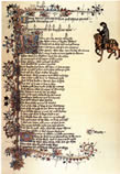
Here’s a color logo that prints out as high-resolution black and white line-art (using image replacement in CSS):
 Book Whitman—Antique Manuscripts#section8
And here’s a JPEG thumbnail that prints out as a high-resolution full color image (using two images):

Hi
Please can any one help me to manage a stick up footer on the website for IE 5.0 +.
As you can see 1 on http://www.bmw.co.uk
thanks
Imran Hashmi
useful
pls allow me download the image
I use low-resolution and clickable thumbs for accessing the high-resolution images.
There http://www.phpclasses.org/ are a lot of good gallery-scripts that make it automatically.
I so needed this.
I’ve built an app that does quotes, and people really need to be able to print. The images I put up at first look great on the site then as soon as you go to print it is crap…
Using 300 & 150dpi images has fixed all the issues. As this is an application and the same 7 images are used over and over again, I’ve simply added a preload js function. Works great.
Now all I need is to get IE7 to print Transparent PNGs…
I suggest you turn off antialiasing to produce B/W print images.
The circles in the example are antialiased, so the printer will use patterns/hatches where the pixels are gray. Using high resolution jagged images improves the sharpness of the borders (barcode readers will thank you too).
Just test and see.
Cheers.